Designing a home that feels both curated and comfortable often comes down to the smallest architectural details. While most people default to standard white for their baseboards and window frames, exploring contrast trim wall ideas can completely transform your living space. This design technique uses color to frame rooms like a piece of art, adding depth, character, and a touch of drama to any interior. Whether you prefer the bold look of black window mullions or the soft warmth of mushroom-toned baseboards, changing your trim color is an easy way to elevate your home’s aesthetic. Dive into these creative strategies to discover how contrasting finishes can anchor your design.

1. Black Window Trim White Walls
Have you ever noticed how a black frame makes a photograph stand out more than a white one? Applying this same logic to your home by painting window trim black against crisp white walls creates a stunning, graphic focal point. This high-contrast choice acts as an architectural highlighter, immediately drawing the eye toward the outdoor view and natural light. It is a staple in modern farmhouse and industrial designs, offering a clean and sophisticated look that never feels dated. To achieve the best results, use a high-quality matte or satin finish to hide minor wood imperfections while maintaining a sleek, expensive feel in the room.
2. Dark Grey Baseboards Light Walls
Choosing dark grey for your baseboards is a sophisticated way to ground a room without the harshness of pure black. When paired with light grey or off-white walls, these darker borders create a sense of structural stability and modern elegance. This color combination is particularly effective in high-traffic areas because darker paint hides scuff marks and dust much better than traditional white. It provides a moody, contemporary vibe that works beautifully with minimalist furniture and textured rugs. By extending the grey to the door frames, you create a cohesive, wrap-around effect that makes the entire architectural layout feel intentional and high-end.
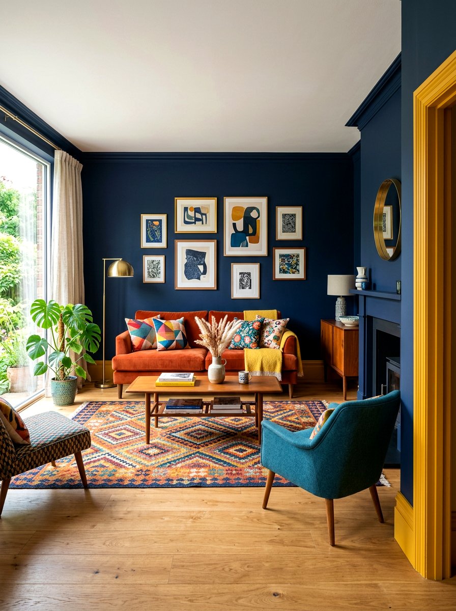
3. Navy Blue Door Frame Neutral Walls
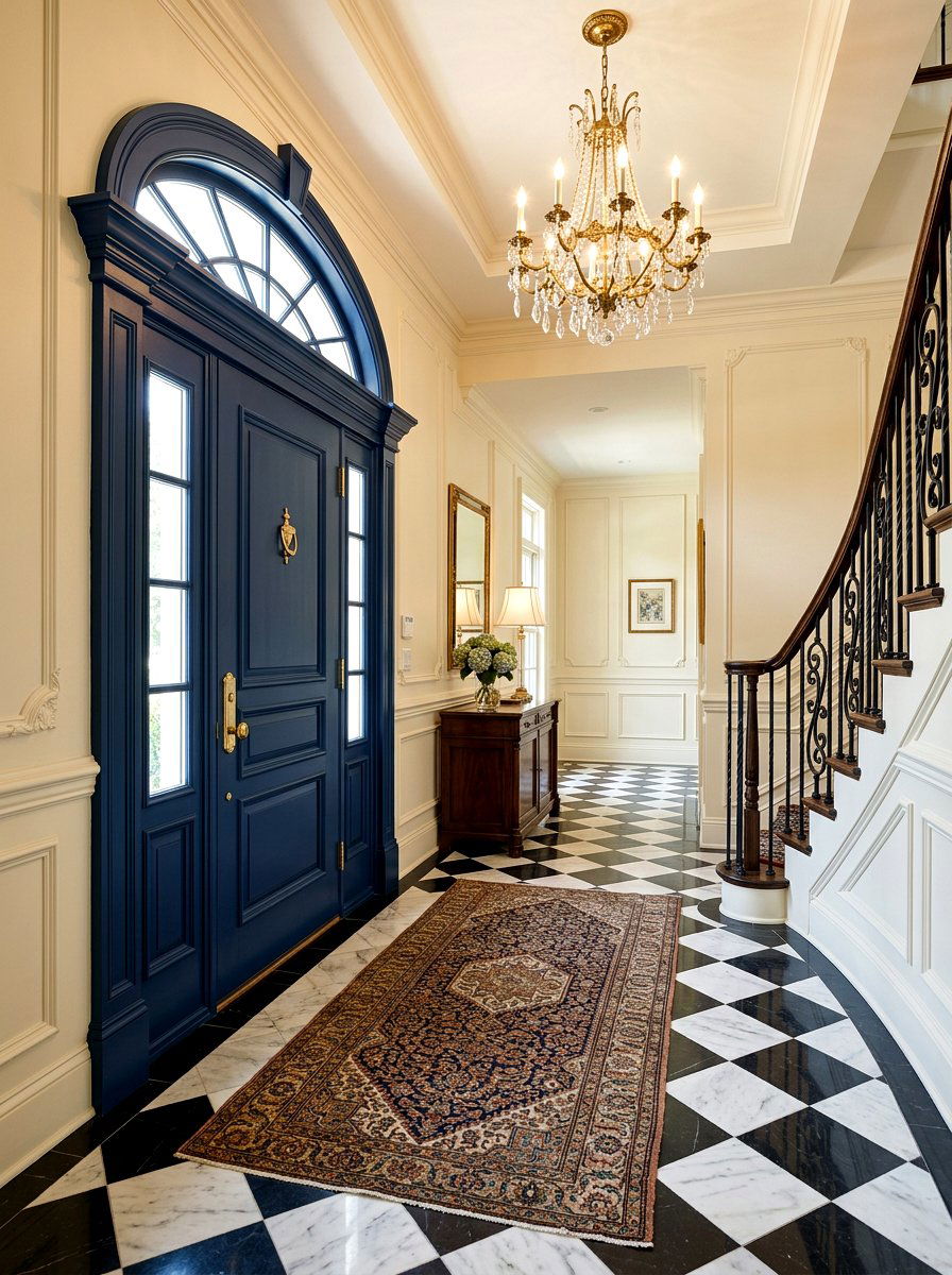
Incorporate a splash of regal personality into your entryway or hallway by painting door frames in a deep navy blue. This choice works exceptionally well against light beige, tan, or soft cream walls, providing a nautical or traditional touch. Navy is often considered a "new neutral" because it pairs seamlessly with various wood tones and metallic hardware like brass or chrome. Using this color on the trim adds a layer of unexpected depth that makes standard doors look like custom installations. It is a fantastic way to experiment with darker hues in a small dose before committing to an entire accent wall.
4. Sage Green Crown Molding Cream Walls
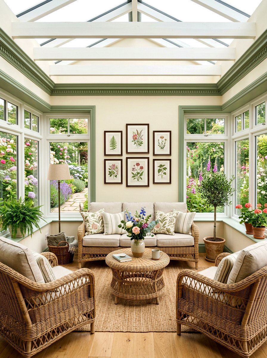
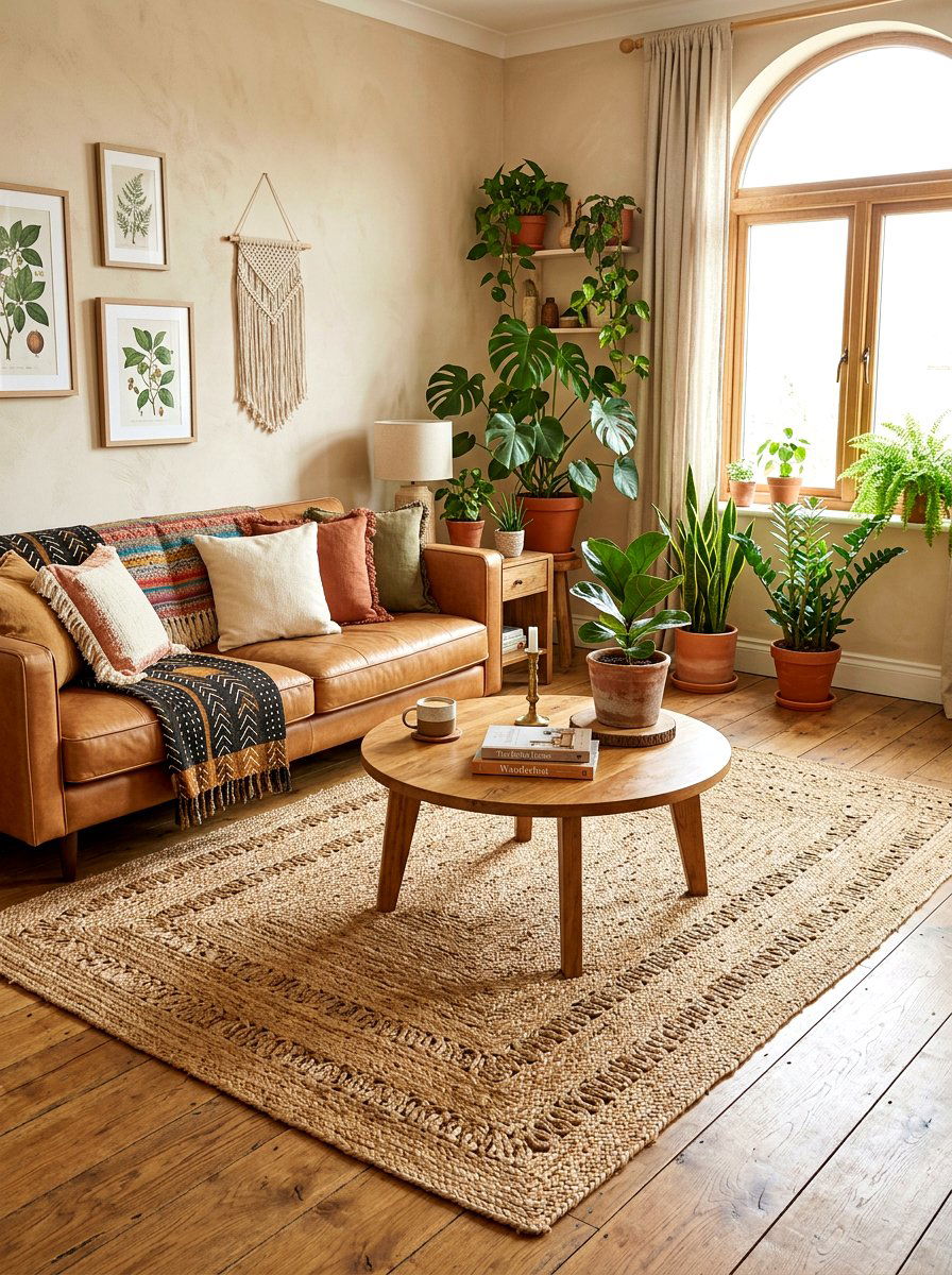
Soft greens are currently trending for their ability to bring a calming, nature-inspired atmosphere indoors. Painting your crown molding in a muted sage green while keeping the walls a warm cream creates a delicate and organic contrast. This approach softens the transition between the walls and the ceiling, making the room feel more expansive and airy. It is a perfect choice for bedrooms or sunrooms where you want to foster a relaxing environment. The green trim mimics the appearance of looking through a forest canopy, especially when paired with natural linen fabrics, light oak furniture, and plenty of indoor potted plants.
5. Charcoal Grey Wainscoting White Walls
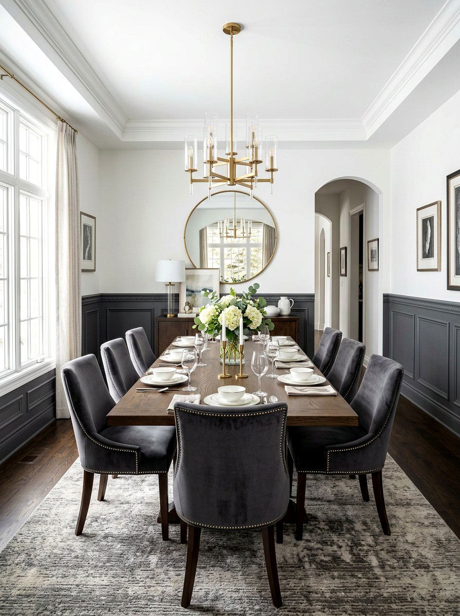
Installing charcoal grey wainscoting on the lower half of a wall creates a dramatic foundation that balances bright white upper walls. This classic architectural detail gains a modern edge when you opt for a dark, saturated paint color. The heavy color on the bottom "anchors" the room, allowing you to use lighter decor items without the space feeling washed out. This look is incredibly popular in formal dining rooms or long hallways where you want to create visual rhythm. The contrast between the dark panels and the light wall above provides the perfect backdrop for colorful artwork or decorative sconce lighting.
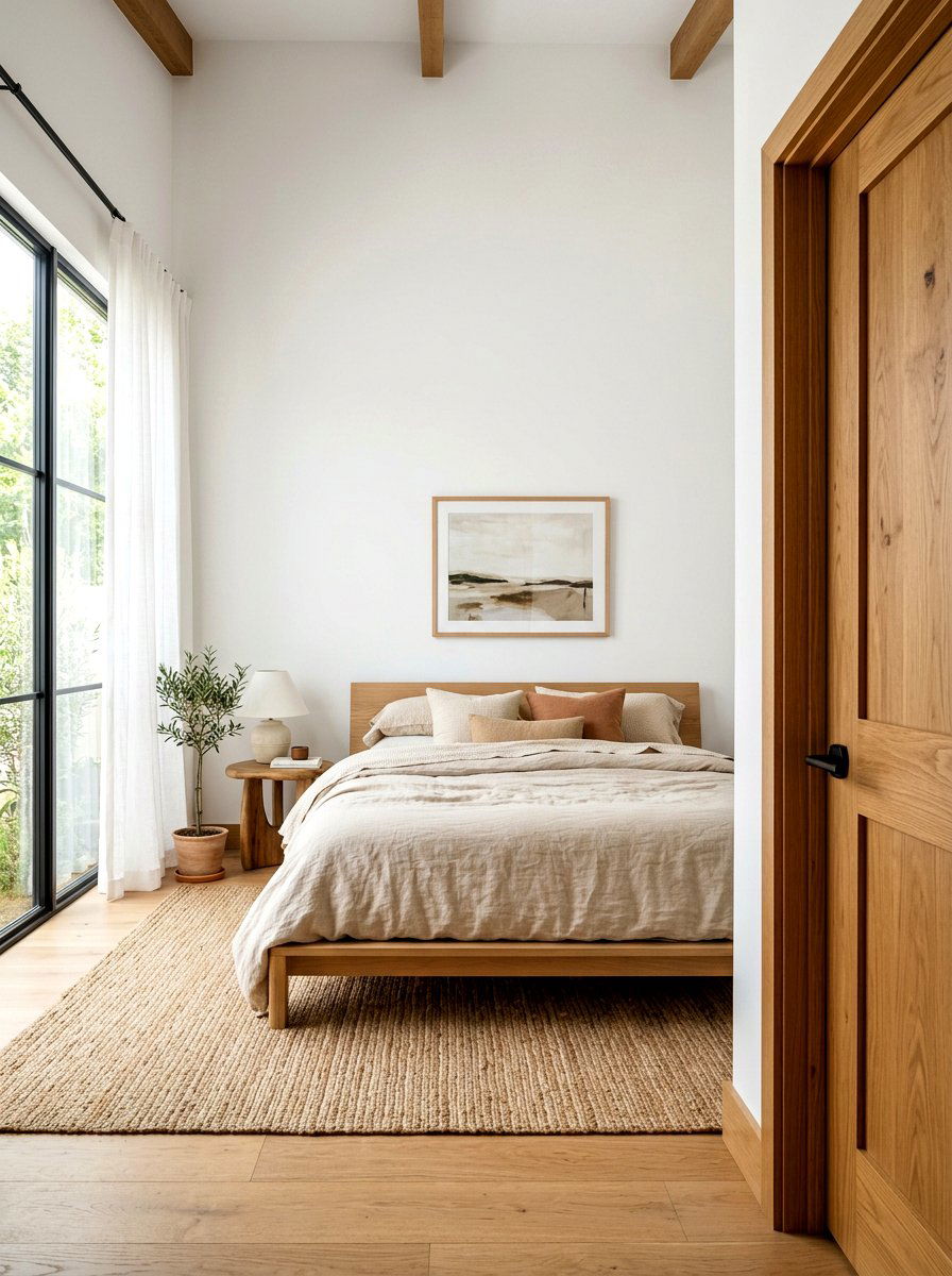
6. Natural Wood Window Trim White Walls
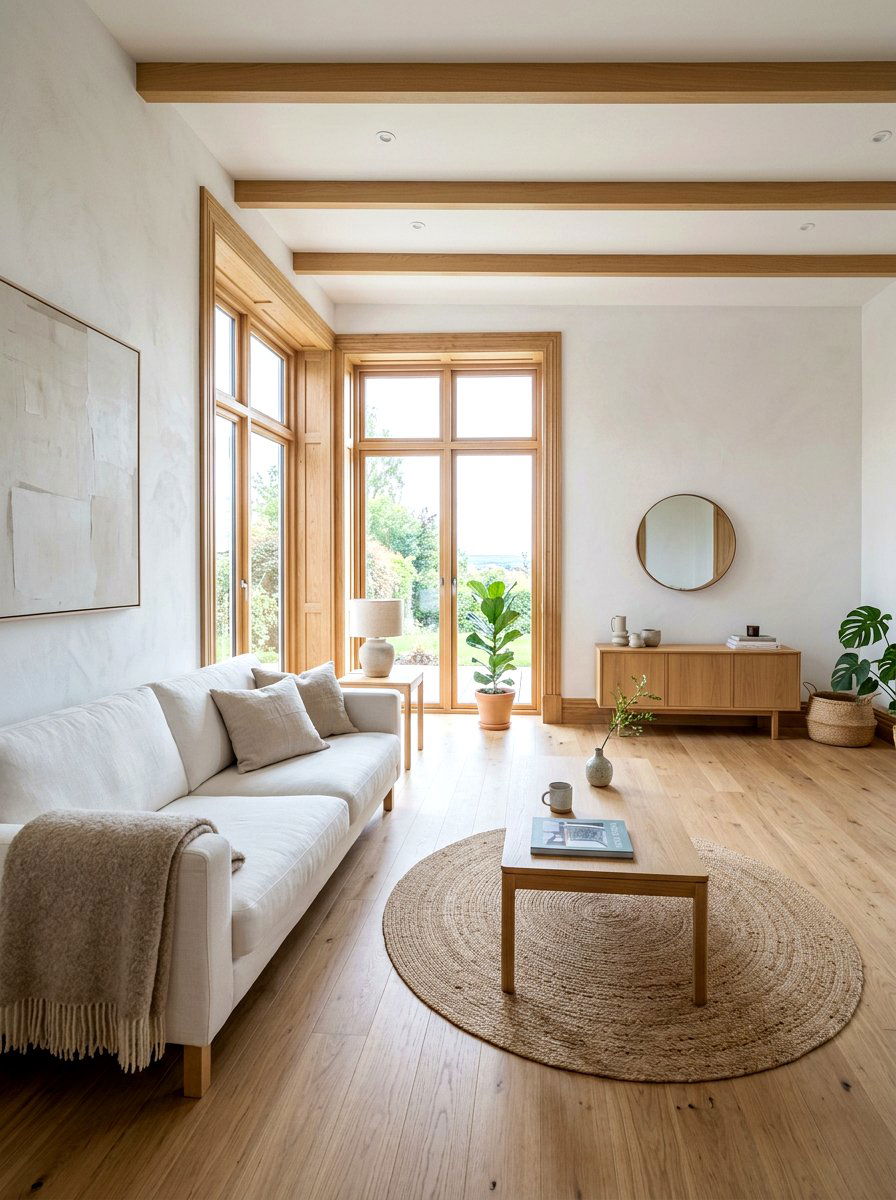
If you are lucky enough to have high-quality wood, leaving the window trim in a natural finish against white walls is a timeless design move. The warmth of the wood grain provides a beautiful organic contrast to the sterile, clean lines of white plaster. This aesthetic is central to Scandinavian and mid-century modern styles, emphasizing honest materials and craftsmanship. It creates a cozy, "cabin-like" feel even in urban environments. To keep the look modern, choose a clear coat or a light honey stain rather than dark, heavy varnishes. This ensures the wood looks fresh and integrates well with contemporary, light-filled spaces.
7. High Gloss Black Door White Trim
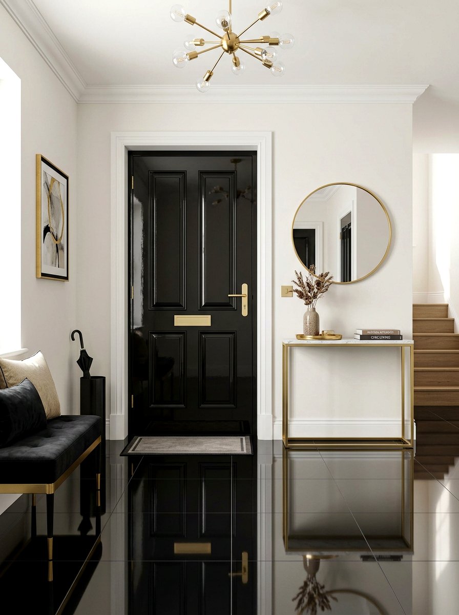
Creating a high-fashion look in your home can be as simple as playing with different paint sheens. A high-gloss black door set against a matte white frame offers a luxury hotel aesthetic that is both bold and inviting. The reflective surface of the door catches the light, adding a sense of movement and dimension to a flat wall. This combination is particularly effective for front doors or home office entrances where you want to make a strong first impression. It feels polished, intentional, and expensive. Pair this look with polished brass or gold door handles to maximize the sophisticated, high-contrast impact.
8. Emerald Green Window Frame Botanical Room
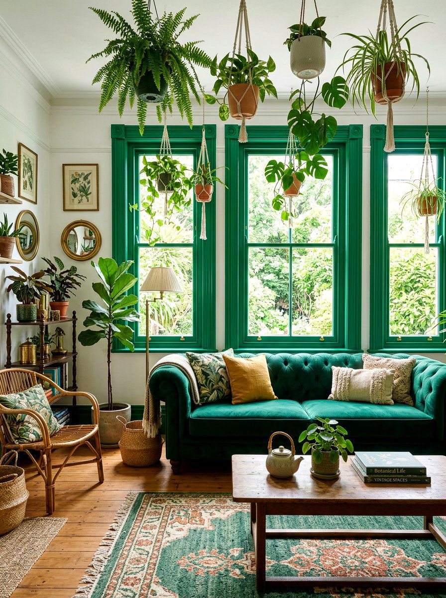
For those who love vibrant colors, emerald green window frames provide a lush, jewel-box feel that enlivens any space. When the room is styled with botanical prints, velvet furniture, and indoor trees, the green trim helps blur the lines between the indoors and the garden. This color choice adds a vintage charm reminiscent of historic glasshouses or Victorian libraries. It works best in rooms with plenty of natural light, as the sunlight will make the green pigment appear even richer. Using a semi-gloss finish will help the color pop against neutral walls, ensuring the window itself becomes a major decorative element.
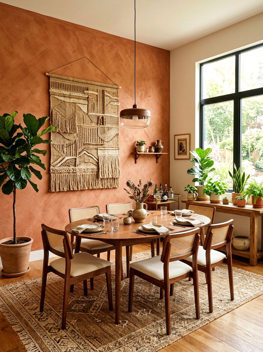
9. Terracotta Archway Trim White Walls
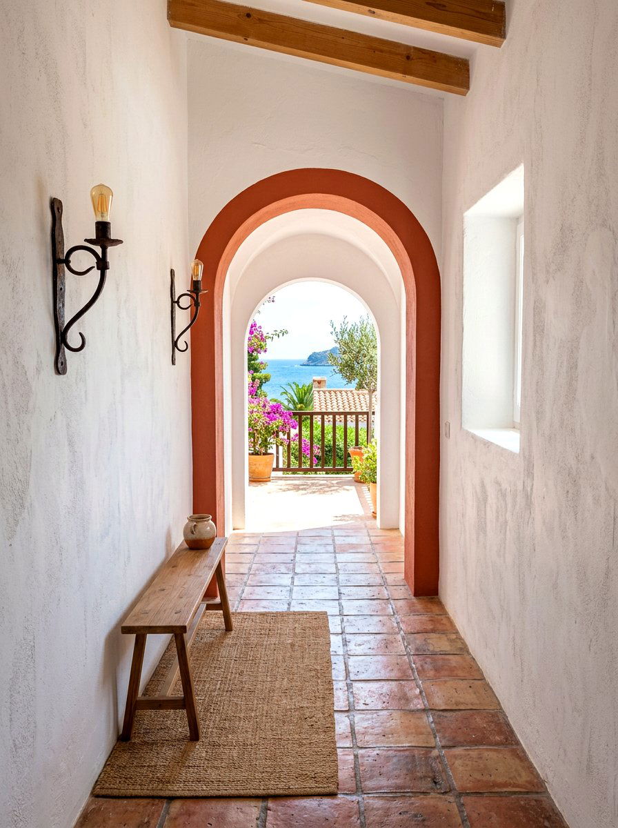
Archways are beautiful architectural features that deserve to be highlighted rather than hidden. Painting the inner trim or the surrounding molding of an archway in a warm terracotta or burnt orange creates an earthy, Mediterranean-inspired look. This hue provides a striking contrast against white or sandy-colored walls, adding warmth and a sun-drenched feel to the transition between rooms. It is an excellent way to guide people through the home using color as a visual cue. This earthy palette pairs beautifully with terracotta floor tiles, woven baskets, and rustic wooden furniture, making the entire space feel cohesive and globally inspired.
10. Deep Plum Picture Rail Lavender Walls
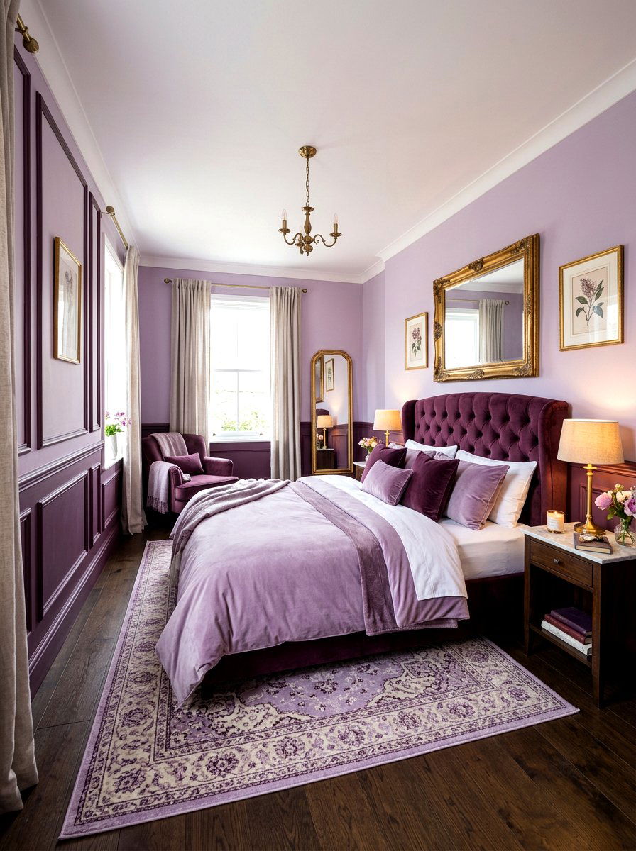
Playing with monochromatic shades can result in a very sophisticated and soothing environment. Try painting your picture rail or thin wall molding in a deep plum color against soft lavender or lilac walls. This subtle shift in saturation creates a layered, "tonal" effect that adds architectural interest without being jarring. It is a romantic and moody choice for a primary bedroom or a cozy reading nook. The dark trim defines the height of the room and provides a sharp line that can be used to hang vintage art or mirrors. This color scheme feels incredibly lush when paired with gold-leafed frames.
11. Ochre Yellow Skirting Board Living Room
Injecting a dose of sunshine into your home can be done through a bold skirting board color choice. Ochre yellow is a grounded, earthy version of bright yellow that adds energy to a living room without feeling overwhelming. When paired with cool grey or navy blue walls, the yellow baseboards provide a sharp, cheerful boundary that defines the floor plan. This is an excellent choice for modern or eclectic homes where playfulness is encouraged. The yellow acts as a "ribbon" around the room, tying together other yellow accents like throw pillows or lampshades for a professional, designer-led appearance.
12. Matte Black Chair Rail Dining Room
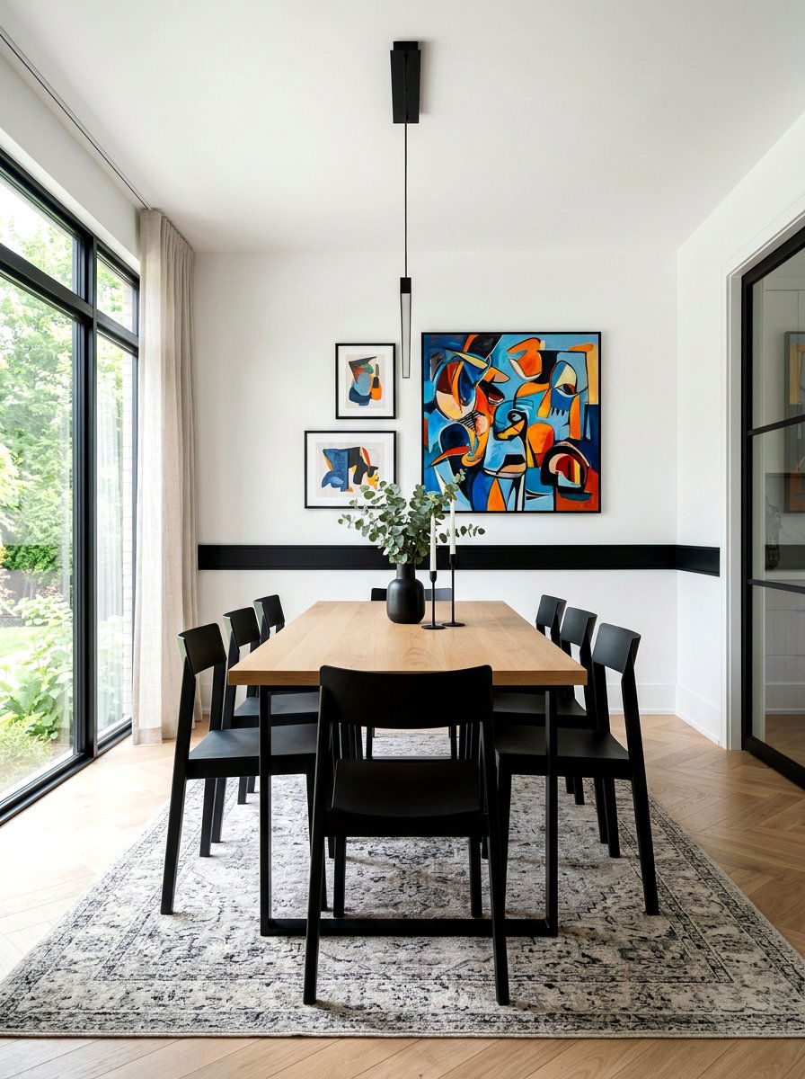
A chair rail is a functional element designed to protect walls, but it can also be a powerful design tool. Painting a chair rail in matte black against a crisp white or pale taupe wall creates a sharp, horizontal line that adds structure to a dining area. This simple addition makes the room feel more formal and "dressed up. " The black line serves as a divider, allowing you to perhaps use wallpaper on the top half and solid paint on the bottom. It provides a contemporary twist on a traditional feature, making the dining space feel more like a modern gallery than a standard room.
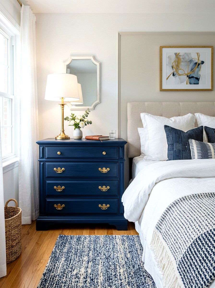
13. Soft Blue Door Casing Cottage Bedroom
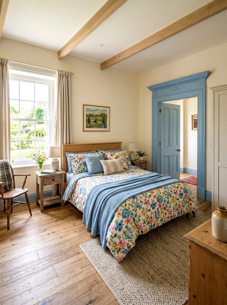
For a peaceful and serene sleeping environment, consider painting your door casings and baseboards in a soft, powdery blue. This gentle contrast against white or cream walls evokes a coastal or cottage-inspired aesthetic that is light and airy. Blue is known for its calming properties, making it an ideal choice for the bedroom trim. This look is particularly charming when applied to older homes with thick, ornate moldings. It highlights the craftsmanship of the wood while keeping the overall atmosphere feeling fresh and youthful. Complement the look with white linen bedding and light-colored wooden flooring for a cohesive style.
14. Dusty Rose Window Sash Grey Walls
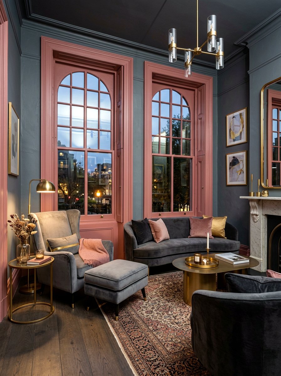
Dusty rose is a sophisticated, muted pink that offers a surprising amount of versatility in interior design. Using this color on window sashes against cool charcoal or slate grey walls creates a chic and moody contrast. The warmth of the rose prevents the grey from feeling too cold, while the grey keeps the pink from looking too sugary or childish. This pairing is perfect for a home office or a sophisticated lounge area. It adds a touch of modern femininity that feels balanced and grown-up. Use black hardware on the windows to add one more layer of sharp, grounding contrast.
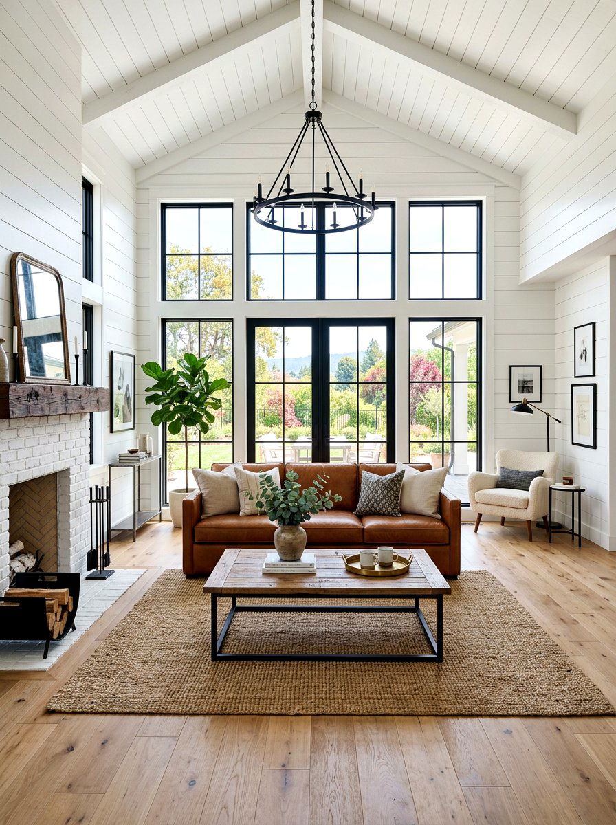
15. Dark Brown Ceiling Beam White Ceiling
Exposed ceiling beams are a coveted architectural feature, and highlighting them with a dark chocolate brown or espresso stain is a classic design move. Against a bright white ceiling, these dark beams provide a massive amount of visual weight and rustic character. This contrast draws the eye upward, emphasizing the height and volume of the room. It works perfectly in vaulted living rooms or large kitchens, adding a sense of history and structural integrity to the space. Whether the beams are genuine reclaimed wood or high-quality faux additions, the dark finish ensures they stand out as the primary focal point.
16. Teal Mantelpiece Trim White Fireplace
Your fireplace is the heart of the home, so why not make it truly unique with a bold color choice? Painting the mantelpiece and the surrounding trim in a vibrant teal or peacock blue creates an instant conversation piece. Against a clean white fireplace surround or light-colored brick, the teal pops with energy and style. This is a great way to introduce a favorite color into a central location without painting all the walls. It creates a "frame" for your seasonal decor, mirrors, or artwork placed above the hearth. This look feels fresh, creative, and helps modernize a traditionally designed fireplace.
17. Burgundy Staircase Railing Neutral Walls
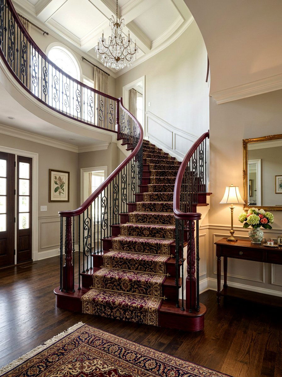
Staircases are often the first thing people see when they enter a home, and a bold railing color can make a lasting impression. Deep burgundy or oxblood red on the banister and spindles offers a rich, traditional feel that looks stunning against neutral greige or white walls. This color choice adds a sense of luxury and Victorian-inspired drama to the entryway. It provides a sharp contrast that makes the staircase feel like a sculptural element rather than just a functional path. Pair the burgundy wood with a patterned runner to create a truly grand and inviting entrance for your guests.
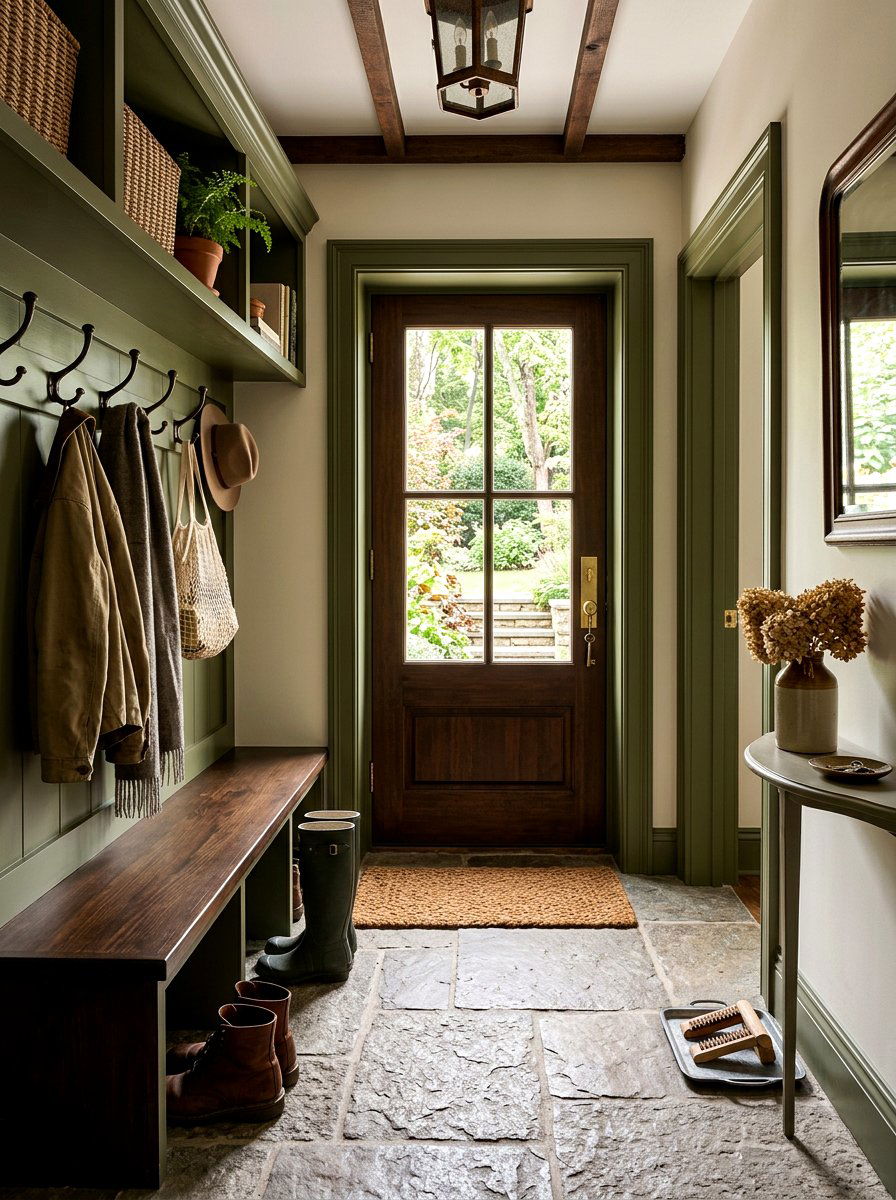
18. Forest Green Door Jamb Mudroom
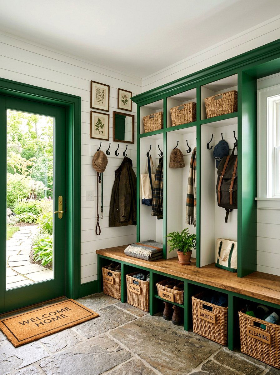
The mudroom is often a utilitarian space, but it can still be high on style with the right trim choices. Painting the door jambs and locker trim in a deep forest green provides a rugged, nature-inspired look that hides dirt and wear perfectly. This dark green provides a beautiful contrast against light oak benches or white shiplap walls. It gives the room a "botanical entryway" feel that bridges the gap between the garden and the interior. This color choice feels timeless and sturdy, which is exactly what a high-traffic mudroom needs. Adding brass hooks will complete this classic, forest-inspired aesthetic beautifully.
19. Slate Grey Bookshelf Trim Light Walls
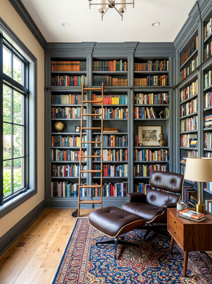
Built-in bookshelves are a fantastic place to experiment with contrast trim. By painting the outer frames and the edges of the shelves in a dark slate grey while keeping the back of the shelves or the surrounding walls light, you create a 3D effect. This makes the books and decorative objects on display pop with more clarity. It turns a standard storage unit into a custom-designed architectural feature. The dark grey frames the contents of the shelf like a curated collection in a museum. This design strategy works well in libraries, home offices, or even living rooms with large wall units.
20. Gold Metallic Accent Trim Modern Room
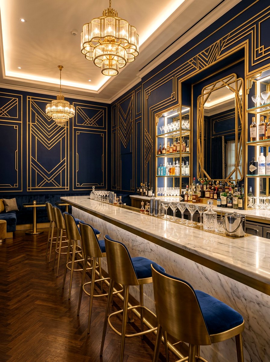
For a touch of glamor and modern luxury, consider using a metallic gold or brass finish for thin wall moldings or picture rails. Against a dark navy or emerald wall, the metallic trim gleams and adds a high-end, Art Deco vibe to the space. This is a bold choice that works best in smaller rooms like powder rooms or formal bars where you want to create a "wow" factor. The reflective quality of the gold trim helps bounce light around, preventing dark walls from feeling too closed in. It adds a sophisticated "jewelry" effect to the architecture of the room.
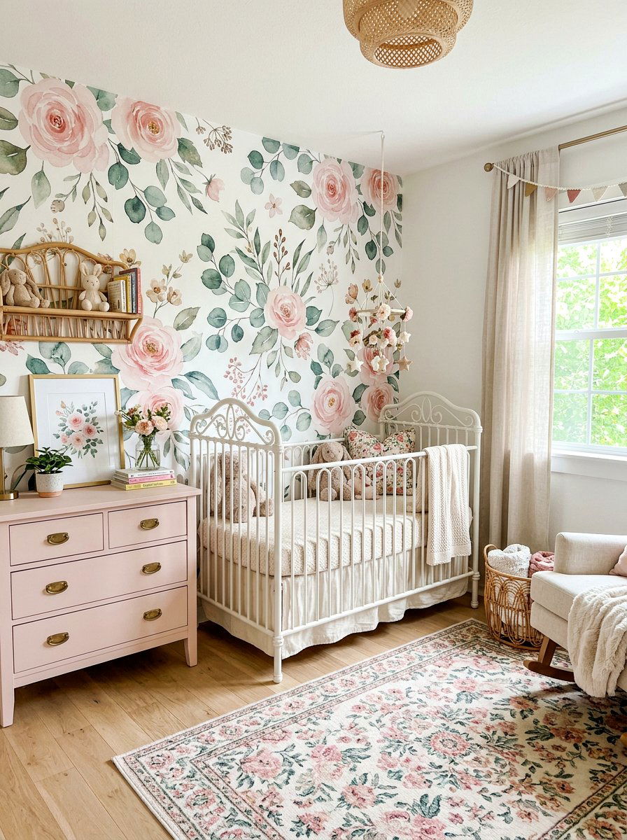
21. Pale Pink Crown Molding Nursery Walls
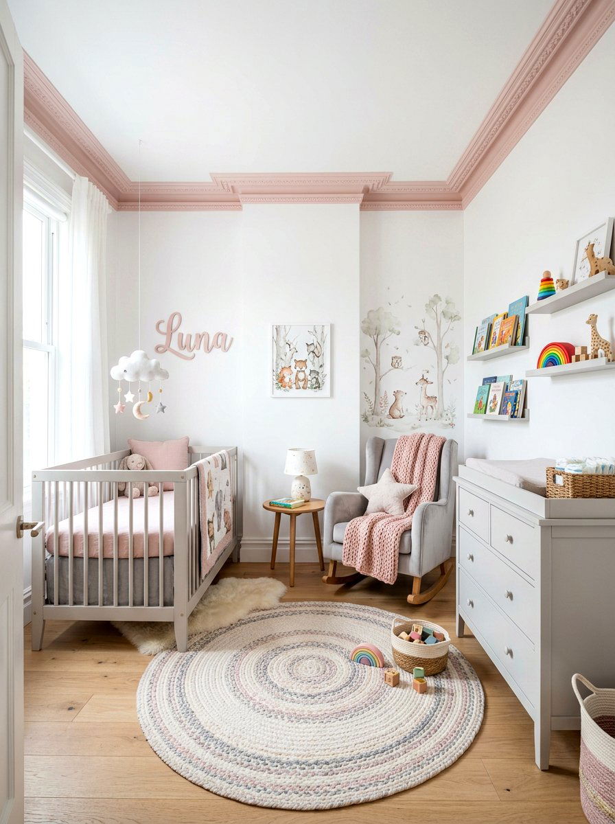
In a nursery or a creative home office, using pale pink for the crown molding and baseboards can add a whimsical and soft touch. When paired with light grey or white walls, the pink trim provides a delicate boundary that feels playful yet sophisticated. This approach is much more subtle than painting an entire wall pink and allows for more flexibility with furniture and decor. It creates a "framed" look for the room that feels cozy and intentional. This color combination is also great for Scandi-style rooms where soft pastels are used to break up large expanses of white.
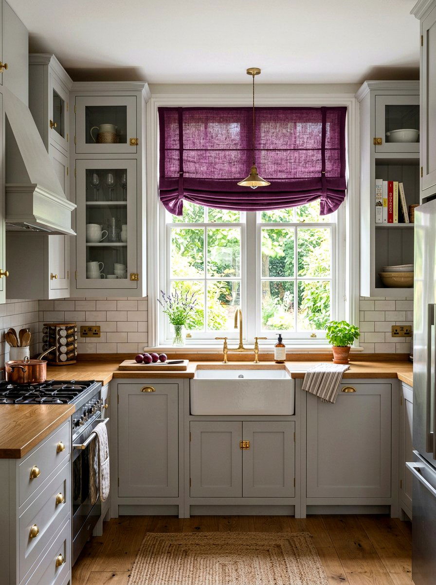
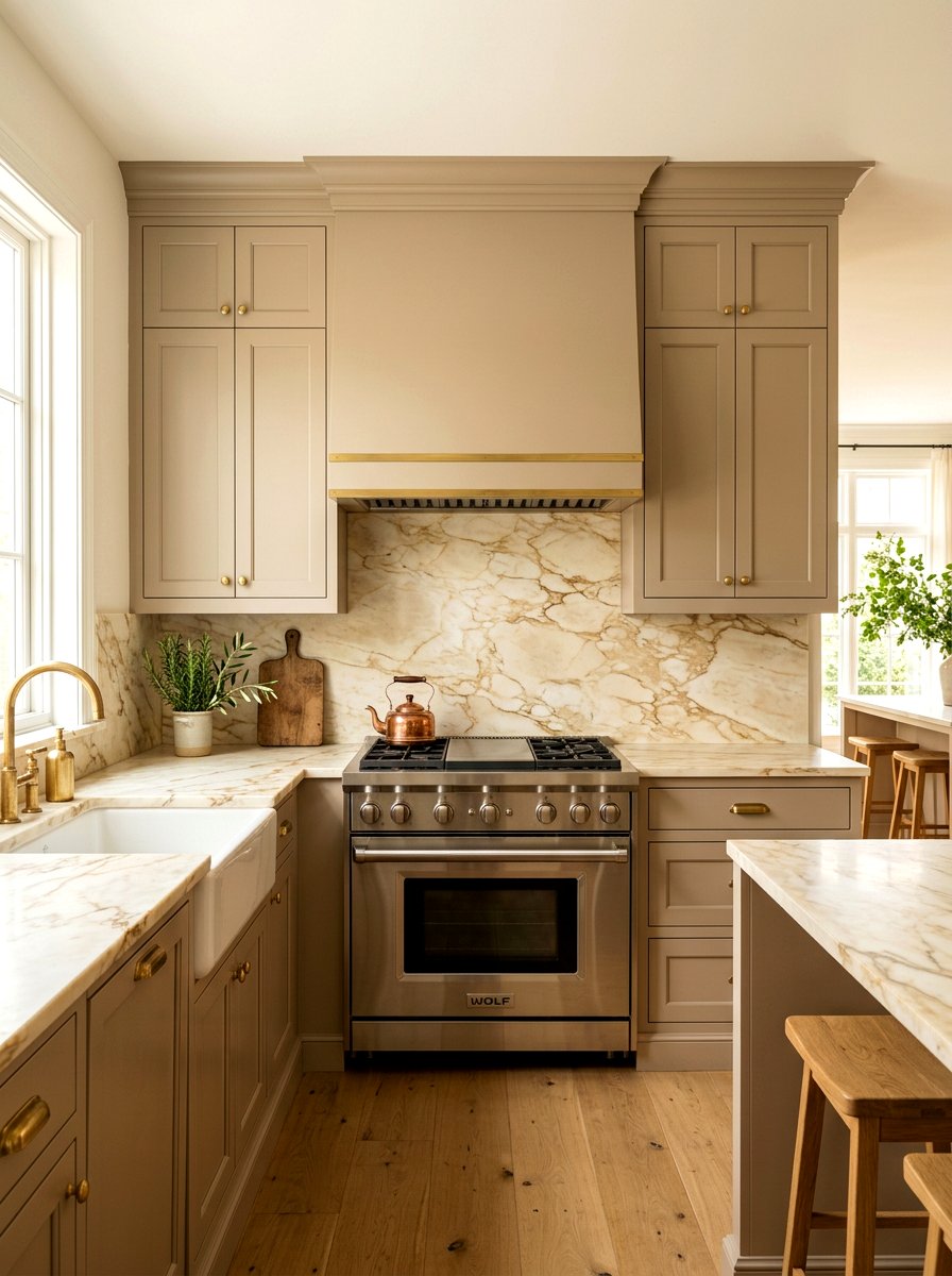
22. Dark Teal Cabinet Trim Kitchen Walls
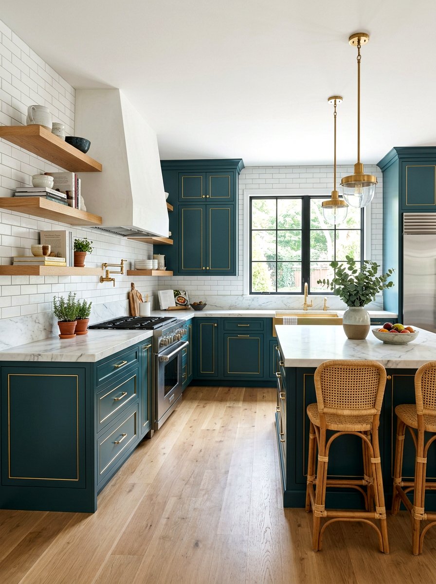
If you have a kitchen with open shelving or glass-front cabinets, painting the trim of these elements in a dark teal can add incredible depth. Against light-colored kitchen walls or white subway tiles, the teal trim provides a modern and moody contrast. This color choice makes the cabinetry look more like custom furniture and adds a professional designer touch to the heart of the home. Teal is a versatile color that pairs well with both warm wood and cool marble countertops. It creates a sophisticated, culinary atmosphere that feels both welcoming and trendy for a modern kitchen space.
23. Warm Tan Door Frame Neutral Walls
Sometimes the best contrast is a subtle one. Painting door frames and baseboards in a warm tan or mushroom color against crisp white walls creates a soft, organic look. This is often referred to as "greige" or "earth-toned" trim and is a favorite among minimalist designers. It provides just enough definition to the room's edges without being visually disruptive. This palette is incredibly calming and works well in bedrooms, bathrooms, or living spaces where you want a natural, grounded feel. It hides light dust well and coordinates effortlessly with woven rugs and wooden furniture pieces for a cohesive look.
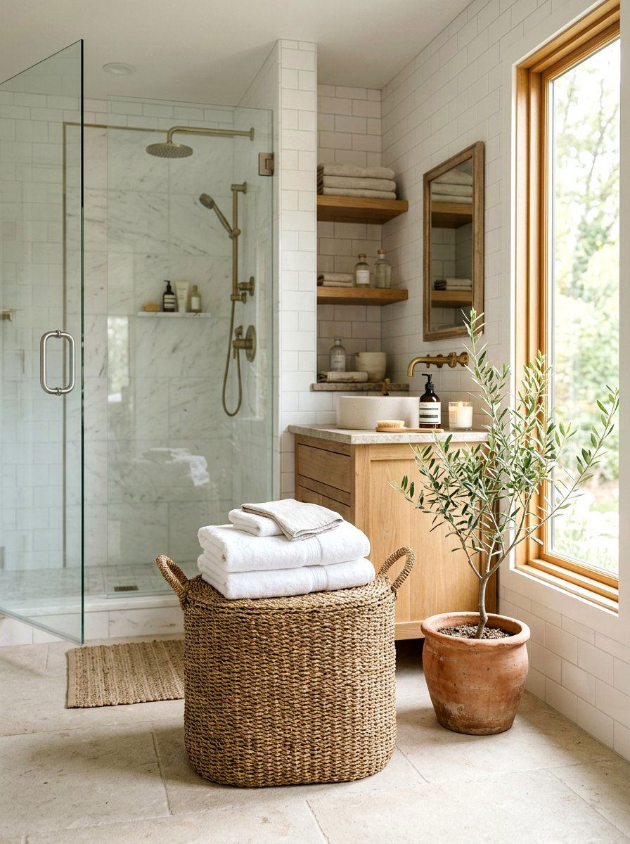
24. Mint Green Bathroom Window Trim White Walls
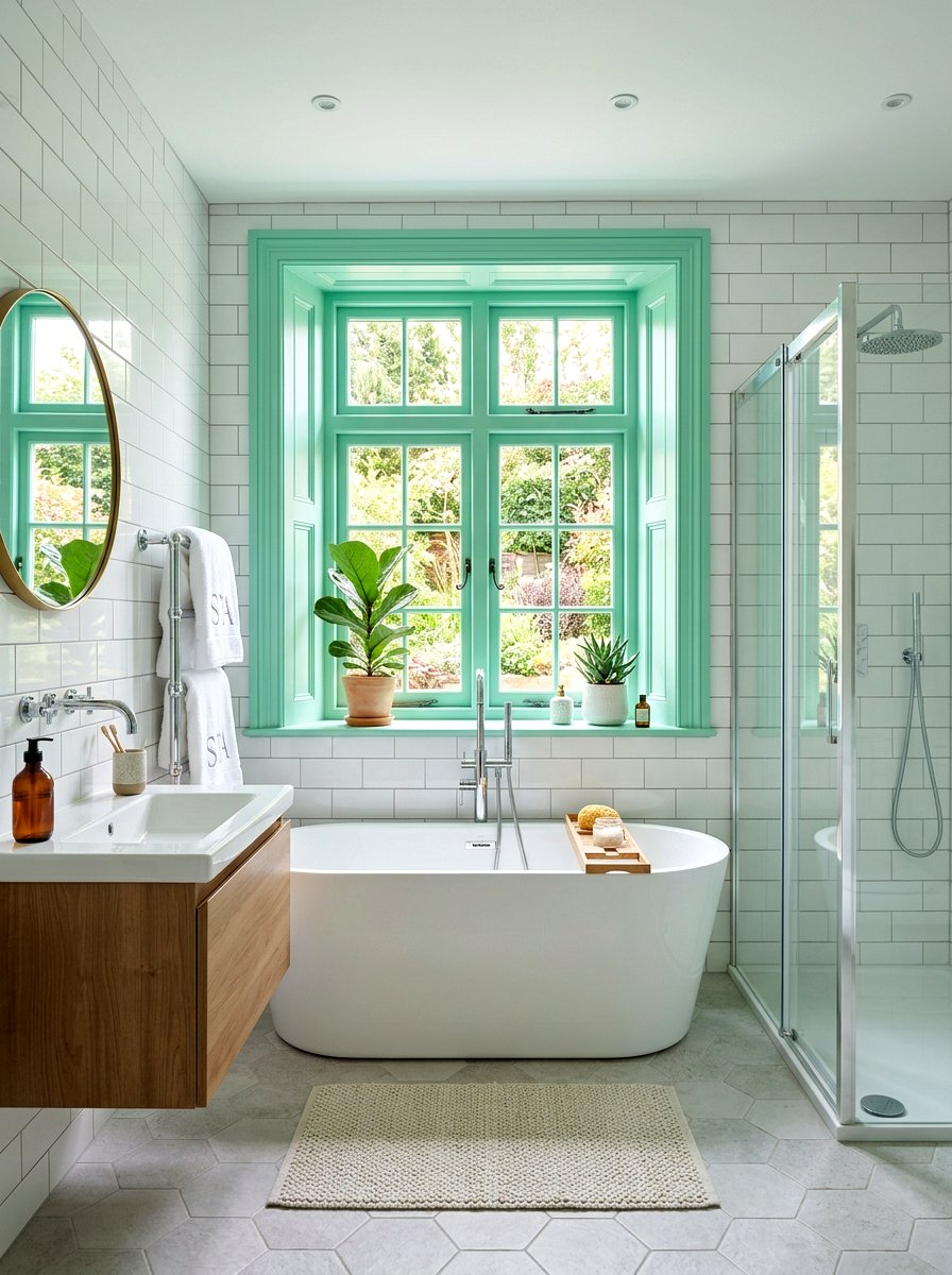
Bathrooms often benefit from a "fresh" color palette, and mint green window trim is a perfect choice. Against white tiles and white walls, the mint adds a clean, spa-like energy that feels bright and invigorating. This pop of color on the trim is a great way to add personality to a small space without cluttering it with decor. It highlights the window as a source of light and provides a cheerful focal point for the room. Mint green pairs beautifully with chrome or nickel fixtures, creating a modern and polished look that feels both vintage and contemporary at once.
25. Royal Blue Picture Frame Molding White Walls
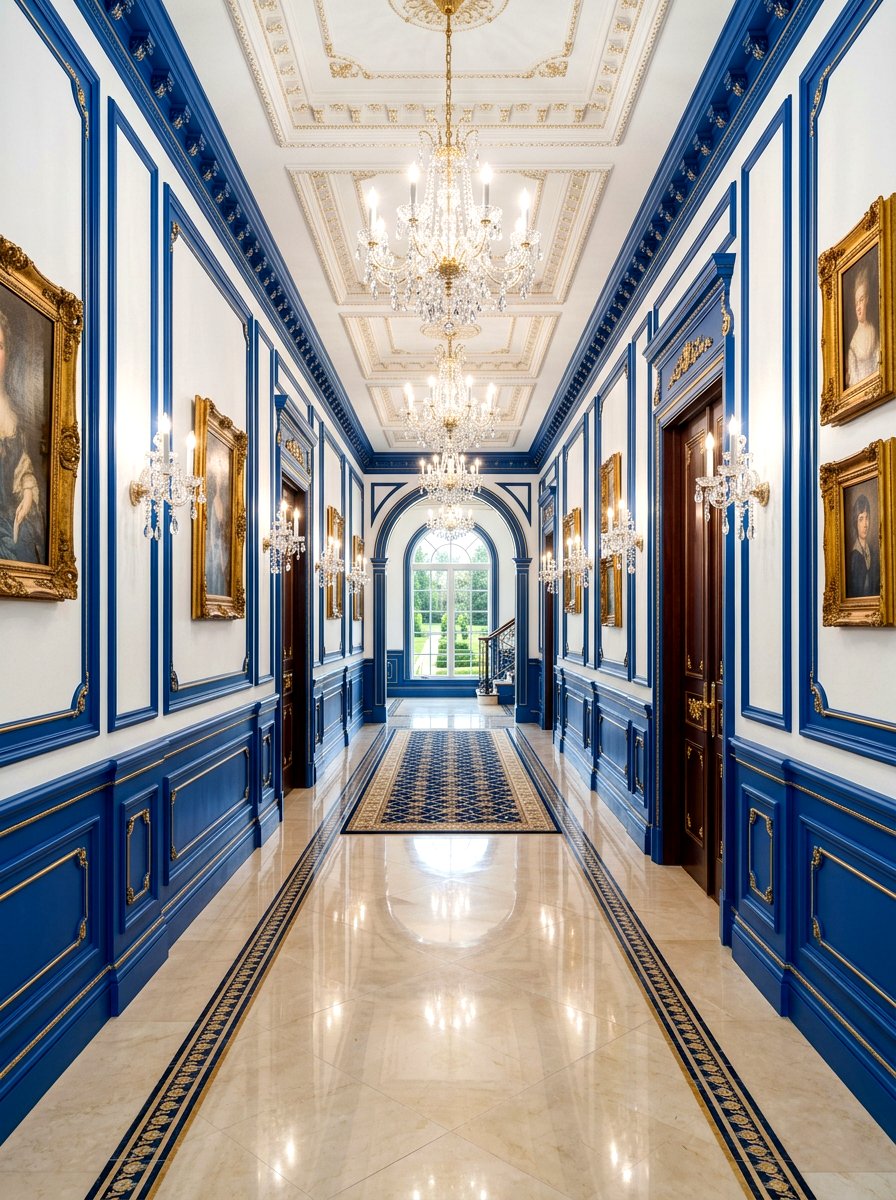
Picture frame molding, also known as box molding, is a classic wall treatment that adds instant elegance. By painting these "boxes" in a vibrant royal blue against a white wall, you create a bold, regency-style aesthetic. This high-contrast look turns the wall itself into a work of art. It is a fantastic choice for formal dining rooms or long hallways where you want to add architectural rhythm. The blue boxes provide a perfect frame for mirrors or sconces, making the space feel grand and expensive. This design move is sure to impress guests and adds a strong personality to the home.
26. Dark Olive Mudroom Trim Light Walls
Olive green is a sophisticated and earthy choice for a mudroom or back entrance. Painting the baseboards, door frames, and built-in bench trim in dark olive against light beige walls creates a sturdy and organic atmosphere. This color is excellent for hiding the inevitable scuffs and dirt that come with a mudroom while providing a beautiful, nature-inspired transition from the outdoors. It feels traditional yet modern and pairs exceptionally well with natural materials like stone floors and wicker baskets. This "herbaceous" color palette makes a functional room feel like a well-designed part of the home’s overall aesthetic.
27. Mustard Yellow Bedroom Baseboard Grey Walls
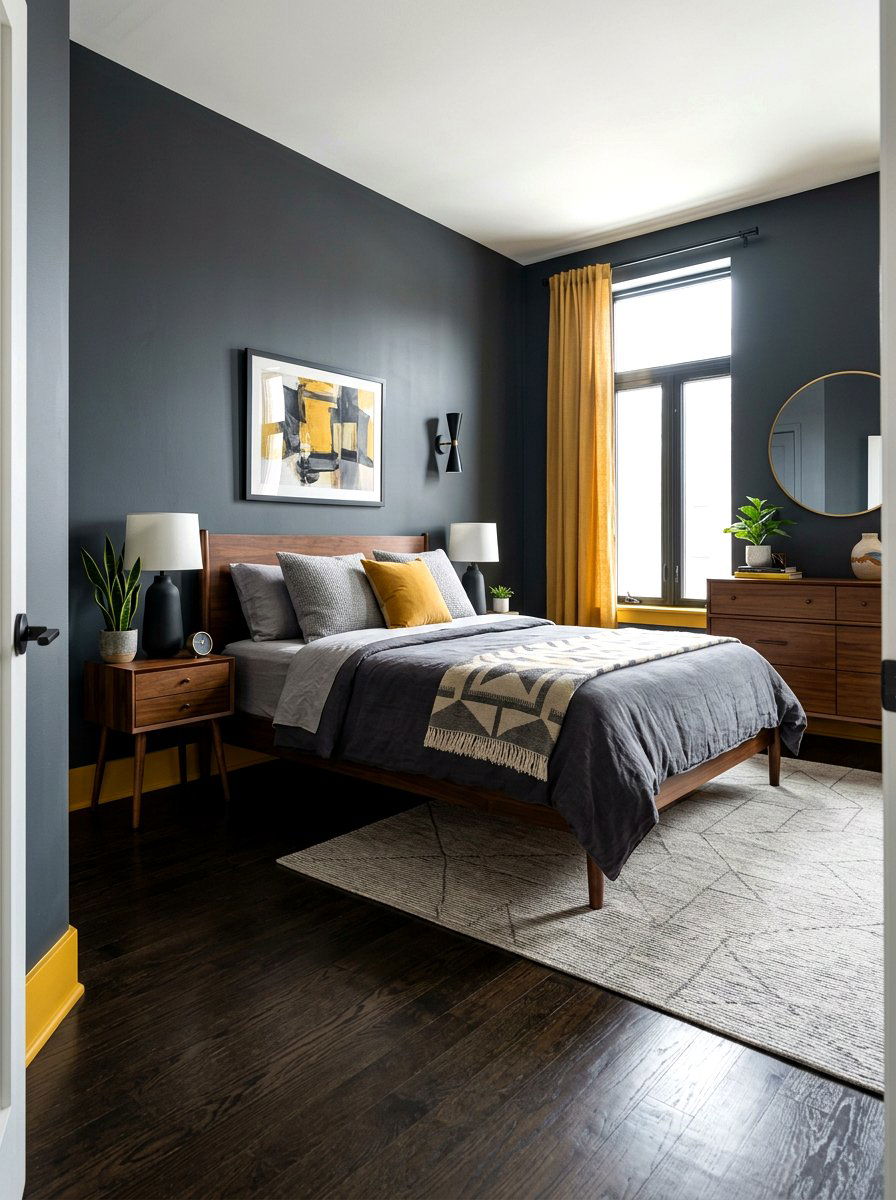
For those who enjoy an eclectic or mid-century modern vibe, mustard yellow baseboards against slate grey walls offer a fun and energetic contrast. The yellow provides a "zing" of color that brightens up the moody grey, making the bedroom feel more dynamic and creative. This is a bold choice that works well in a teenager's room or a guest suite where you want to showcase a bit of personality. The dark walls provide a quiet backdrop for sleep, while the yellow trim adds a playful edge that keeps the room from feeling too somber or heavy.
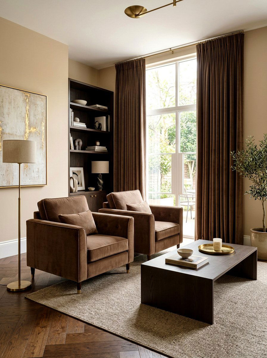
28. Chocolate Brown Living Room Trim Cream Walls
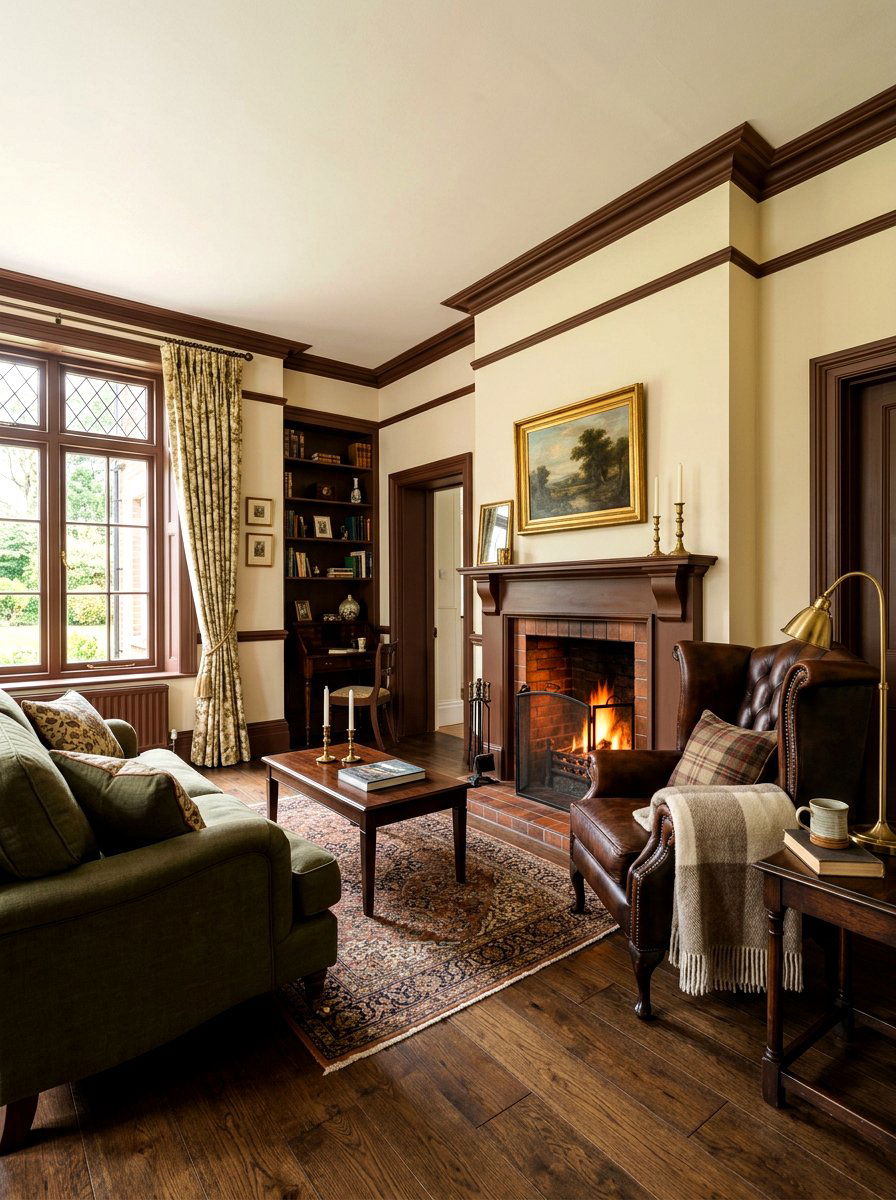
Brown trim is making a massive comeback, but instead of the orange-toned wood of the past, designers are opting for rich chocolate brown paint. Against cream or off-white walls, this dark brown trim provides a velvety and luxurious contrast that feels incredibly cozy. It evokes a "gentleman’s club" or historic library feel that is perfect for a den or a primary living room. This color palette is warm, inviting, and provides a beautiful frame for leather furniture and wool rugs. It is a timeless choice for anyone looking to add traditional depth and a sense of history to their space.
29. Steel Blue Office Window Casing Light Walls
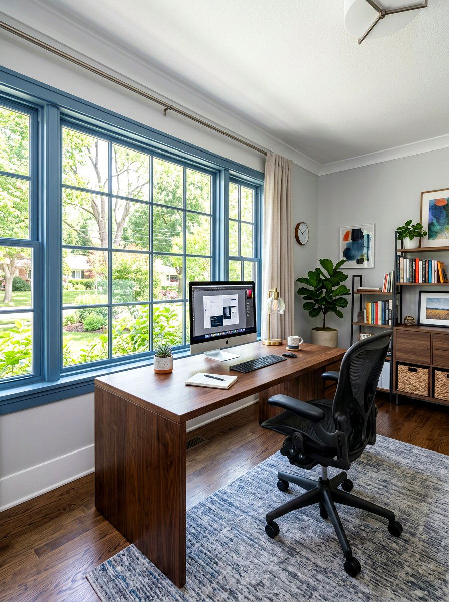
Create a focused and professional atmosphere in your home office by painting the window casings in a cool steel blue. This color is known for promoting concentration and calm, making it the perfect choice for a work environment. Against light grey or white walls, the blue trim provides a sharp, clean boundary that highlights the view outside. This contrast adds a layer of modern sophistication without being distracting. Steel blue pairs perfectly with dark wood desks and black office chairs, creating a cohesive and polished look that will make you feel more productive and organized throughout the day.
30. Greige Ceiling Trim White Walls
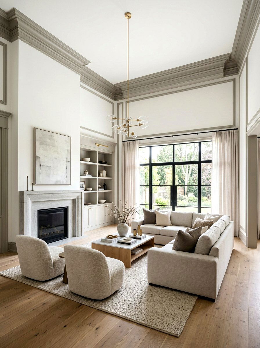
If you have high ceilings with crown molding, consider painting that molding in a soft greige while keeping the ceiling and walls white. This creates a "shadow" effect that emphasizes the height and architectural detail of the room without using a heavy color. It is a subtle, high-end design move that adds a layer of complexity to a neutral room. The greige trim acts as a sophisticated transition between the vertical walls and the horizontal ceiling, making the space feel more finished and curated. This look is perfect for modern condos or open-concept living areas where you want a light, airy feel.
Conclusion:
Exploring the world of contrast trim wall ideas is one of the most effective ways to upgrade your home’s interior design without a full renovation. By moving away from standard white and embracing bold blacks, soft greens, or rich wood tones, you can highlight the unique architectural features of every room. Whether your style is modern farmhouse, traditional luxury, or eclectic mid-century, the right trim color can provide the necessary structure and character to tie your decor together. Remember to consider the lighting and overall mood of each space before selecting your palette. These intentional design choices will ensure your home feels truly personalized.
Related posts: