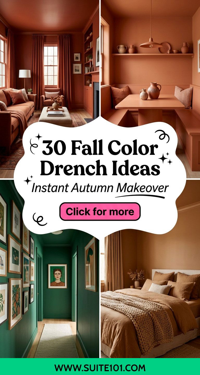
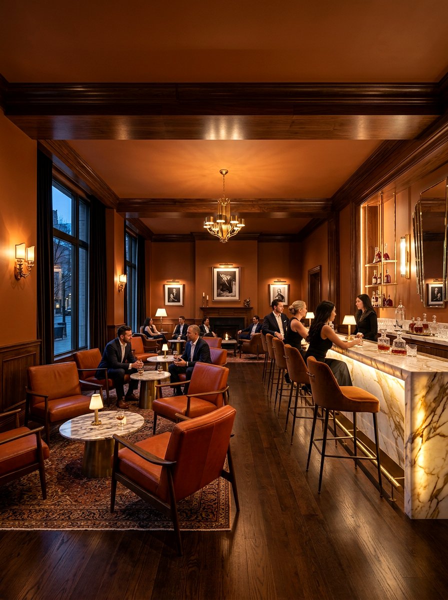
Color drenching has emerged as one of the most transformative interior design techniques, offering a bold yet sophisticated way to embrace the seasonal shift. This method involves saturating an entire space — including the walls, ceiling, trim, and even built-in cabinetry — with a single, cohesive hue. During the fall season, this aesthetic approach creates an incredibly cozy and cocoon-like atmosphere that traditional accent walls simply cannot replicate. By removing visual breaks between different surfaces, color drenching makes rooms feel more expansive and intentionally curated. Whether you prefer the earthy warmth of terracotta or the moody elegance of deep forest green, this technique provides a high-impact solution for modern homes.
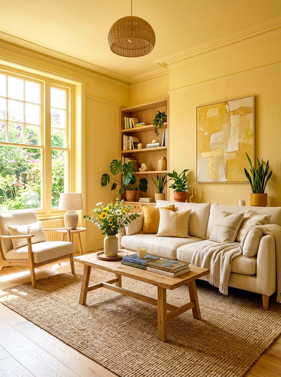
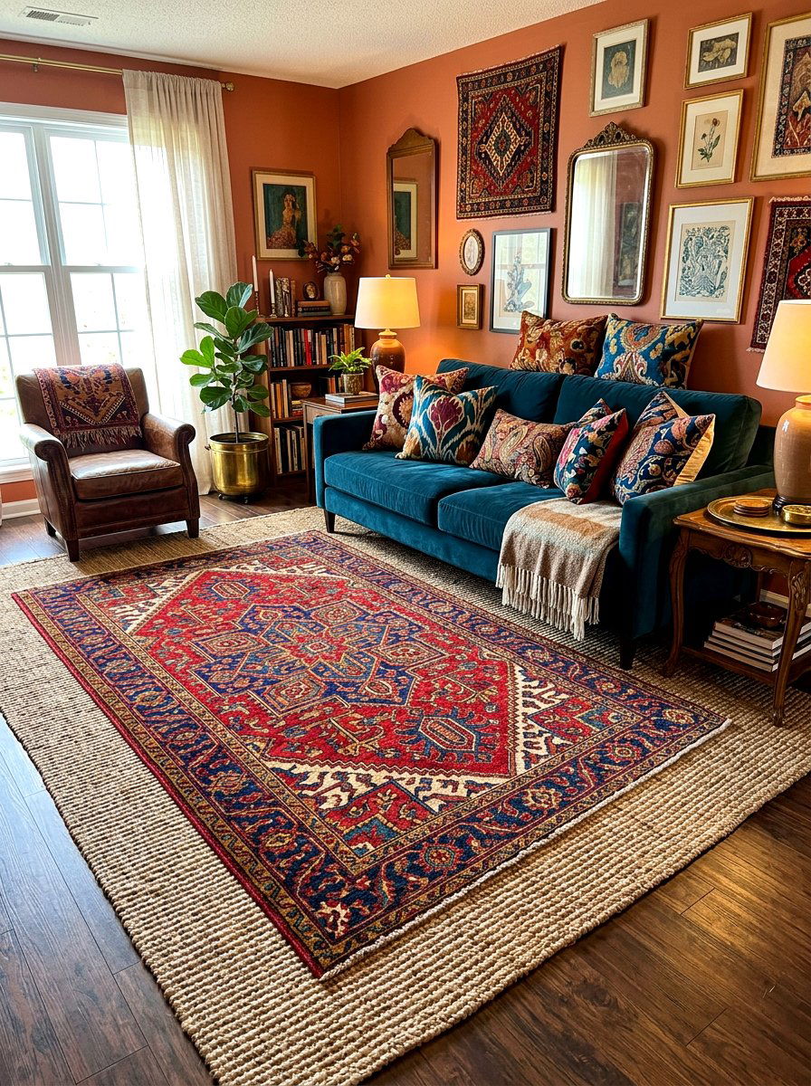
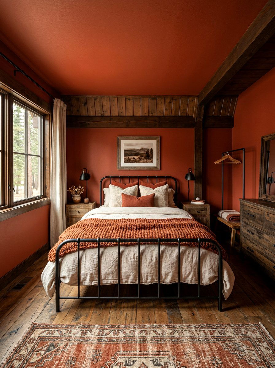
1. Terracotta Living Room
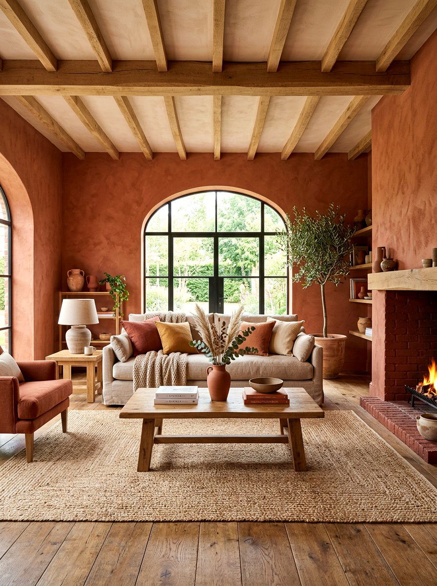
Imagine walking into a space that feels like a warm hug on a crisp autumn afternoon. A terracotta living room uses earthy, clay-inspired tones to cover every surface from the baseboards to the ceiling crown molding. This approach eliminates visual breaks, making the room feel more expansive and cohesive. You can pair this rich color with natural textures like linen sofas, woven jute rugs, and light oak coffee tables. The monochromatic backdrop allows the architectural details of your home to shine without distraction. It creates a grounded atmosphere that perfectly reflects the changing leaves outside. This bold choice brings an organic energy that feels both modern and timeless.
2. Olive Green Bedroom
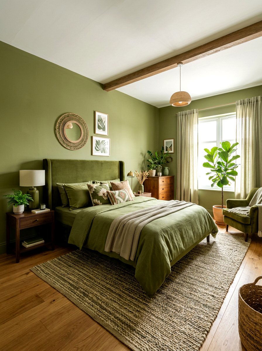
Have you ever wanted to feel like you are sleeping in a serene, sun-dappled forest? An olive green bedroom provides a mossy, natural sanctuary by drenching the walls and ceiling in a velvety matte finish. This specific shade of green acts as a "nature neutral, " meaning it pairs effortlessly with almost any wood tone or metallic accent. To enhance the immersive feel, choose bedding in a similar tone but different fabric, such as silk or heavy cotton. The result is a tranquil retreat that encourages deep relaxation and rest. This color drenching technique highlights the softness of the space while maintaining a sophisticated, high-end editorial appearance.
3. Deep Plum Dining Room
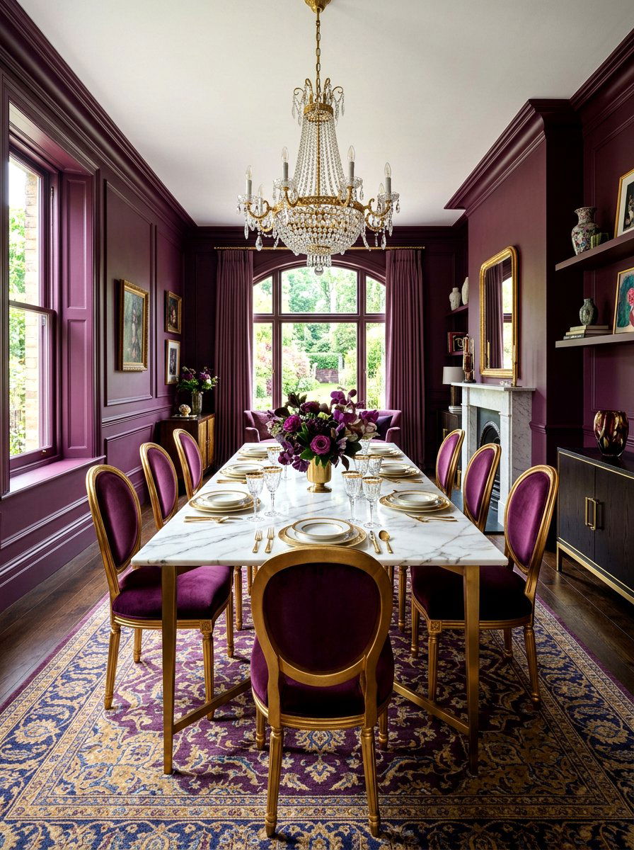
Does your dining area feel a bit too clinical for intimate dinner parties? A deep plum dining room creates an immediate sense of drama and luxury by wrapping the entire space in a rich, regal purple. By painting the walls, window frames, and even the radiator in the same plum shade, the room becomes a cozy jewel box. This setup looks stunning under the glow of a modern chandelier or candlelight, as the dark pigment absorbs and reflects light in interesting ways. You can balance the intensity with a light-colored marble dining table or gold-rimmed glassware. It is a perfect choice for those who love hosting grand gatherings.
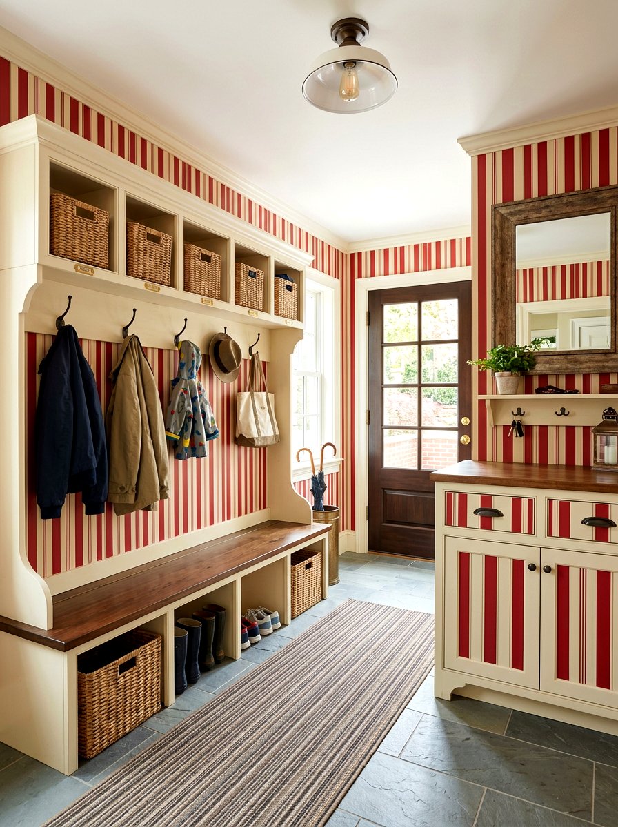
4. Burnt Orange Mudroom
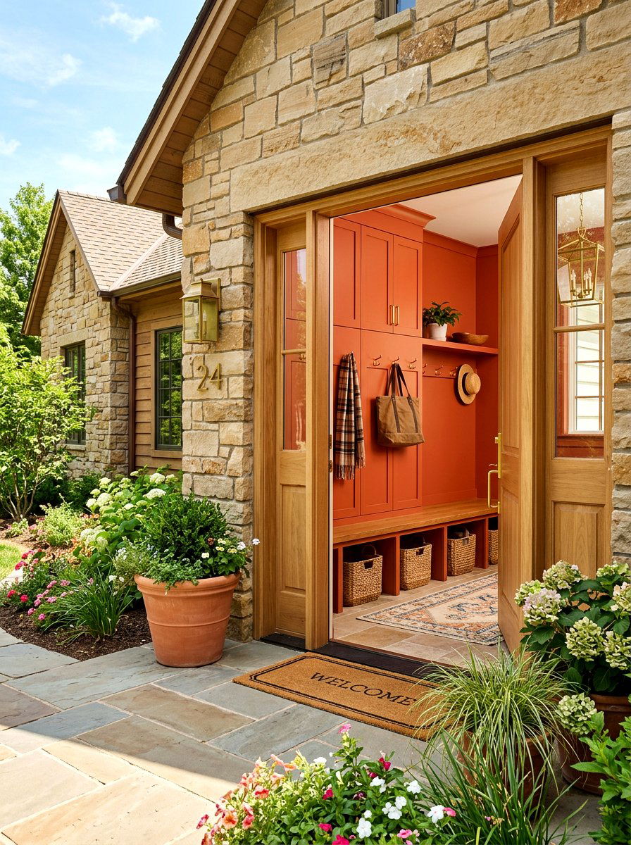
Can a utility space actually feel inspiring and energetic every time you walk through the door? A burnt orange mudroom turns a functional entryway into a vibrant statement piece by saturating the lockers, bench, and walls in a fiery autumnal tone. This bold color choice hides dirt and scuffs better than lighter neutrals, making it a practical option for high-traffic family zones. When the trim and ceiling match the walls, the mudroom feels like a purposeful part of the home’s design rather than an afterthought. Adding brass hooks and a patterned runner rug will complete this warm, welcoming look that greets you after a long day.
5. Mustard Yellow Office
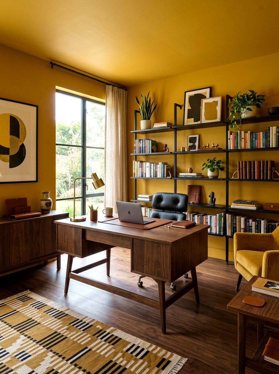
Are you looking for a way to boost your productivity and creative spark while working from home? A mustard yellow office uses a golden, sun-soaked palette to create a cheerful and stimulating environment. Color drenching in yellow can sometimes feel overwhelming, but a muted mustard tone provides warmth without being too bright for long hours of focus. By painting the bookshelves and desk the same color as the walls, you create a streamlined look that reduces visual clutter. This allows your mind to focus on the tasks at hand. Pair it with dark walnut furniture and black metal accents to keep the space feeling professional.
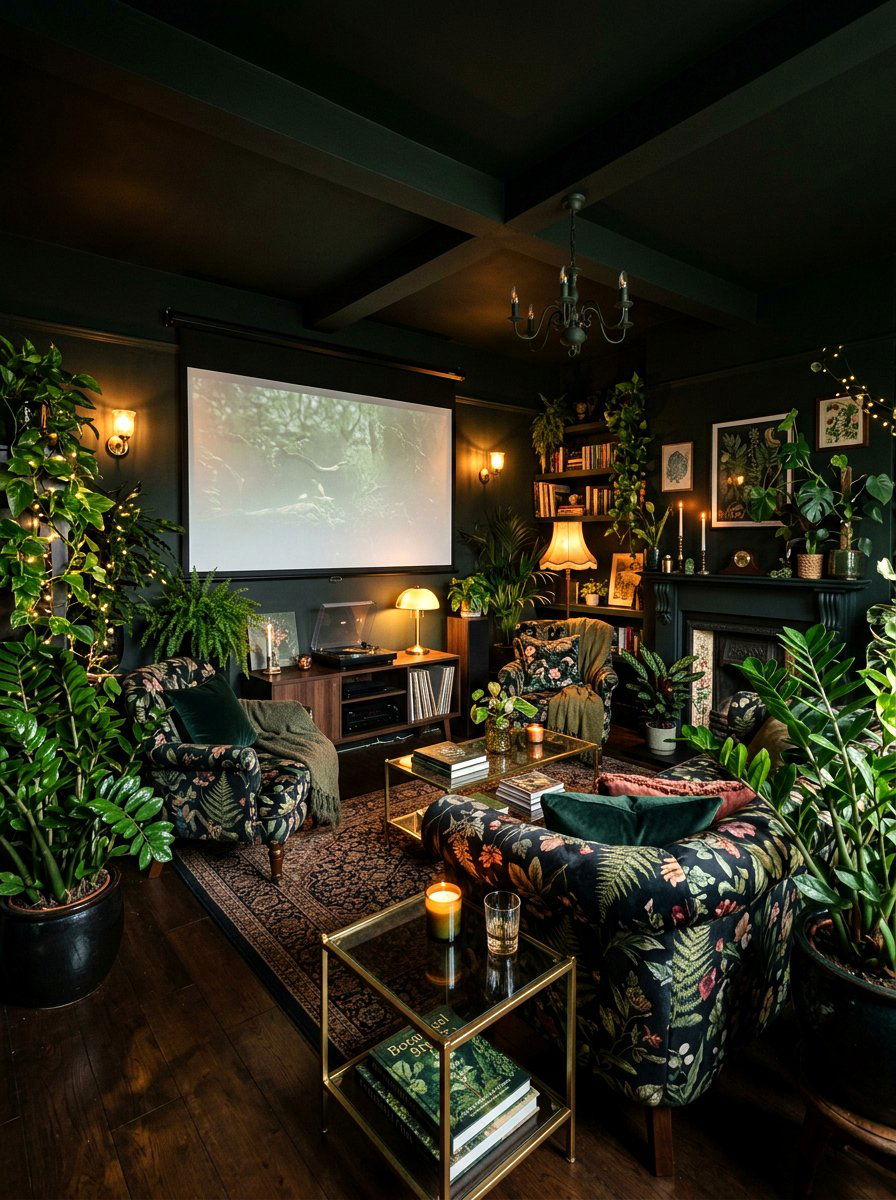
6. Chocolate Brown Den
What could be more sophisticated than a room that mimics the richness of dark cocoa and polished leather? A chocolate brown den is the ultimate "dark academia" choice for a cozy media room or reading area. Drenching the space in a deep brown hue creates a sense of stability and comfort that is hard to achieve with lighter colors. When the ceiling is painted to match the walls, it blurs the boundaries of the room, making it feel like an intimate, private cave. This design works exceptionally well with plush velvet seating, brass floor lamps, and tall stacks of colorful books that pop against the dark background.
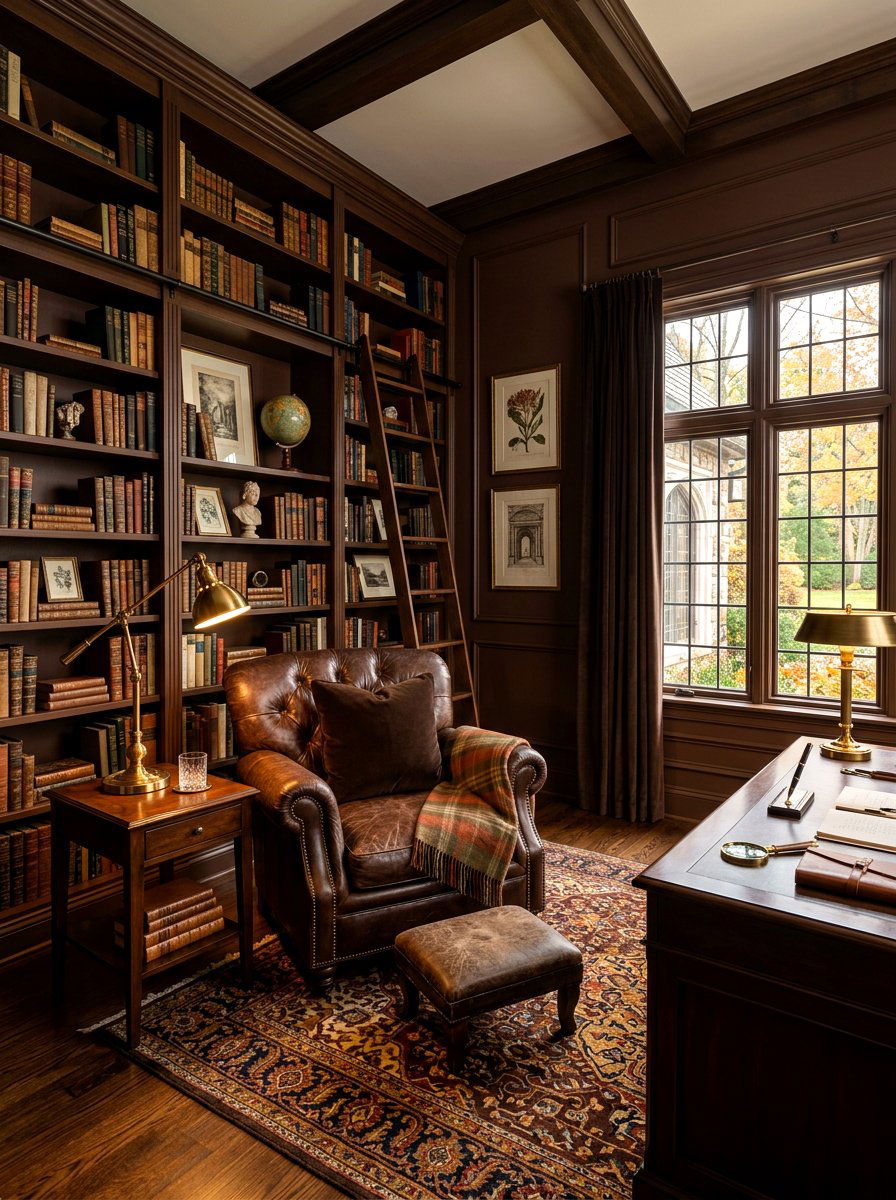
7. Maroon Library
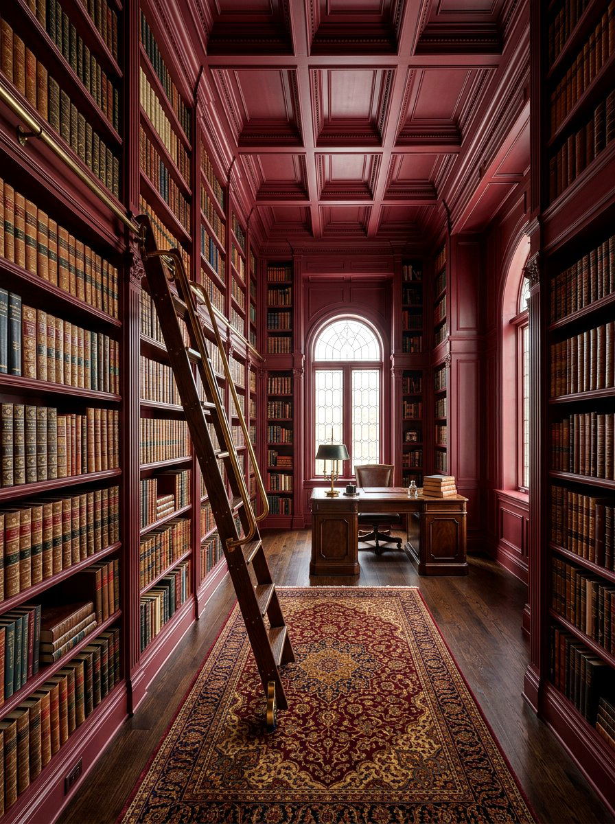
Why settle for a traditional study when you can have a space that feels like a historic manor? A maroon library uses a deep, brownish-red palette to create a sense of heritage and intellectual depth. By applying this rich color to the floor-to-ceiling built-in shelves and the crown molding, you create a seamless environment that highlights your book collection. Maroon is a classic fall color that brings warmth and a touch of formality to the home. To keep the space from feeling too heavy, incorporate leather armchairs and soft, warm lighting that emphasizes the rich texture of the monochromatic paint finish.
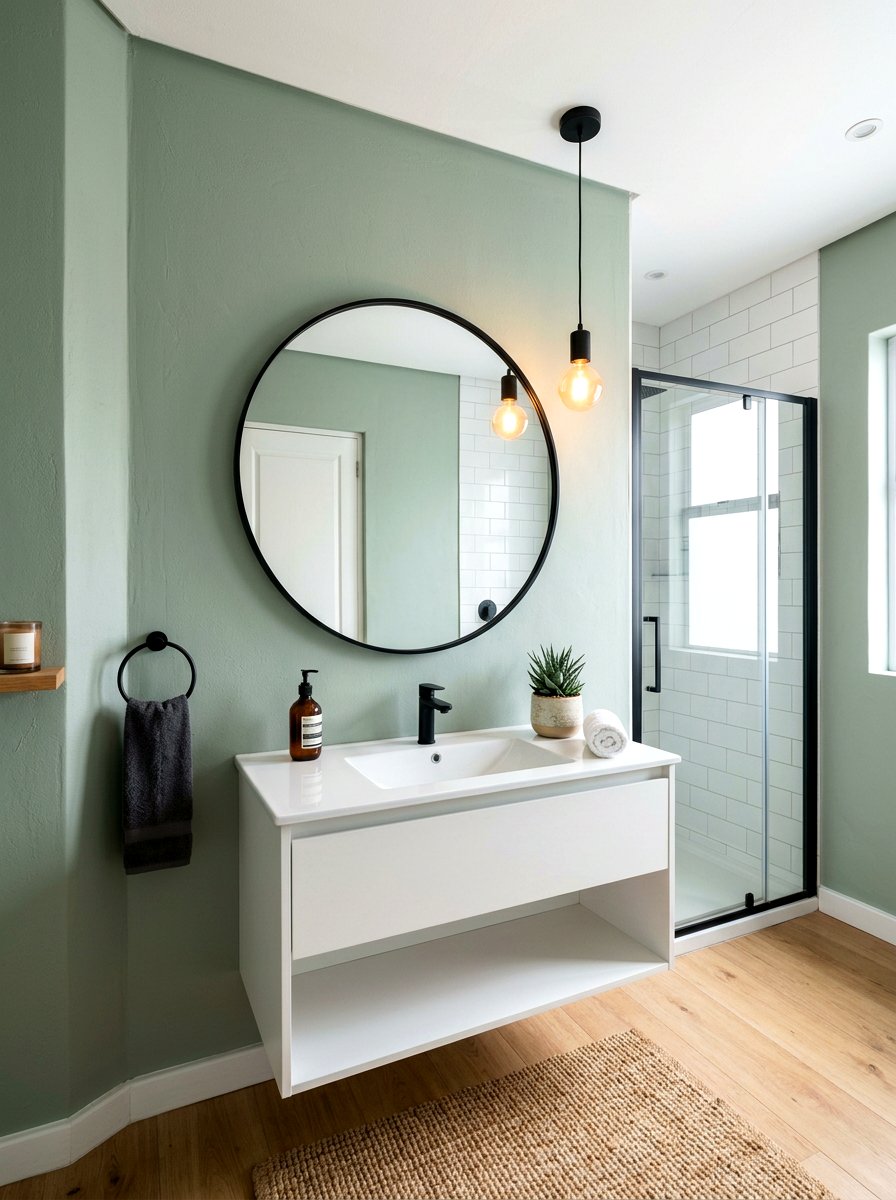
8. Sage Green Bathroom
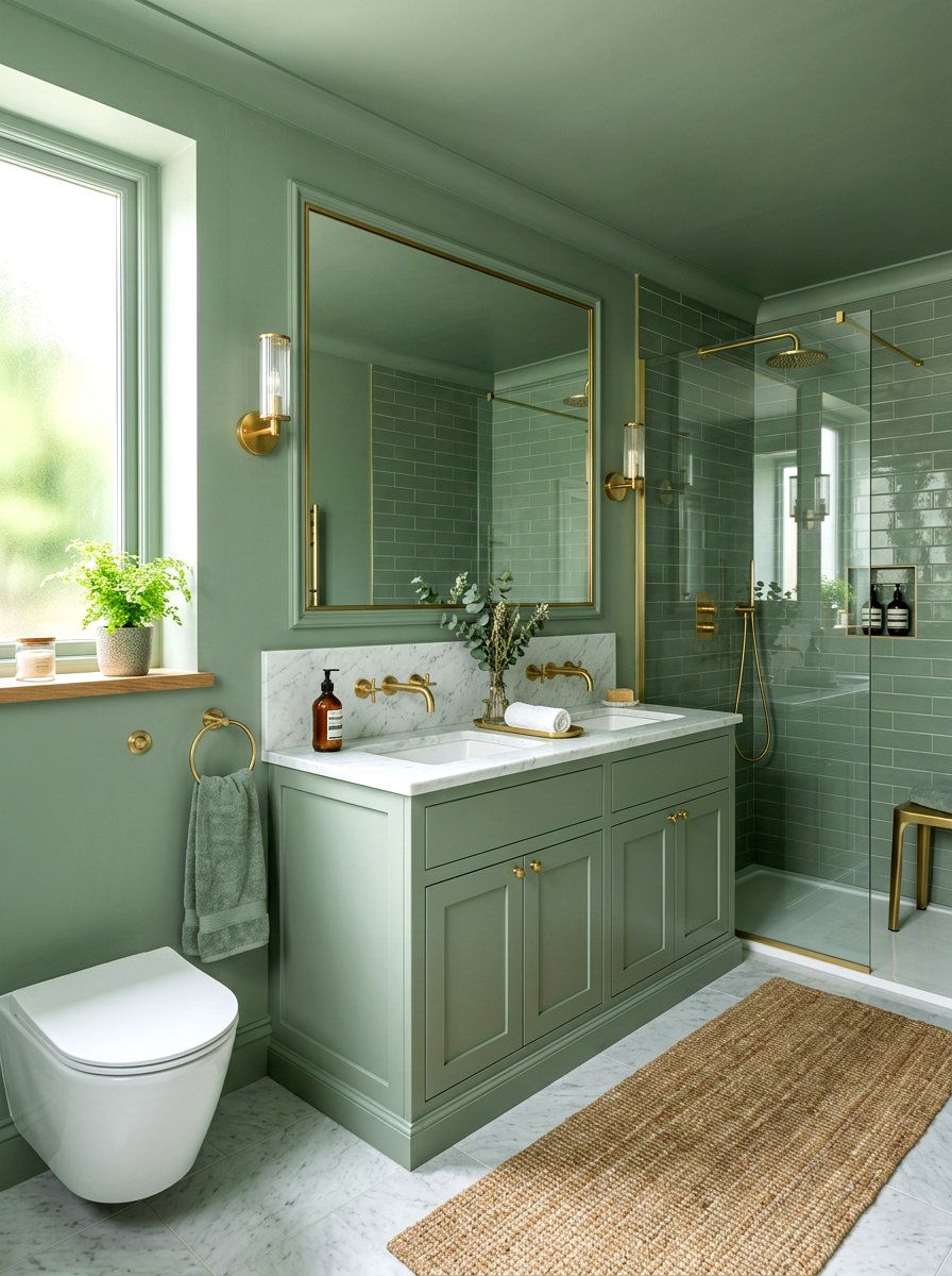
Is there anything more refreshing than a bathroom that feels like a private spa hidden in a garden? A sage green bathroom uses a soft, herbal tone to create a calming and airy atmosphere. When you drench the walls, vanity, and even the ceiling in sage, the room feels much larger and more cohesive. This color is particularly effective in spaces with white tile or marble surfaces, as it provides a gentle contrast without breaking the flow of the room. The muted green tone reflects natural light beautifully, making the space feel clean and organic. It is a timeless choice for a relaxing soak.
9. Charcoal Kitchen
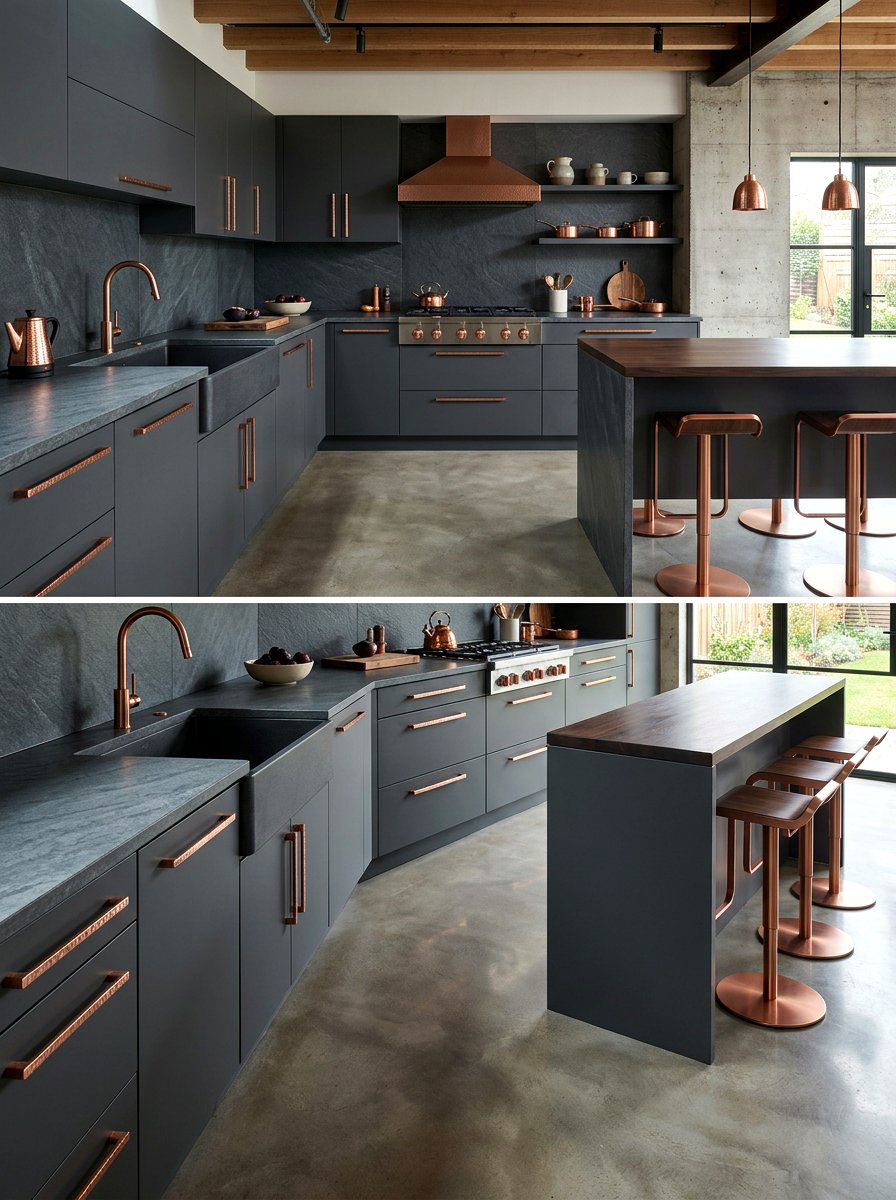
Can a kitchen really be both industrial and incredibly cozy at the same time? A charcoal kitchen proves that a dark, monochromatic palette can be breathtakingly modern and inviting. By painting the cabinets, walls, and backsplash in a deep slate or charcoal grey, you create a sleek, architectural look. This technique makes standard appliances look like integrated parts of the design rather than bulky additions. To prevent the room from feeling too cold, add warm wood flooring and copper hardware. The charcoal backdrop acts as a perfect canvas for colorful produce, fresh herbs, and stylish cookware, making the kitchen feel like a chef's studio.
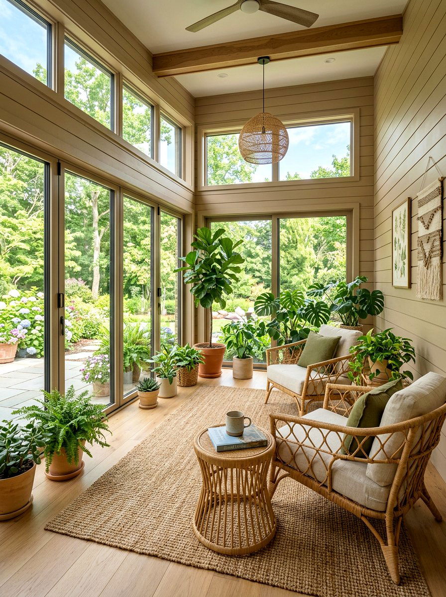
10. Copper Sunroom
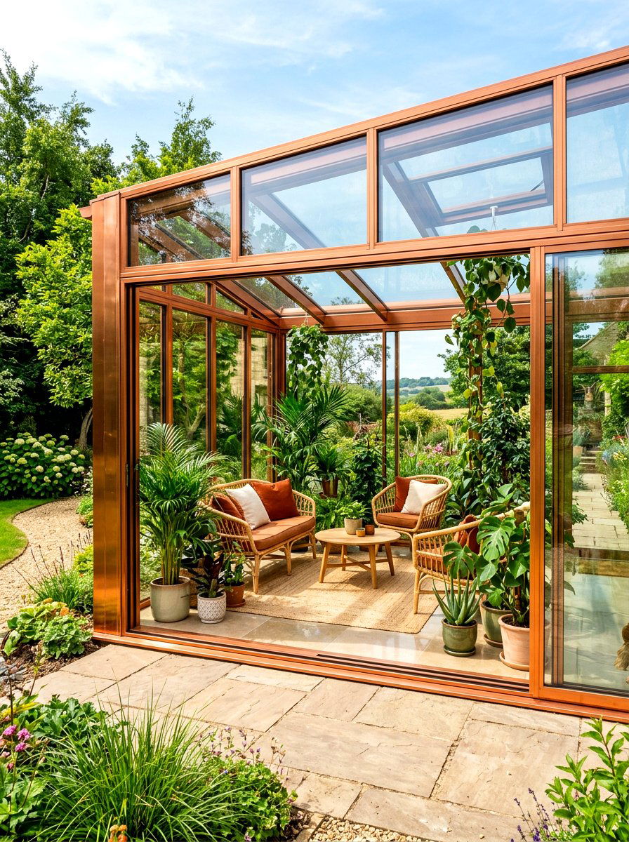
How do you capture the fleeting beauty of the golden hour and keep it inside your home year-round? A copper sunroom uses a metallic-inspired orange-brown tone to create a space that feels constantly bathed in warmth. This shade is perfect for rooms with large windows, as the natural light interacts with the copper pigment to create a shifting, luminous effect. Drenching the window casings and the ceiling in this tone connects the interior space to the changing autumn landscape outside. It is a brilliant way to make a transition space feel intentional. Decorate with plenty of leafy green plants to create a striking color contrast.
11. Forest Green Entryway
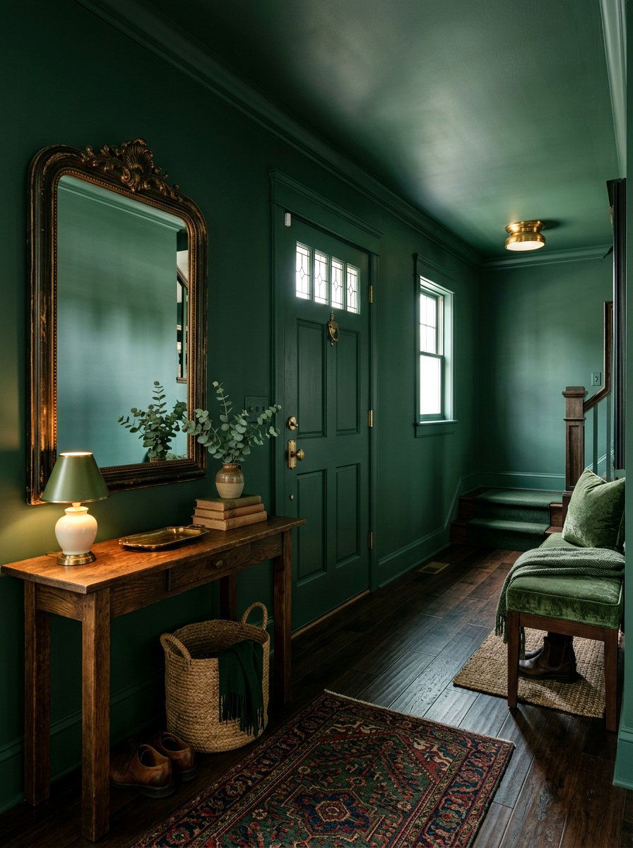
Does your home’s first impression reflect the style and personality you have worked so hard to cultivate? A forest green entryway uses a deep, coniferous tone to provide a dramatic and sophisticated welcome to any guest. By painting the front door, the baseboards, and the walls in this dark green, you create a sense of mystery and depth. This color drenching choice works well in narrow hallways, as it hides shadows and makes the space feel more substantial. Pair this moody hue with a large antique mirror and a small wooden console table to create a functional yet high-design entry point for your home.
12. Rust Guest Room
What better way to welcome visitors than with a room that feels like a cozy, rustic cabin retreat? A rust guest room uses a burnt, reddish-orange palette that instantly evokes the feeling of fallen leaves and autumn bonfires. By drenching the entire room in this warm tone, you create an environment that feels safe and comfortable for travelers. The color rust is surprisingly versatile, looking great with both modern black metal bed frames and traditional wooden furniture. Use cream-colored linens and textured wool throws to add layers of softness. This design choice ensures your guests feel right at home the moment they step inside.
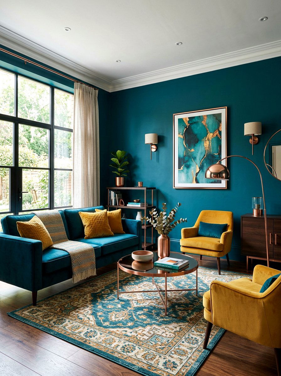
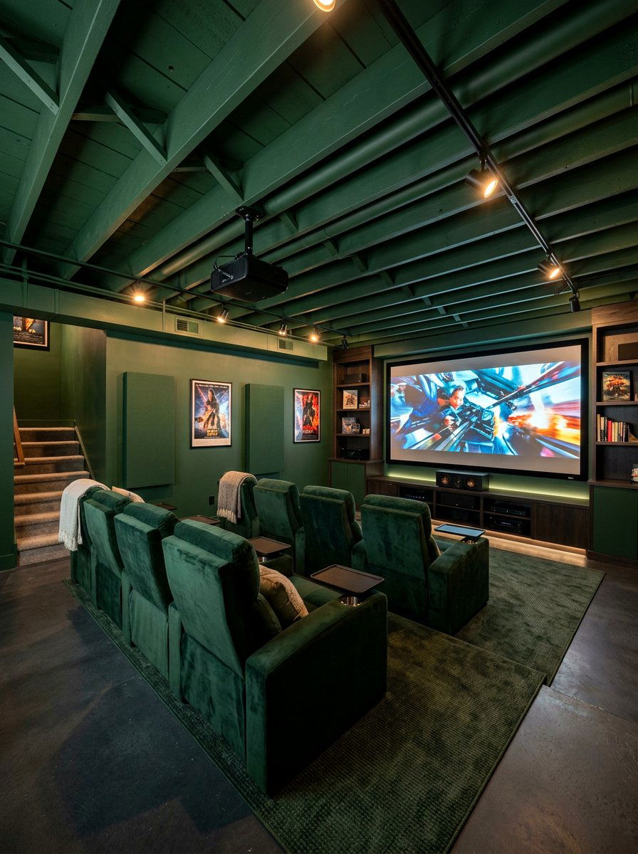
13. Navy Blue Media Room
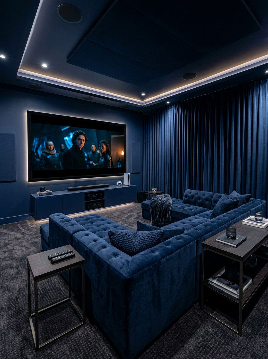
Are you ready to create the perfect cinematic experience right in the comfort of your own living space? A navy blue media room uses a dark, midnight hue to minimize light reflections and maximize focus on the screen. By painting the walls, ceiling, and even the window treatments in the same deep blue, you create an immersive environment that rivals any theater. This color drenching technique makes the boundaries of the room disappear, focusing all attention on the entertainment. Plush seating in a similar navy tone adds to the "cloud-like" feel of the space, making it the favorite spot for family movie nights.
14. Ochre Nursery
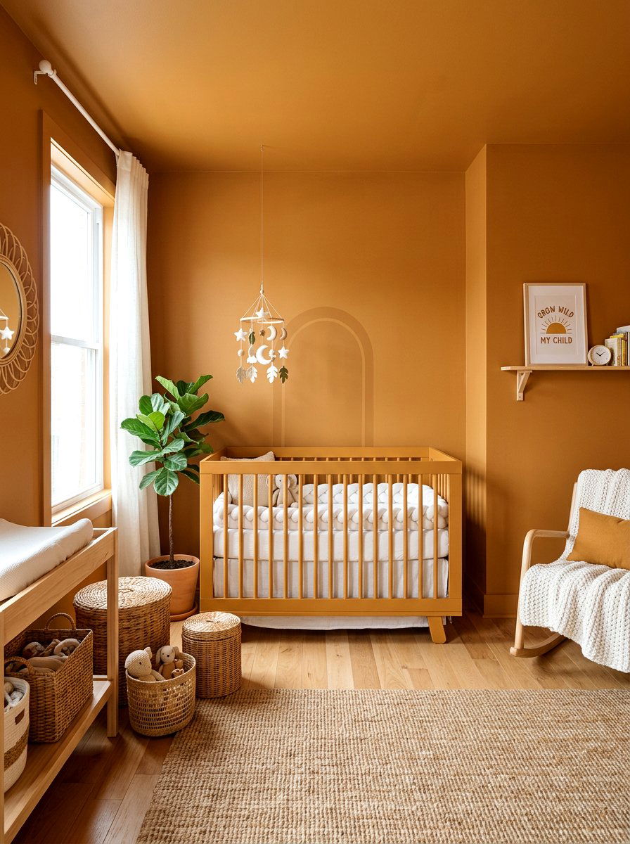
Can a nursery be both trendy and incredibly soothing for a newborn and their parents alike? An ochre nursery uses a deep, earthy yellow tone to create a space that feels sunny yet grounded. Unlike bright primary yellows, ochre has a sophisticated brown undertone that makes it perfect for color drenching. By painting the crib and the walls in this same shade, you create a harmonious environment that isn't overly stimulating. This color pairs beautifully with natural wood toys, white textiles, and wicker baskets. It is a gender-neutral option that grows with the child, remaining stylish long after the toddler years have passed.
15. Crimson Powder Room
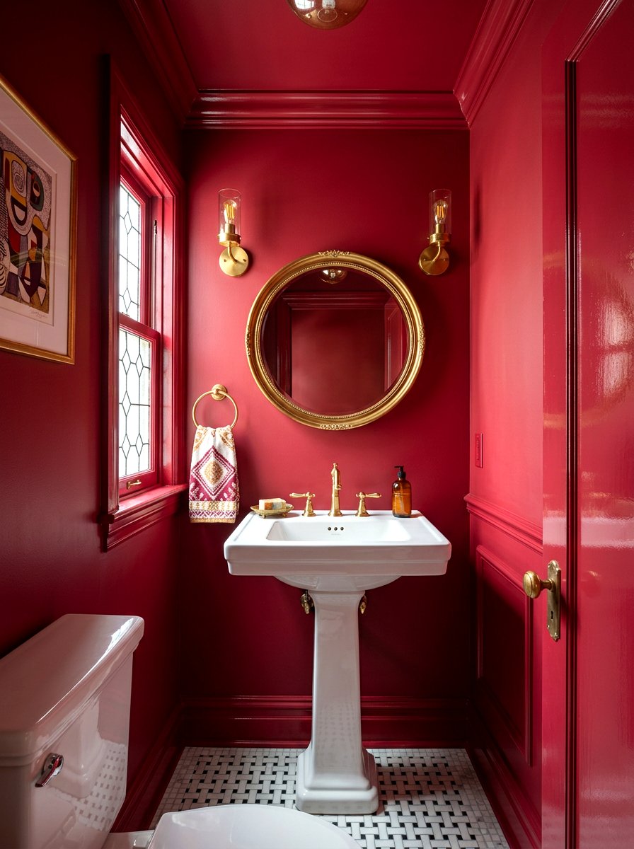
Why not take a risk in the smallest room of your house to create a truly unforgettable experience? A crimson powder room uses a bold, saturated red to create a high-impact "wow" factor for guests. Color drenching in a small space like a powder room is a classic designer trick to make the area feel intentional and expensive. When the ceiling and trim match the vibrant walls, the room feels like a luxurious jewel box. Pair the crimson walls with polished brass fixtures and a clean white pedestal sink for a timeless, high-contrast look. It is a daring choice that pays off with style.
16. Cinnamon Laundry Room
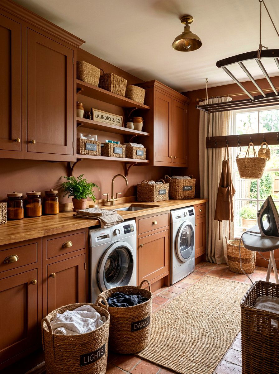
Who says that doing household chores has to be a boring and uninspired task every single weekend? A cinnamon laundry room uses a spicy, reddish-brown hue to transform a utility area into a warm and inviting space. By painting the cabinets and the walls in this rich tone, you create a cohesive look that hides the visual clutter of soaps and baskets. The cinnamon color brings an unexpected touch of luxury to a space that is usually overlooked. Adding a butcher block countertop and some woven laundry hampers will complete the cozy, artisanal feel of the room, making laundry day much more pleasant.
17. Teal Reading Nook
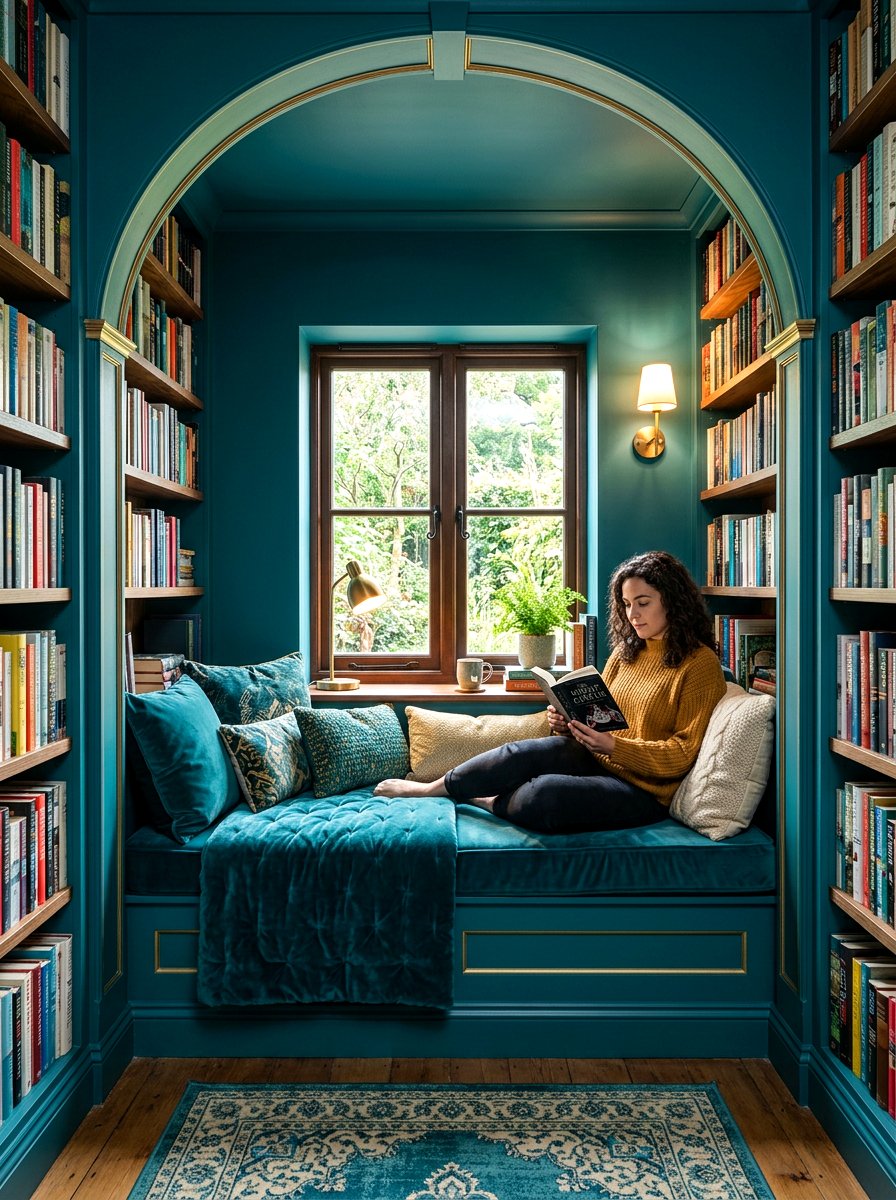
Is there a small corner of your home that is just waiting to become your new favorite escape? A teal reading nook uses a deep, aquatic green-blue to create a space that feels quiet, contemplative, and incredibly cozy. Drenching a small alcove or nook in teal helps to define the area as a separate "zone" within a larger room. This color is known for its calming properties, making it the perfect backdrop for getting lost in a good book. Add a matching velvet armchair and a small built-in shelf for your favorites. The monochromatic look creates a focused, distraction-free environment for any avid reader.
18. Espresso Breakfast Nook
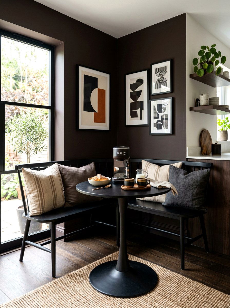
Do you want your morning coffee to feel like a high-end cafe experience every single day? An espresso breakfast nook uses a near-black, dark brown palette to create a chic and intimate dining area. By drenching the bench seating, walls, and window trim in this dark tone, you create a beautiful contrast against the bright morning sun. This technique makes the morning light feel even more special and focused. Pair the dark walls with a light oak pedestal table and some modern minimalist chairs. The result is a sophisticated corner that feels both grounded and incredibly stylish for starting your busy morning.
19. Camel Study
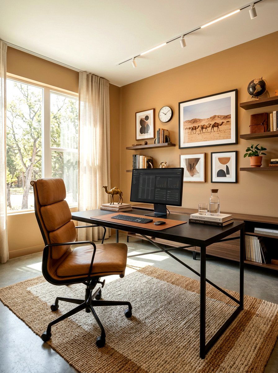
Can a home office feel professional while also being as comfortable as your favorite worn-in leather jacket? A camel study uses a warm, tan-toned palette to create a space that is both bright and incredibly sophisticated. This shade of beige has enough yellow and brown in it to feel rich rather than bland. Color drenching in camel makes a room feel expansive and flooded with light, even on cloudy autumn days. It works perfectly with black accent pieces, like a metal desk lamp or a leather executive chair. This monochromatic approach creates a high-end, tailored look that is perfect for professional video calls.
20. Emerald Green Closet
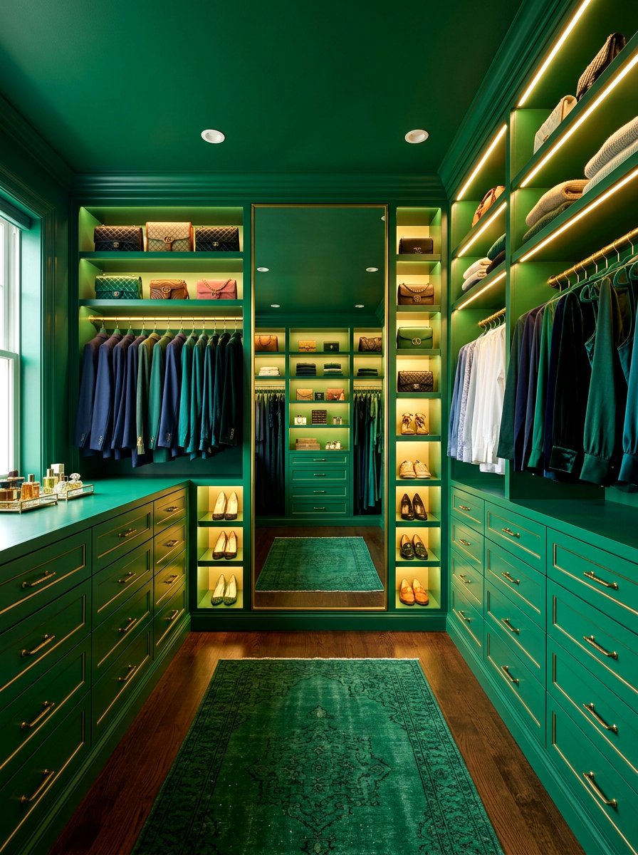
Why shouldn't your dressing area feel as luxurious and well-curated as a high-end fashion boutique? An emerald green closet uses a deep, jewel-toned palette to turn a storage space into a glamorous sanctuary. By painting the shelves, drawers, and walls in the same rich green, you create a stunning backdrop that makes your clothing and accessories pop. This color drenching choice feels incredibly opulent and helps to organize the visual space. Adding some warm LED strip lighting under the shelves will emphasize the depth of the color. It is a daily dose of luxury that makes getting ready every morning feel special.
21. Brick Red Hallway
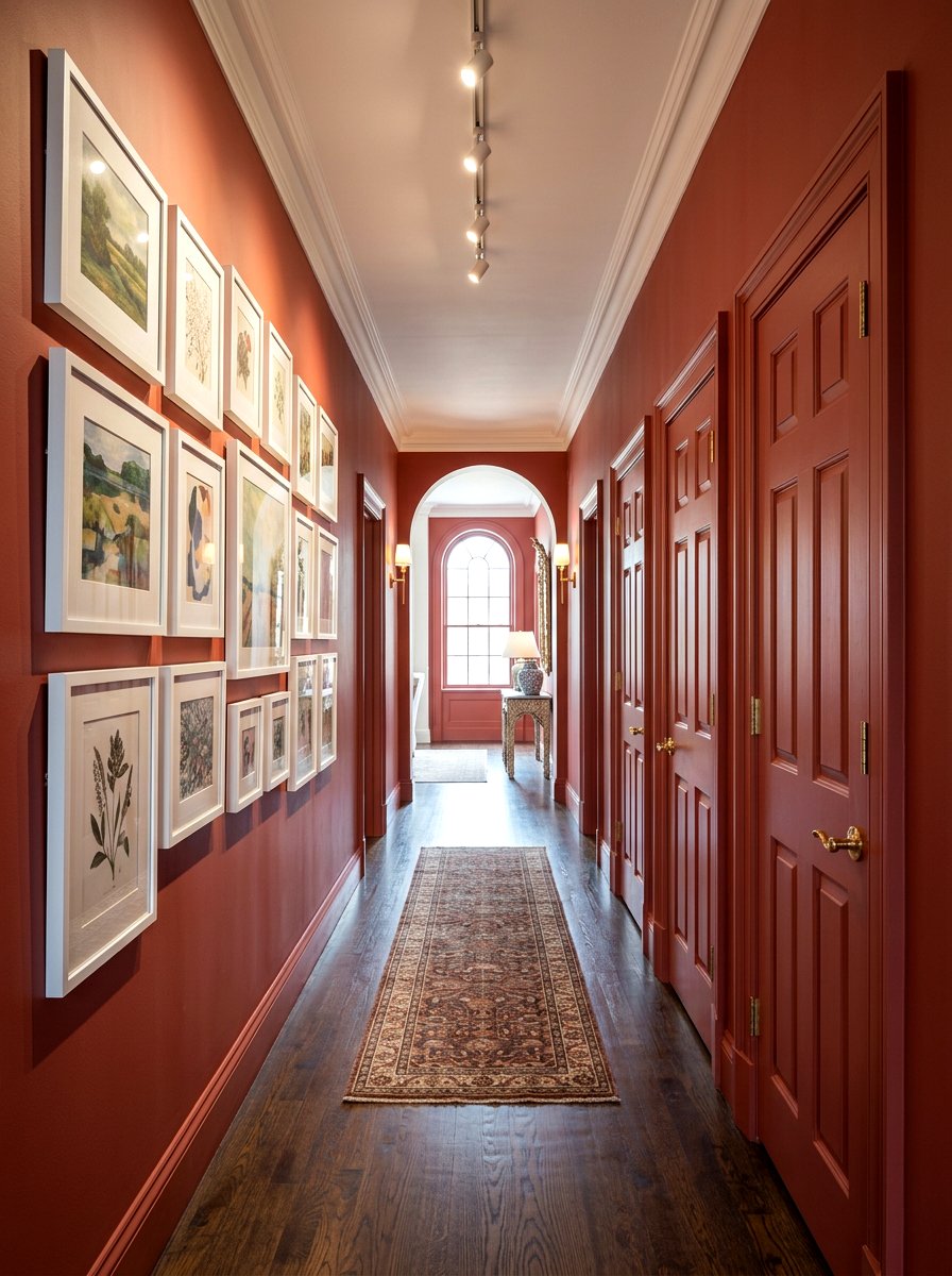
How do you turn a boring transitional space into a warm and welcoming journey through your home? A brick red hallway uses a muted, clay-based red to create a sense of movement and energy between rooms. By drenching the doors, trim, and walls in this earthy tone, you create a seamless flow that guides the eye forward. This color choice is particularly effective in homes with traditional architecture, as it highlights the craftsmanship of the woodwork. Pair the red walls with a series of black-and-white family photos in matching frames. The monochromatic backdrop makes the artwork feel more intentional and organized.
22. Dusty Rose Bedroom
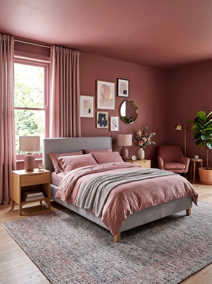
Is it possible to use pink in a way that feels grown-up, sophisticated, and perfect for the cooler months? A dusty rose bedroom uses a muted, brownish-pink palette to create a space that is romantic without being overly sweet. By drenching the walls and the ceiling in this soft tone, you create a warm, glowing environment that feels like a sunset. This color is incredibly flattering and makes the space feel soft and inviting. Pair it with grey linens and light wood furniture to keep the look modern. It is a wonderful alternative to standard beige for those who want a hint of color.
23. Slate Grey Home Gym
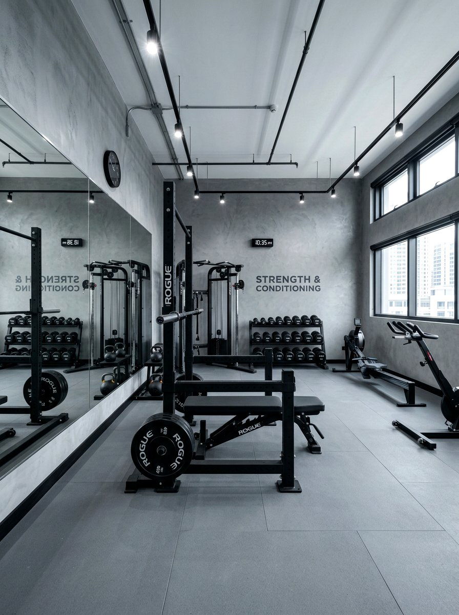
Does your workout space feel like a messy afterthought rather than a place that actually motivates you? A slate grey home gym uses a cool, stony palette to create a focused and professional environment for exercise. Color drenching in grey helps to minimize distractions, allowing you to focus on your form and fitness goals. By painting the walls and ceiling the same shade, you create a cohesive look that makes bulky gym equipment feel more integrated into the room. This monochromatic approach creates a modern, sleek aesthetic. Add a large wall mirror and some bright white lighting to keep the energy high.
24. Bronze Stairwell
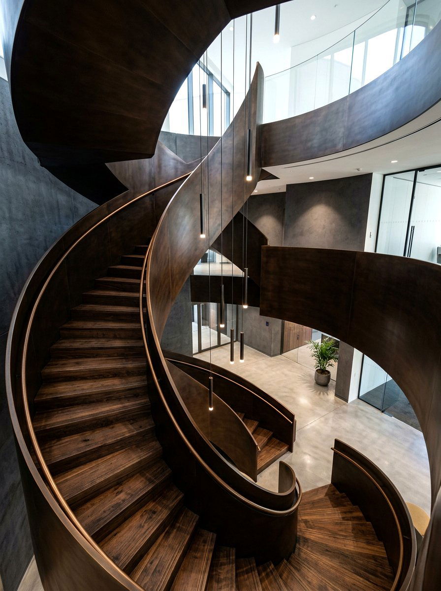
Can a vertical space like a staircase become the architectural focal point of your entire home design? A bronze stairwell uses a deep, metallic-tinged brown to create a sense of height and drama. By drenching the railings, steps, and surrounding walls in this dark tone, you create a sculptural look that feels incredibly expensive. This technique blurs the lines between the different levels of the house, making the transition feel more fluid and intentional. This color choice works beautifully with warm accent lighting or a modern pendant lamp hanging in the center. It turns a functional necessity into a stunning piece of art.
25. Aubergine Conservatory
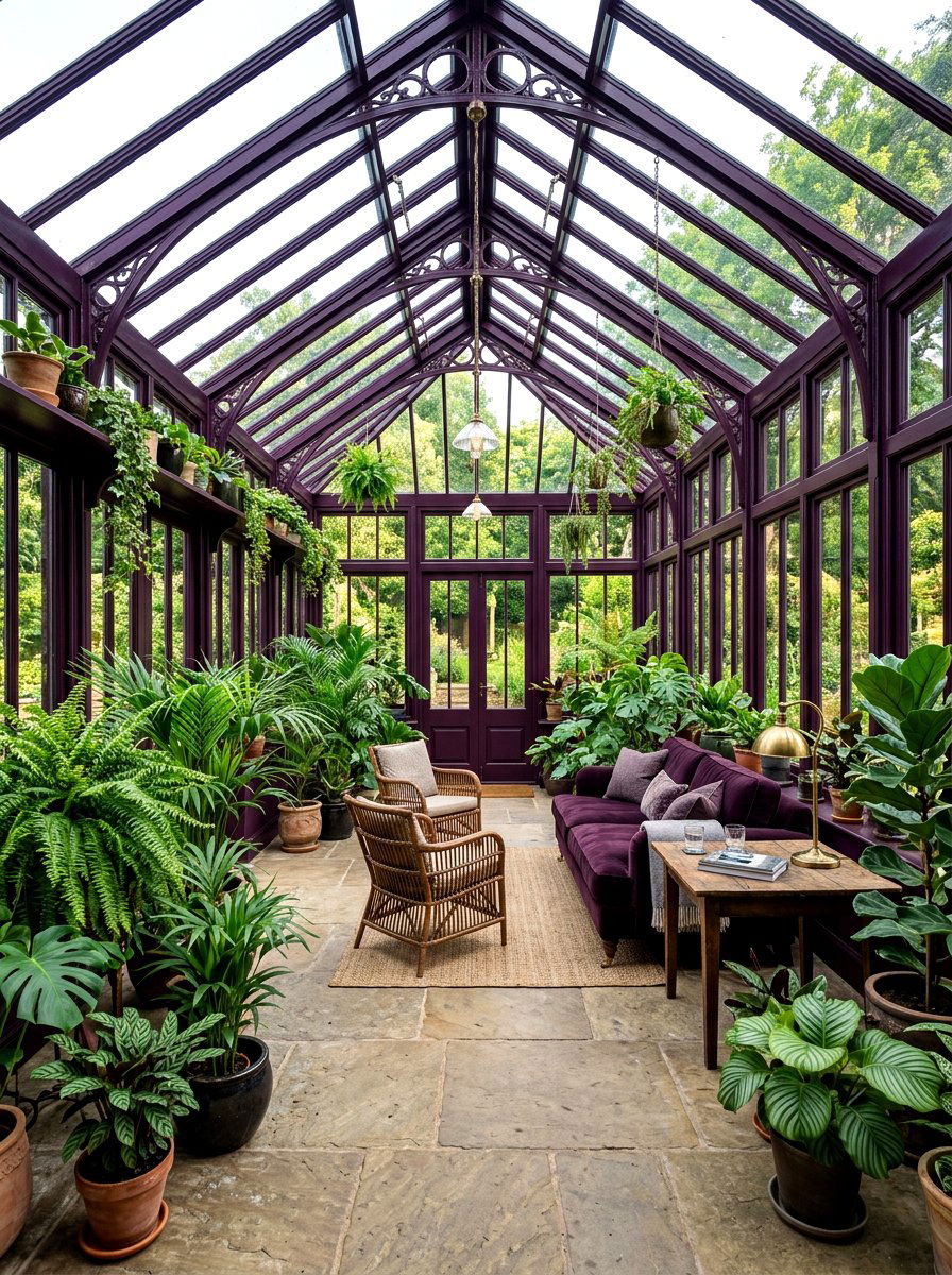
How do you create a space that feels both connected to the garden and incredibly luxurious inside? An aubergine conservatory uses a deep, black-toned purple to create a moody and sophisticated plant-filled sanctuary. This dark color is the perfect backdrop for the vibrant greens of tropical plants and ferns, making their leaves appear even more vivid. Drenching the window frames and the ceiling in aubergine creates a frame for the view outside, acting like a dark mat for a beautiful painting. This color is especially stunning in the evening when the glass reflects the deep purple tones, creating a magical, intimate atmosphere for relaxing.
26. Amber Music Room
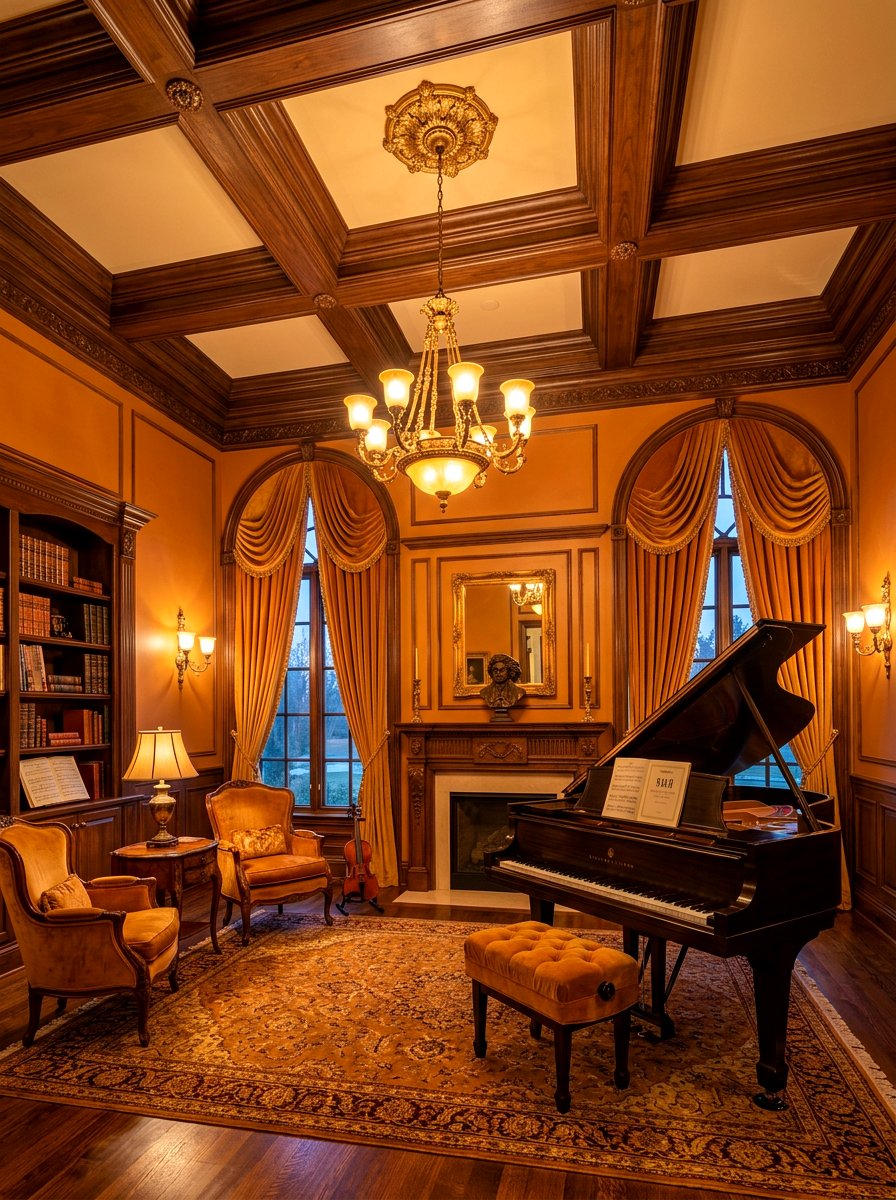
What if a room could actually sound as warm and rich as the color on the walls looks? An amber music room uses a deep, honey-toned orange to create a space that feels resonant and inviting. This golden palette is perfect for a room dedicated to instruments, as it complements the wood tones of pianos, violins, and guitars. Color drenching in amber creates a glowing environment that feels like being inside a precious gemstone. The monochromatic look reduces visual noise, allowing the focus to remain on the music. Pair it with heavy velvet curtains and comfortable seating to create the ultimate private concert hall.
27. Pine Green Basement
Is your basement feeling a bit dark, damp, and uninviting for the family to hang out in? A pine green basement uses a deep, saturated evergreen tone to lean into the moodiness of a subterranean space. Instead of fighting the lack of natural light with bright whites, color drenching in a dark green makes the room feel like a cozy, intentional den. This technique creates a "cocoon" effect that is perfect for a home theater or a playroom. By painting the exposed ceiling joists and walls the same color, you hide architectural imperfections and create a cool, industrial-chic look that everyone will love.
28. Cognac Lounge
Are you dreaming of a sophisticated space that feels like a private club for relaxing after a long day? A cognac lounge uses a rich, leathery brown-orange palette to create an environment that feels expensive and timeless. Color drenching in cognac brings a sense of warmth and history to a modern home. This shade looks incredible in a matte finish on the walls paired with a high-gloss finish on the trim and doors. This variation in sheen adds depth and interest without breaking the monochromatic theme. Decorate with mid-century modern furniture and brass accents to complete this high-end, polished look for entertaining.
29. Clay Craft Room
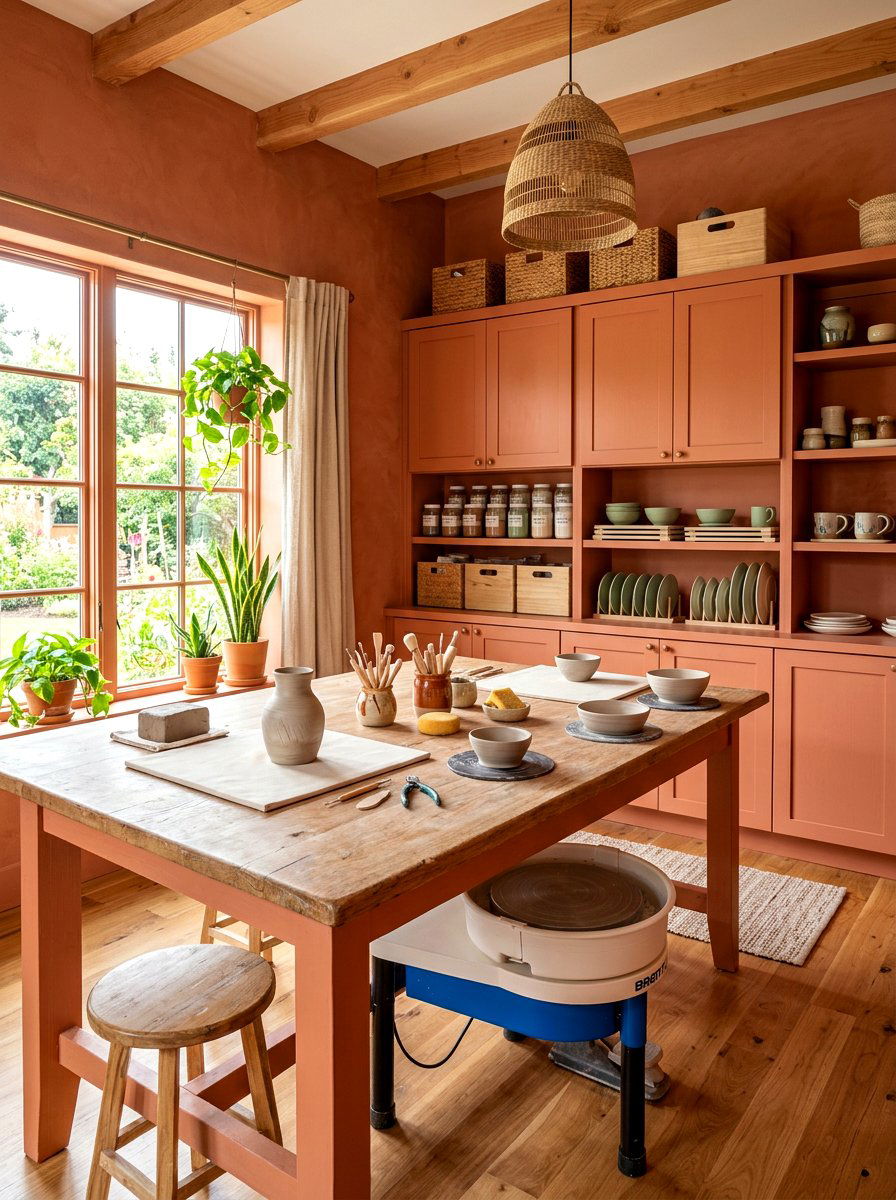
How do you create a workspace that is inspiring for your hobbies without becoming a chaotic mess of supplies? A clay craft room uses a soft, earthy terracotta tone to create a grounded and organized environment for creativity. By painting the storage cabinets, worktable, and walls in the same clay shade, you create a calm backdrop that allows your colorful supplies to take center stage. This monochromatic approach makes the room feel less cluttered, even when you are in the middle of a big project. The warm, organic tone encourages a relaxed state of mind, which is essential for creative thinking and focus.
30. Mauve Attic Suite
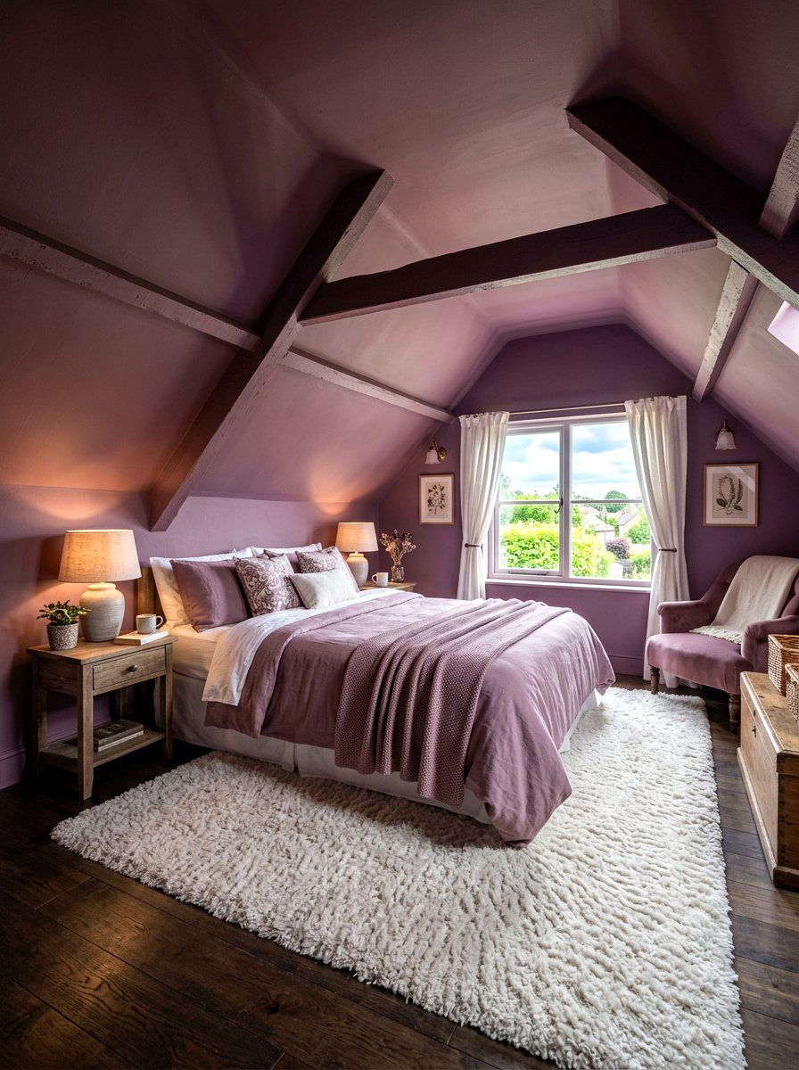
What can you do with the awkward angles and low ceilings of an attic to make it feel like a luxury suite? A mauve attic suite uses a dusty, purple-grey palette to turn a challenging space into a cozy and charming retreat. Color drenching is the perfect solution for attics, as it blurs the lines where the walls meet the sloped ceilings, making the space feel taller and more open. Mauve is a soft, sophisticated color that provides warmth without being overwhelming in a small area. Pair it with soft white linens and a plush rug to create a dreamlike guest room or private hideaway.
Conclusion:
Color drenching is more than just a passing design trend; it is a powerful tool for creating atmosphere and emotional resonance in your home. By choosing a single, saturated hue for an entire room, you can transform a standard living space into a breathtakingly cohesive sanctuary. This approach is particularly effective during the fall, when we naturally crave warmth, comfort, and a sense of being grounded. Whether you choose a bold crimson or a tranquil sage, the results of this immersive technique are consistently sophisticated and high-impact. Embracing this bold paint strategy allows you to showcase your personal style while making every corner of your home feel intentional.
Related posts: