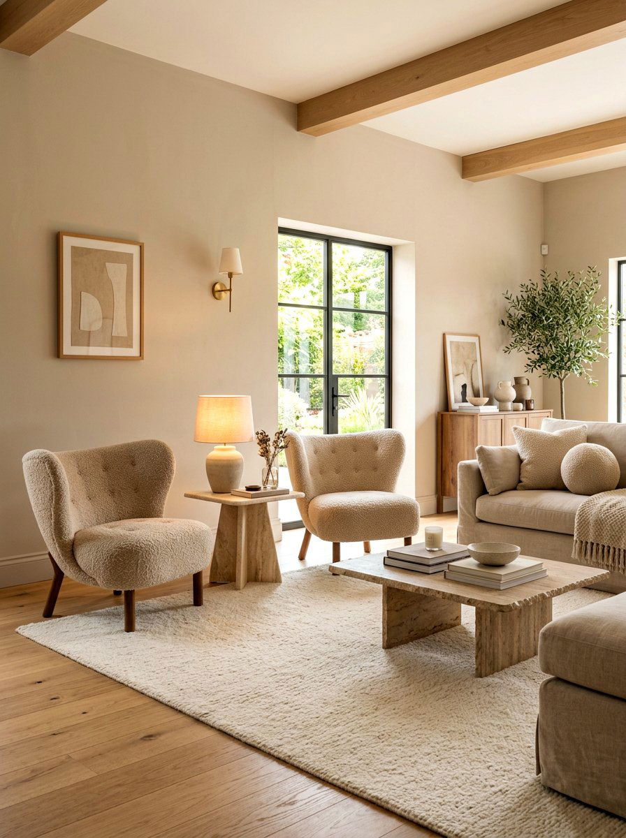
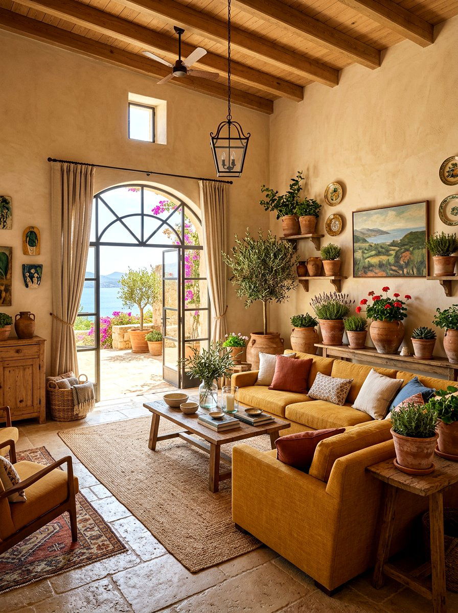
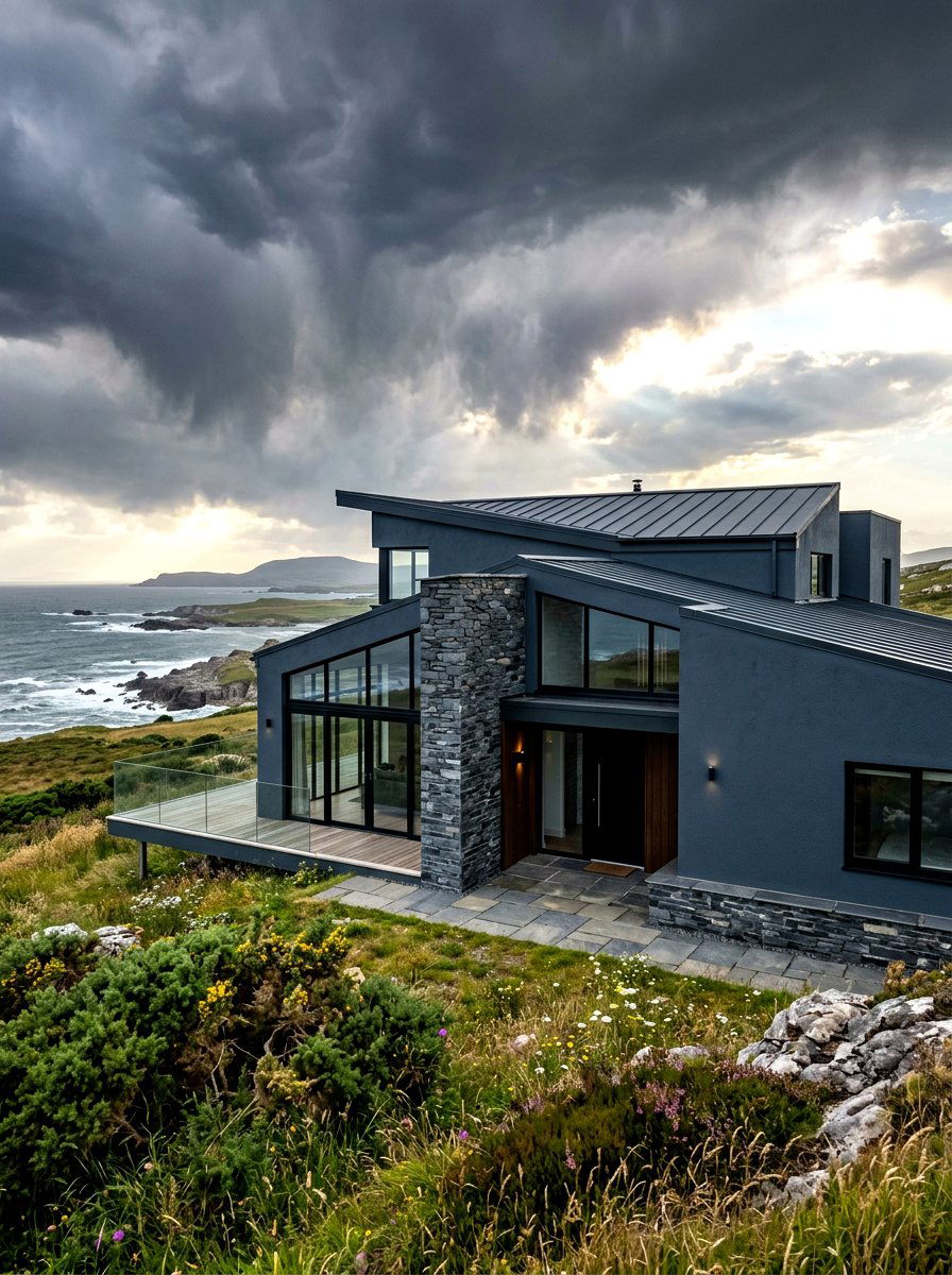
Finding the perfect paint color can feel like an endless journey through thousands of tiny swatches. Warm neutrals have become the gold standard for creating a home that feels both modern and deeply inviting. Unlike cool tones that can sometimes feel clinical or cold, warm neutrals incorporate hints of yellow, red, or brown to provide a sense of comfort and serenity. Whether you are looking for a creamy white, a soft greige, or a rich sandy beige, these tones work beautifully in any lighting condition. They serve as a versatile backdrop for various furniture styles, allowing your personal decor and textures to truly shine without overwhelming the senses in your living space.

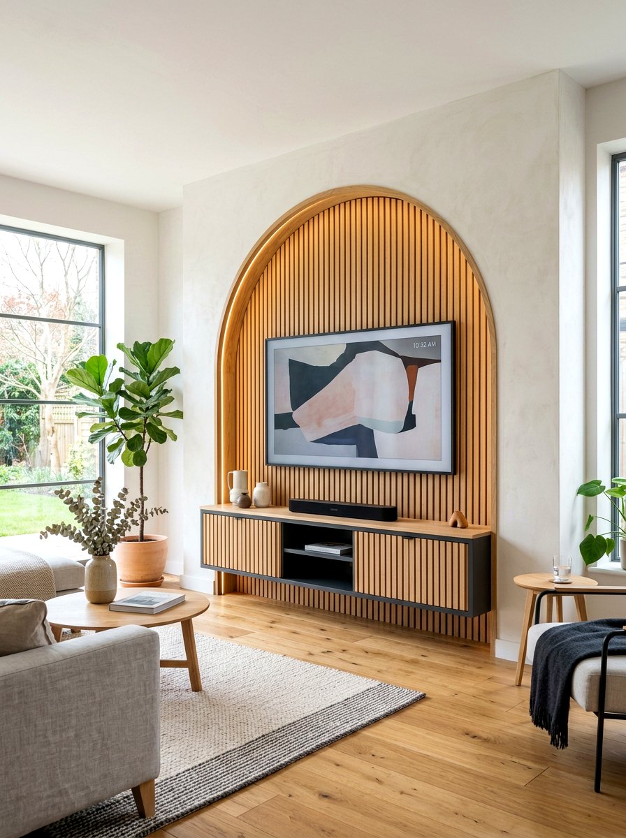
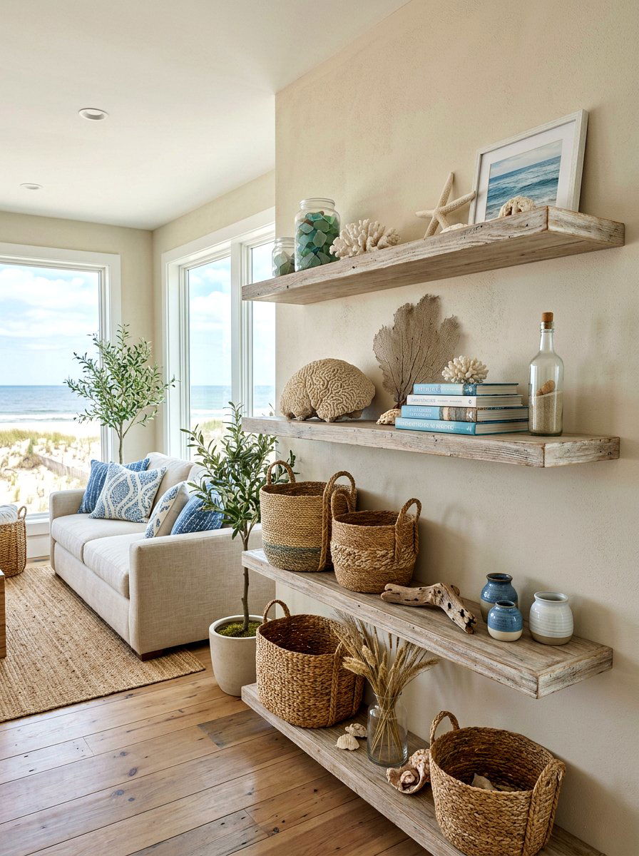
1. Warm White Living Room
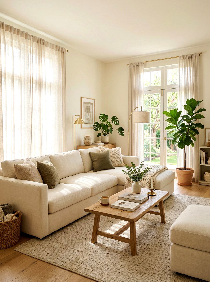
Starting your home transformation with a warm white living room creates a foundation of timeless elegance and light. Choosing a shade with a hint of cream or yellow ensures the space feels welcoming rather than cold or clinical. This design approach allows natural light to bounce off the walls, making the entire area feel larger and more airy throughout the day. You can easily layer different textures like wool rugs, linen curtains, and velvet pillows to add depth to the neutral palette. Incorporating wooden furniture and metallic accents will further enhance the inviting glow, making your main living area the perfect spot for relaxing with family or entertaining guests in style.
2. Creamy Kitchen Cabinets
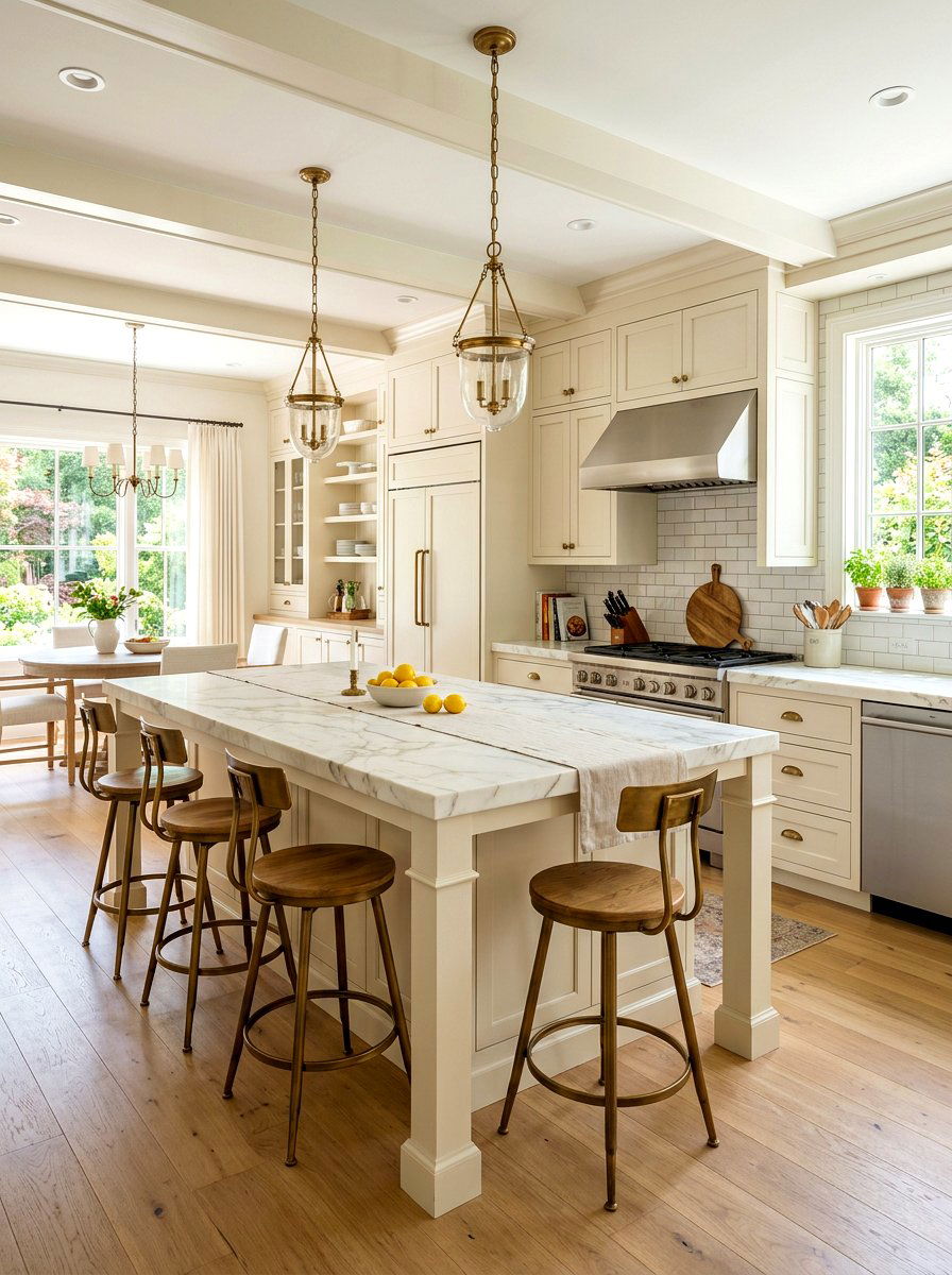
Updating your kitchen with creamy cabinets offers a sophisticated alternative to traditional stark white finishes. A warm, buttery neutral on your cabinetry brings a sense of softness to a room that is often filled with hard surfaces and cold appliances. This color choice pairs beautifully with natural stone countertops, such as marble or quartz, and looks particularly stunning with antique brass or bronze hardware. The warmth of the paint reflects light in a way that feels cozy during morning coffee yet elegant during evening dinner prep. By keeping the walls in a similar tonal range, you create a seamless, high-end look that feels both clean and approachable.
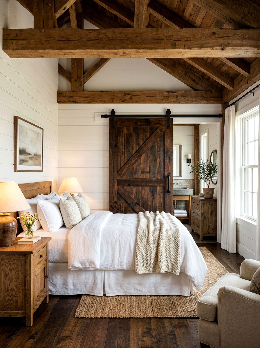
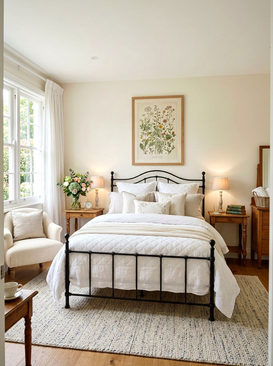
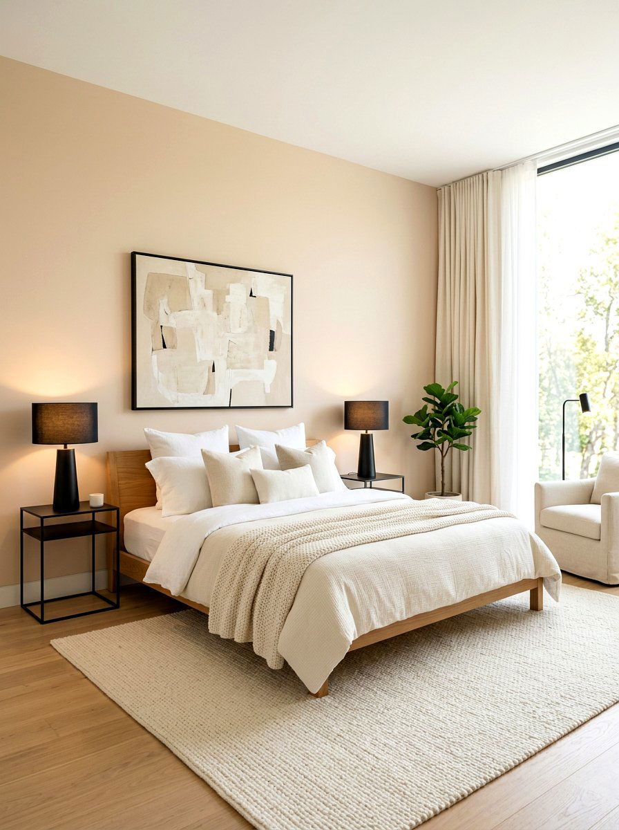
3. Greige Primary Bedroom
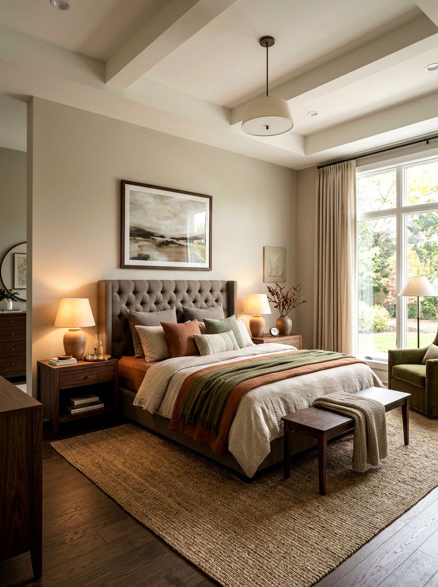
Designing a primary bedroom with a warm greige palette provides the ultimate sanctuary for rest and relaxation. Greige perfectly balances the modern appeal of gray with the cozy undertones of beige, making it incredibly versatile for various bedding and decor styles. In a bedroom setting, this neutral tone creates a calm atmosphere that helps quiet the mind before sleep. You can enhance the warmth by adding layers of textured fabrics, such as a chunky knit throw or quilted shams in complementary earthy hues. This color thrives under soft, warm lighting, turning your private suite into a peaceful retreat that feels sophisticated without being overly dark or moody.
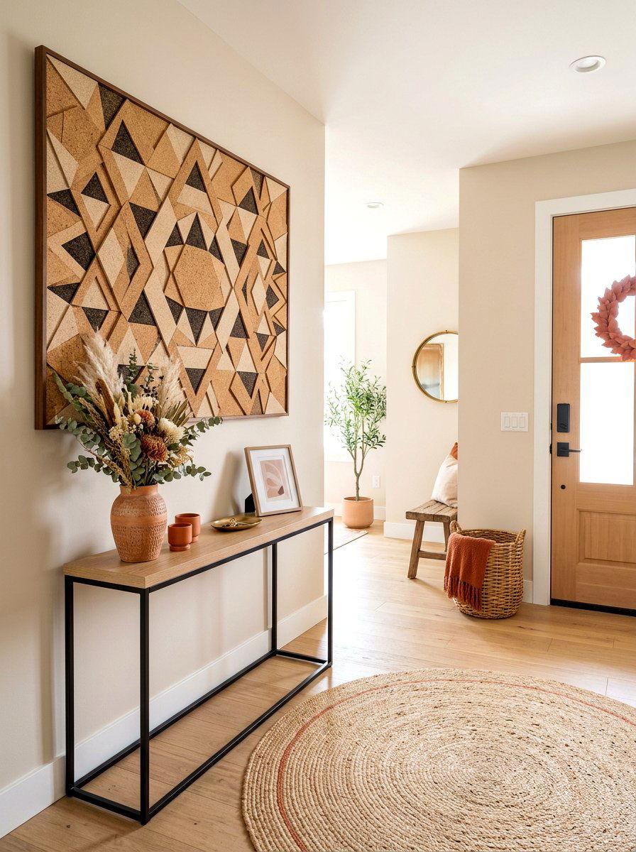
4. Sandy Neutral Entryway
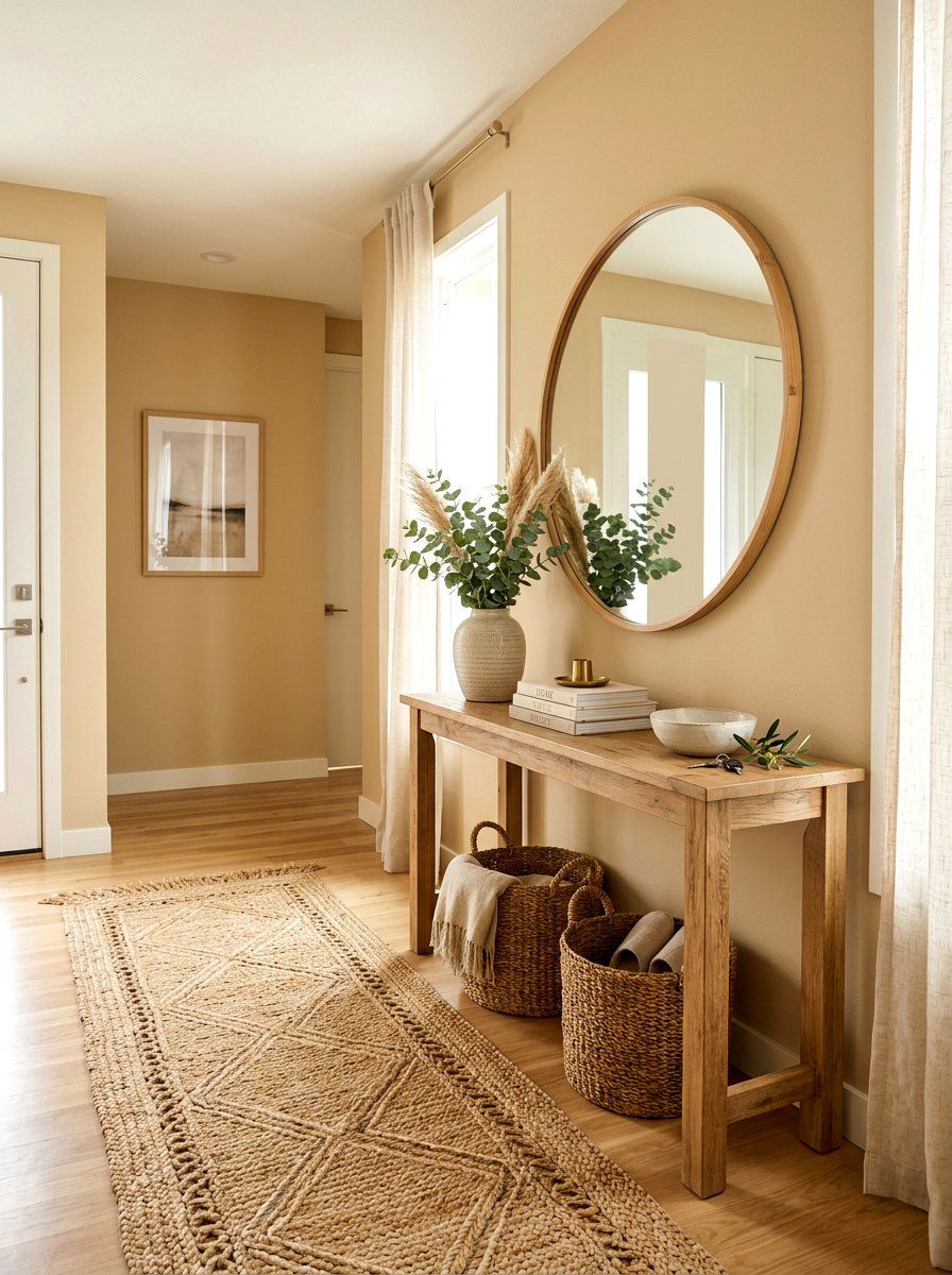
Creating a first impression with a sandy neutral entryway sets an inviting tone for the rest of your home. This earth-inspired color mimics the natural beauty of the outdoors, bridging the gap between your exterior landscape and interior design. A warm sand tone is practical for high-traffic areas because it hides minor scuffs and dust better than pure white. When paired with a natural wood console table and a jute rug, the space feels grounded and organic. The warm undertones ensure that your hallway feels bright and cheerful, welcoming you and your guests with a gentle glow that transitions perfectly into any adjacent room.
5. Soft Beige Home Office
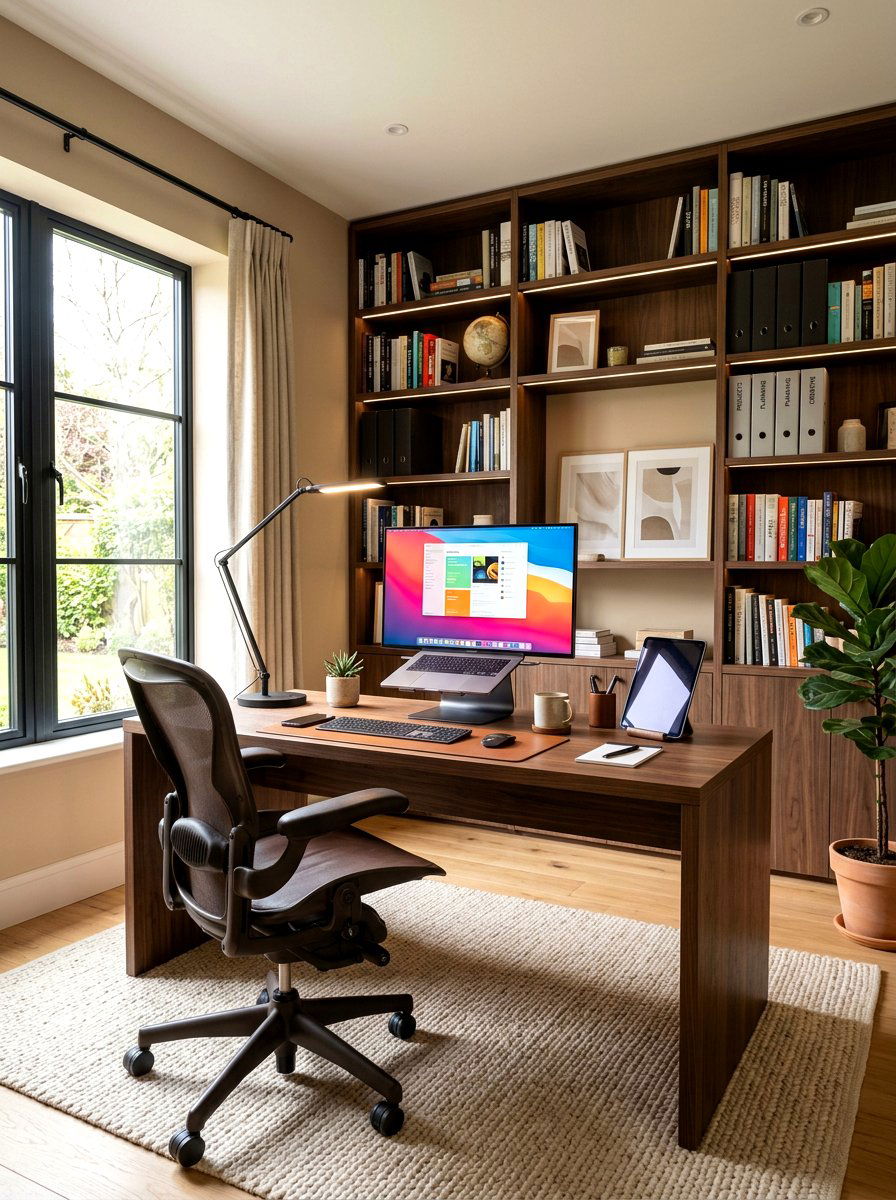
Boosting your productivity starts with a soft beige home office that feels both professional and comfortable. Moving away from harsh office whites allows the eyes to rest, reducing fatigue during long hours of work. A warm beige provides a steady, calm background that doesn't distract from your tasks while still making the room feel personal. This color works beautifully with dark wood desks or modern black metal furniture, providing a necessary contrast that looks curated. By adding indoor plants and soft lighting, your workspace becomes a balanced environment where creativity can flourish without the clinical feel often found in many traditional corporate office settings.
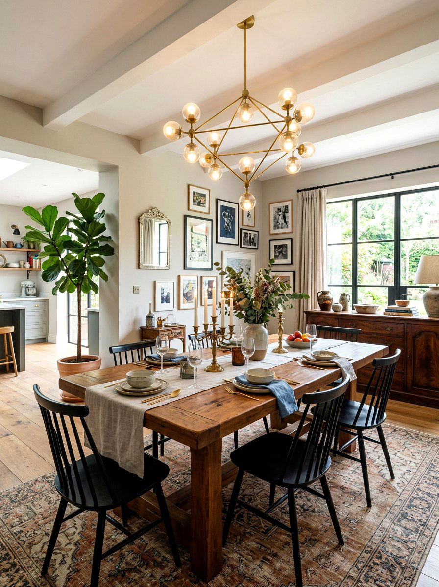
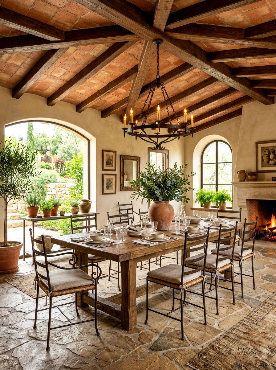
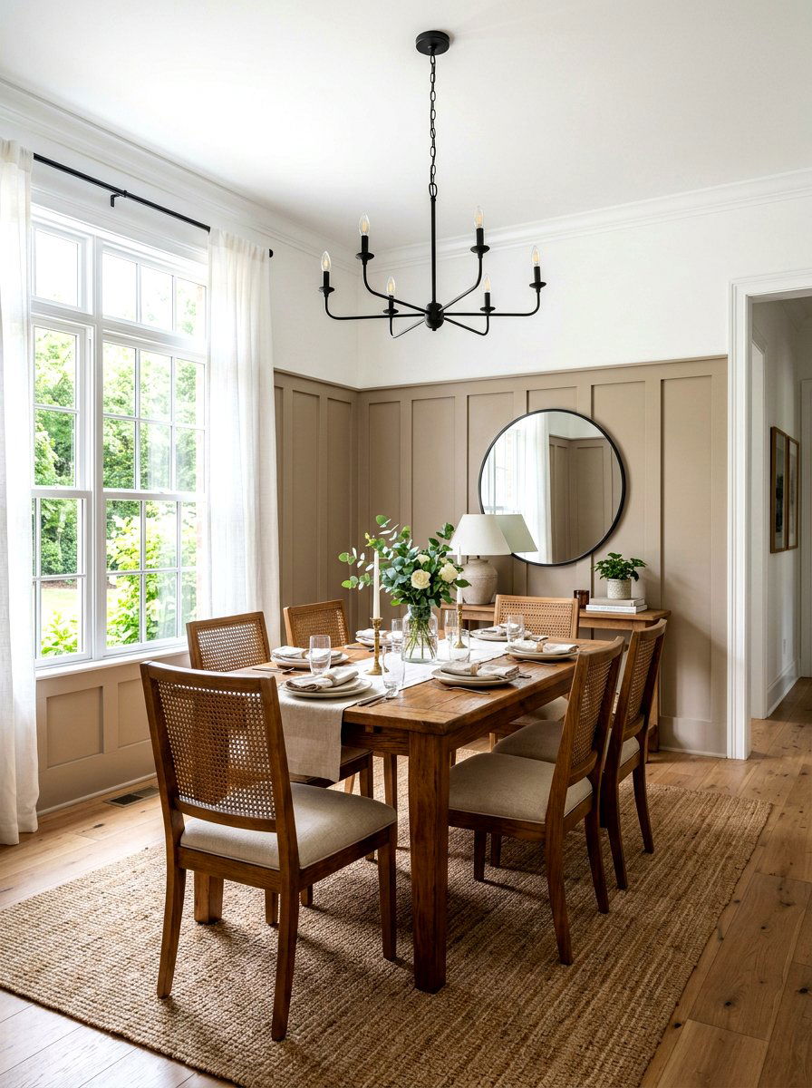
6. Muted Taupe Dining Room
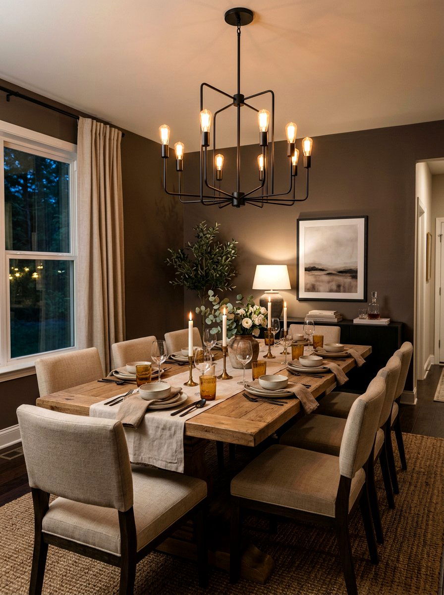
Hosting dinner parties in a muted taupe dining room creates an atmosphere of refined intimacy and classic charm. Taupe is a deeper neutral that carries hints of purple or brown, offering more visual interest than a standard beige. It provides a stunning backdrop for a large wooden dining table and upholstered chairs, making the furniture pieces stand out as focal points. In the evening, the walls take on a richer, more enveloping quality under the glow of a chandelier or candlelight. This sophisticated color choice ensures your dining area feels warm and substantial, providing a perfect setting for long conversations and memorable meals with friends.
7. Warm Gray Nursery
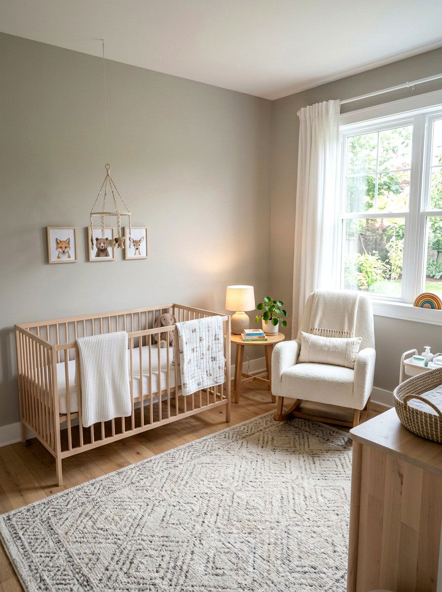
Preparing a warm gray nursery offers a modern yet soothing environment for your little one to grow and play. While many grays can feel cold, choosing a version with warm yellow or brown undertones ensures the room stays cozy and bright. This versatile neutral serves as the perfect canvas for pops of color in toys, wall art, or patterned rugs. It creates a timeless look that can easily transition as your child gets older, saving you from frequent repainting. Pairing the warm gray walls with light wood cribs and soft white textiles creates a serene, gender-neutral space that feels incredibly fresh, clean, and safe.
8. Off White Sunroom
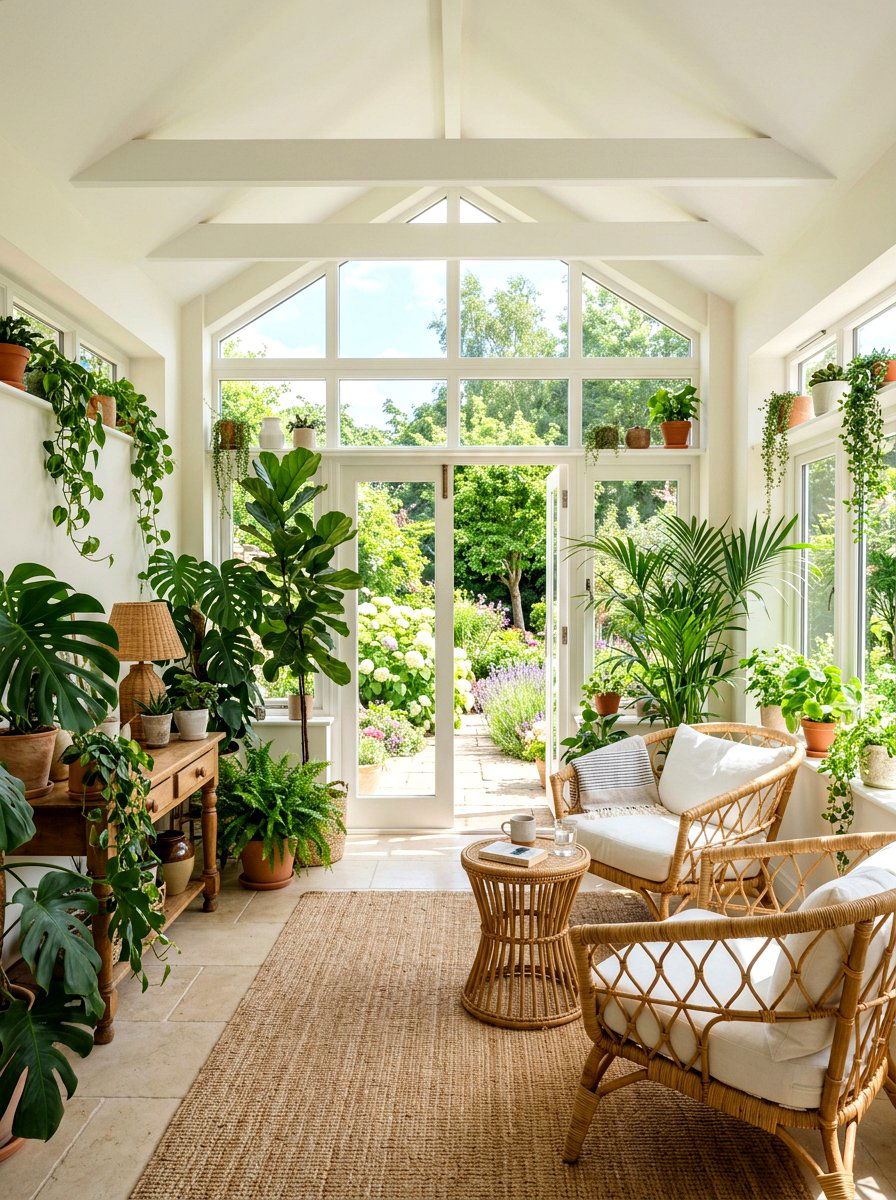
Maximizing the brightness of an off white sunroom allows you to enjoy the beauty of the outdoors from the comfort of your home. Selecting an off-white with warm undertones prevents the large amount of natural light from feeling blinding or blue-toned. This choice enhances the sunshine, making the room feel like a permanent summer afternoon even on cloudy days. You can fill the space with wicker furniture, leafy green plants, and light-colored cushions to emphasize the airy, organic aesthetic. The warm white walls act as a quiet frame for the views outside, ensuring the focus remains on the garden while maintaining a cozy interior atmosphere.
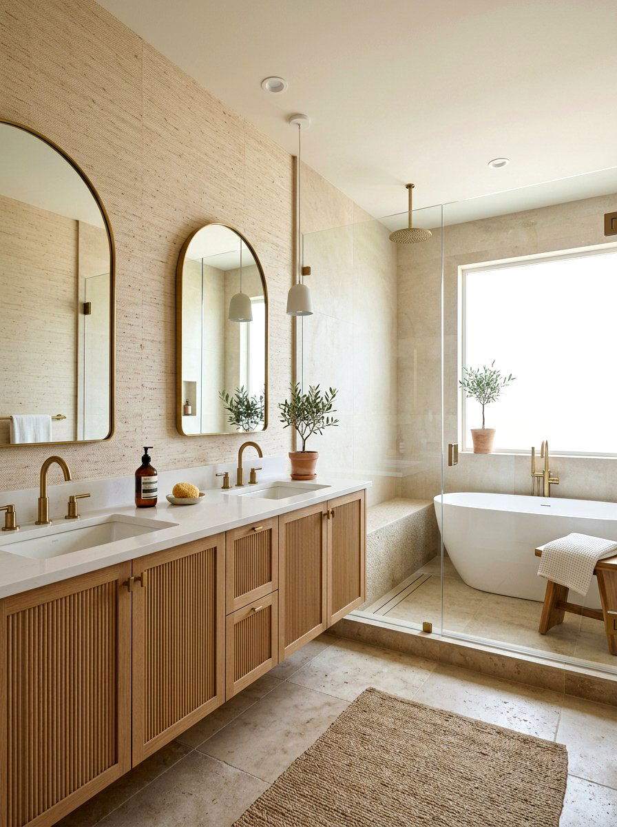
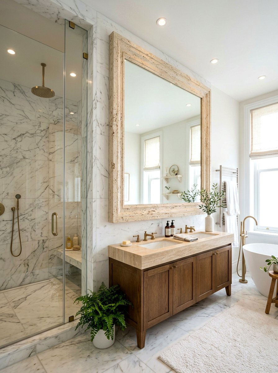
9. Earthy Neutral Bathroom
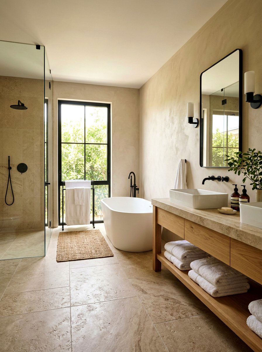
Transforming your bathroom into an earthy neutral spa provides a daily retreat for self-care and relaxation. Colors inspired by clay, stone, and natural minerals bring a grounded energy to the space, making it feel more like a high-end resort. These warm tones pair exceptionally well with textured tiles, wooden vanities, and matte black or copper fixtures. A warm neutral palette in the bathroom feels clean without the starkness of clinical white, creating a more flattering light for morning routines. By incorporating soft towels and organic bath mats, you complete a look that is both visually stunning and physically comforting for your daily hygiene rituals.
10. Champagne Toned Hallway
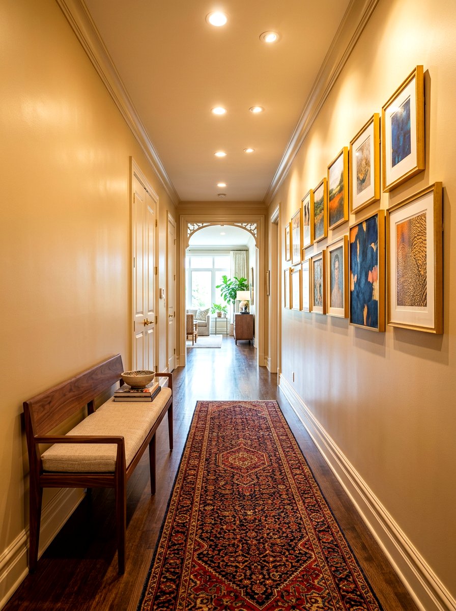
Brightening up a long, narrow space with a champagne toned hallway adds a touch of luxury and light to your home’s transitions. Champagne is a sophisticated neutral that carries a subtle shimmery quality, reflecting light beautifully in areas that often lack windows. This color makes a hallway feel wider and more expansive, preventing it from becoming a dark or forgotten part of the house. You can accentuate the warmth by hanging gallery walls with gold or wooden frames, which catch the light and add personality. This elegant choice ensures that every step through your home feels intentional, bright, and curated with a sense of high-end style.
11. Tan Mudroom
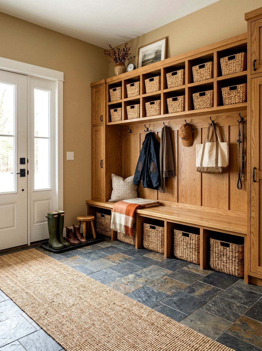
Organizing a busy household becomes more stylish with a tan mudroom that balances functionality with a welcoming aesthetic. Tan is an excellent warm neutral for entry points because it handles the wear and tear of daily life with grace. It provides a grounded backdrop for built-in cubbies, benches, and hooks, making the organizational elements look integrated and intentional. When paired with slate floors or brick accents, the tan walls create a rustic yet modern farmhouse feel. This color choice ensures the transition from the outdoors feels natural, providing a warm and tidy space to drop bags and kick off shoes after a long day.
12. Ivory Guest Bedroom
Welcoming visitors with an ivory guest bedroom shows a thoughtful attention to comfort and classic design. Ivory is softer than pure white and more luminous than beige, creating a room that feels instantly clean and high-end. It offers a versatile base that allows you to swap out seasonal decor or colorful accents easily to suit different guests. Layers of white and cream bedding against ivory walls create a monochromatic look that is deeply relaxing and luxurious. This timeless neutral ensures that your guests feel like they are staying in a boutique hotel, providing a serene environment where they can truly rest and feel at home.
13. Light Greige Laundry Room
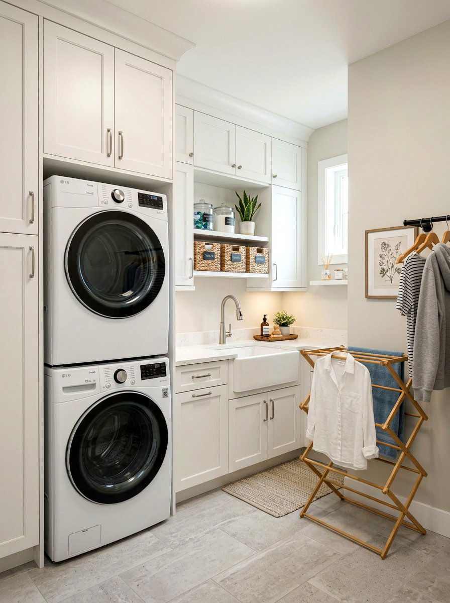
Elevating a utilitarian space with a light greige laundry room makes daily chores feel much more pleasant and organized. Light greige is the perfect choice for small, often windowless rooms because it keeps things bright while adding a touch of sophisticated warmth. It pairs beautifully with white cabinetry and stainless steel appliances, creating a clean and modern look that doesn't feel sterile. The subtle warmth of the paint makes the space feel more like a finished part of the home rather than just a workspace. Adding woven baskets and wooden shelving further enhances the inviting atmosphere, proving that even a laundry area can be beautiful and cozy.
14. Warm Stone Living Space
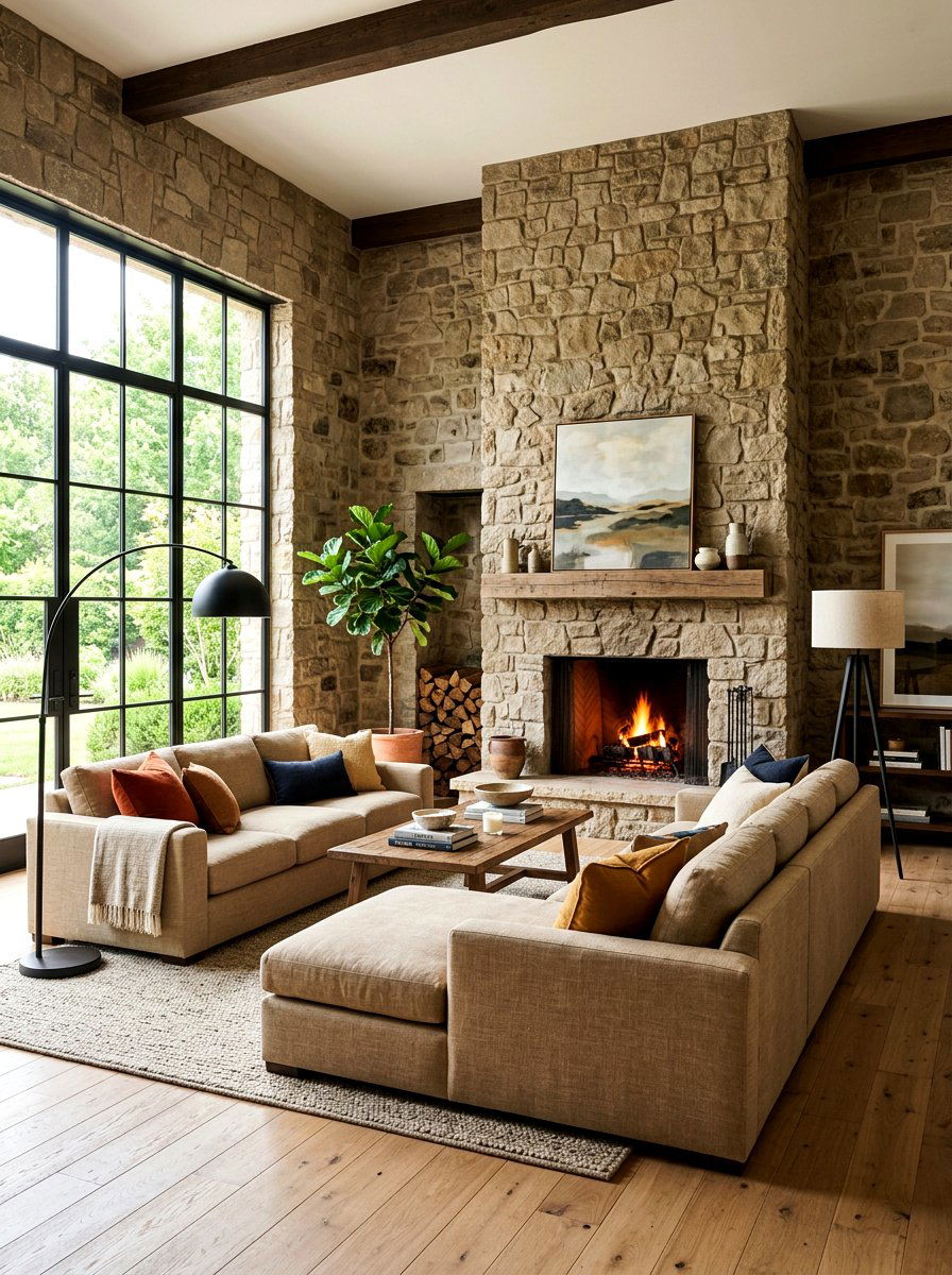
Embracing a warm stone living space brings an architectural and grounded feel to the heart of your home. This medium-toned neutral mimics the natural hues found in limestone or travertine, offering a sense of permanence and strength. It works particularly well in open-concept homes where you want a cohesive color that flows naturally from one area to another. The warm stone tone provides a beautiful contrast against white trim and dark flooring, creating a balanced visual hierarchy. By incorporating plush furniture and soft area rugs, you can soften the "stony" look, resulting in a sophisticated environment that feels both sturdy and incredibly comfortable for family life.
15. Oatmeal Family Room
Creating a cozy hub for your household with an oatmeal family room offers a perfect blend of comfort and durability. Oatmeal is a rich, textured neutral that feels substantial and inviting, making it ideal for spaces where people gather to watch movies or play games. This color hides minor imperfections and everyday mess better than lighter shades, which is essential for active families with children or pets. It pairs effortlessly with leather sofas, knit blankets, and dark wood accents. The warm, grainy undertones of oatmeal paint create a snug atmosphere that encourages lounging, making your family room the most popular and lived-in spot in the entire house.
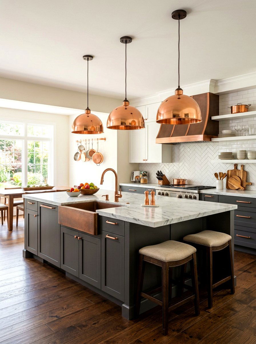
16. Mushroom Kitchen
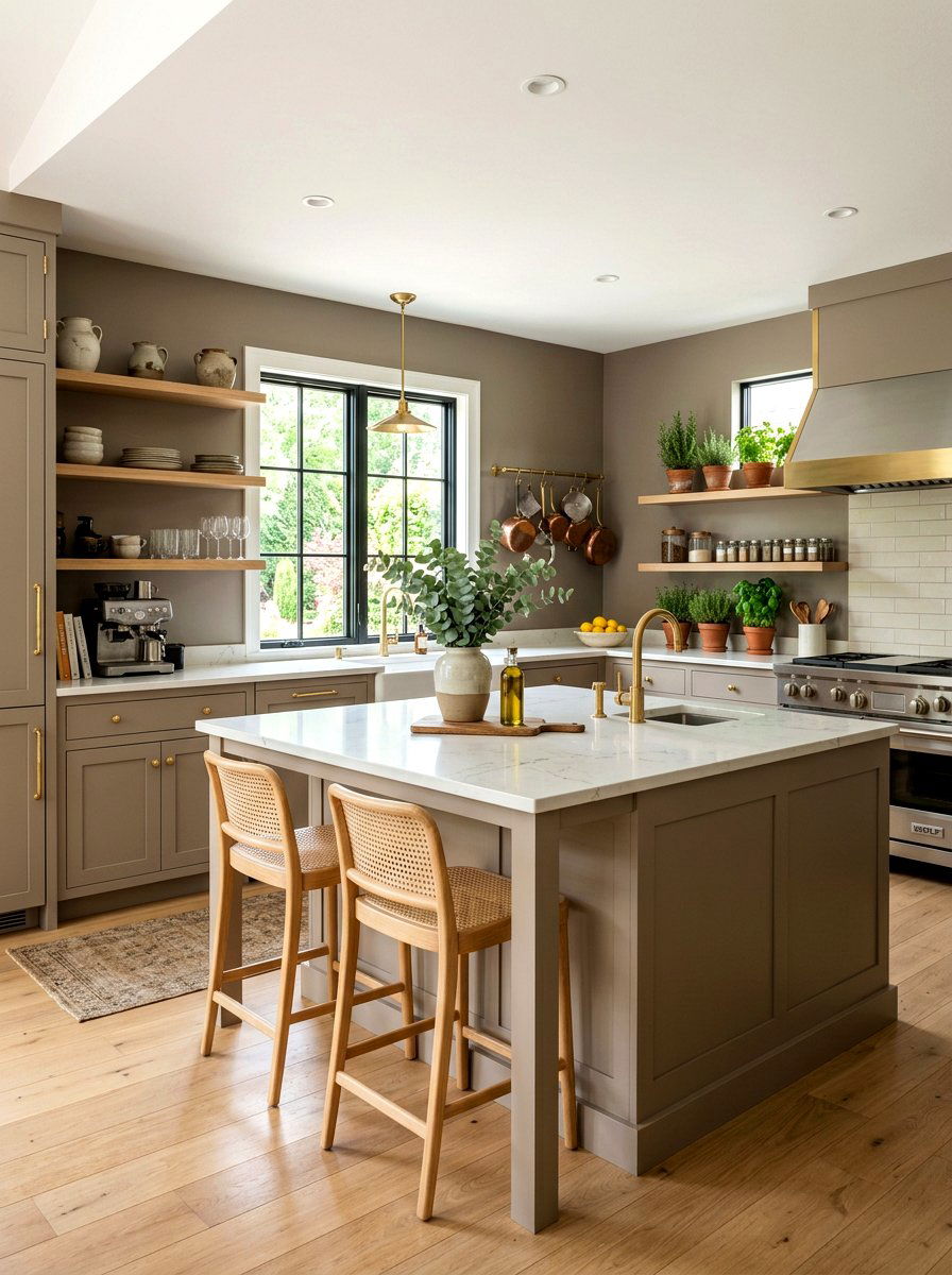
Updating your culinary space with a mushroom kitchen provides a trendy yet timeless look that feels deeply organic. Mushroom is a unique neutral that sits between gray, brown, and taupe, offering a sophisticated depth that changes beautifully throughout the day. This color is perfect for kitchen islands or full cabinetry, providing a soft contrast to white tiled backsplashes or light stone counters. It feels grounded and earthy, making the kitchen feel like a natural extension of a garden-inspired home. Pairing mushroom tones with unlacquered brass hardware and wooden open shelving creates a high-end, designer aesthetic that is currently dominating modern interior design trends for a reason.
17. Buff Primary Suite
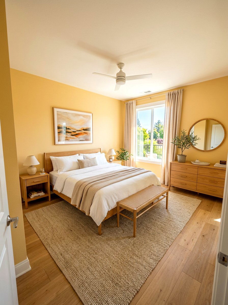
Designing a buff primary suite introduces a soft, golden-tan warmth that feels like a permanent sunrise in your bedroom. Buff is a lighter, sunnier version of beige that adds an uplifting energy to a private space without being overwhelming. It works exceptionally well in rooms that receive limited natural light, as the warm undertones help to brighten the walls artificially. You can style this space with white linens and light oak furniture to maintain a fresh, airy feeling. The gentle glow of buff paint creates a serene backdrop for sleep and morning routines, ensuring your primary suite remains a cheerful and restorative haven every single day.
18. Soft Clay Reading Nook
Carving out a quiet corner with a soft clay reading nook adds a touch of earthy character and artistic flair to your home. Clay-toned neutrals carry subtle pink or terracotta undertones, providing a more unique and soulful feeling than standard tans. This color creates a cocoon-like effect that is perfect for tucking into a comfortable armchair with a good book. It pairs beautifully with warm wood bookshelves and floor lamps with linen shades. The richness of the clay color makes a small space feel special and intentional, turning a neglected corner into a cozy destination that invites you to slow down and enjoy a peaceful moment.
19. Almond Bedroom
Refreshing your personal space with an almond bedroom offers a delicate and creamy atmosphere that is perfect for modern relaxation. Almond is a sophisticated neutral with a hint of warmth that feels smoother and more refined than traditional beige. It provides a clean, minimalist backdrop that looks stunning with both contemporary and vintage furniture styles. When paired with crisp white bedding and soft, layered lighting, the room feels incredibly spacious and light. The subtle warmth of almond paint prevents the space from feeling cold, ensuring that your bedroom remains a welcoming environment that feels both high-end and deeply comfortable for a good night’s rest.
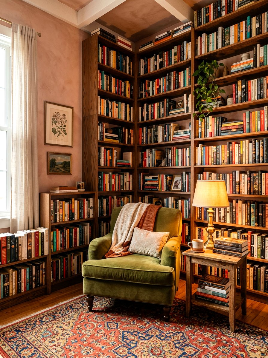
20. Parchment Library
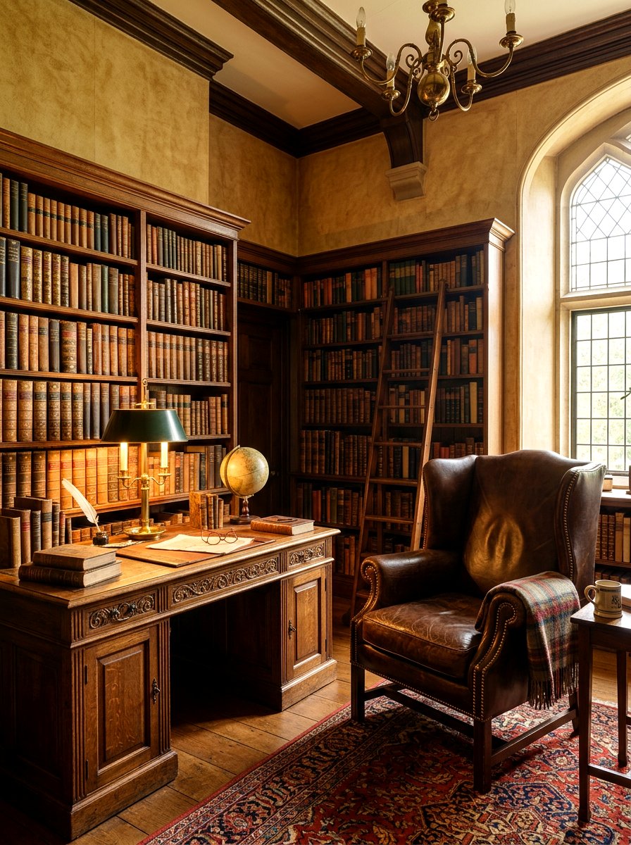
Transforming a study or home office into a parchment library creates a space that feels academic, historic, and incredibly cozy. Parchment is a deep, aged neutral that mimics the look of old paper or vellum, adding instant soul and character to any room. It provides a stunning background for walls lined with books, as the warm tones complement the varied colors of book spines. This color thrives in spaces with soft lamps and comfortable leather seating, creating an environment that feels intellectual yet approachable. A parchment-colored library becomes the perfect sanctuary for deep focus, writing, or simply enjoying the quiet ambiance of a well-designed home workspace.
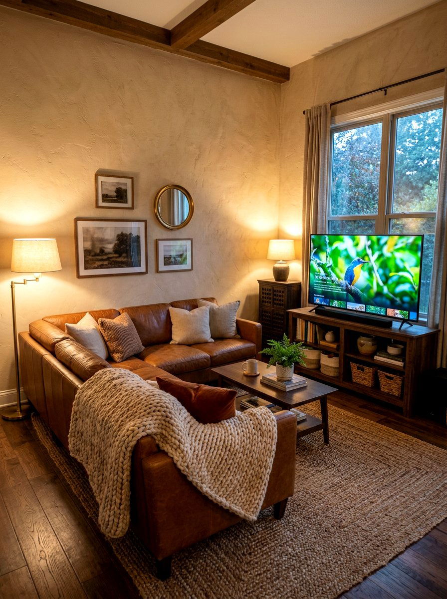
21. Warm Pewter Den
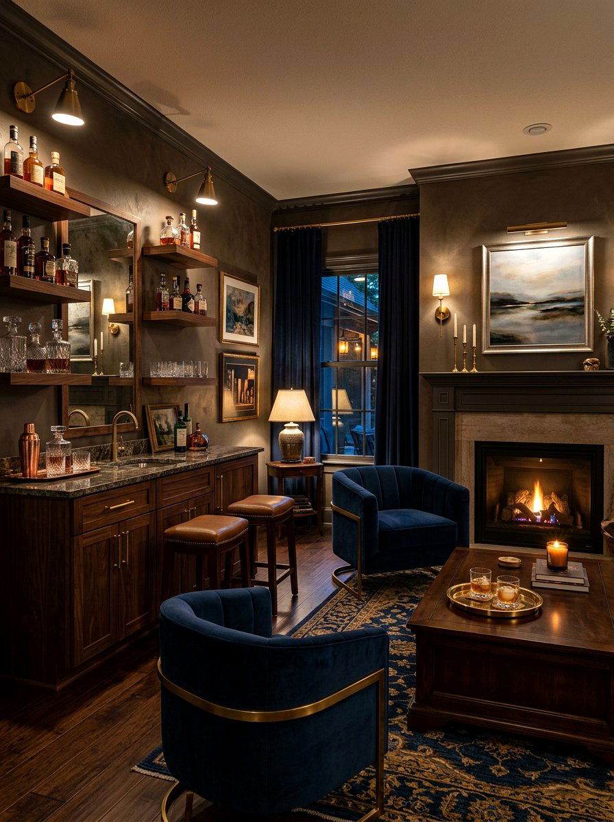
Creating a moody and masculine retreat with a warm pewter den offers a sophisticated way to use deeper neutrals. Pewter is a darker greige that carries significant warmth, preventing it from feeling like a standard cold gray. This color is excellent for cozy media rooms or "man caves" where you want a sense of enclosure and intimacy without the room feeling blacked out. It pairs beautifully with dark wood cabinetry, navy blue accents, and metallic finishes like silver or pewter. The depth of the color makes the space feel substantial and high-end, providing a perfect backdrop for relaxing in front of the television or enjoying a quiet evening.
22. Cotton White Breakfast Nook
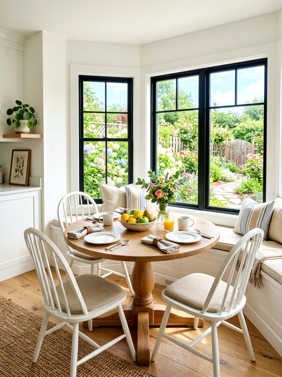
Starting your morning in a cotton white breakfast nook provides a fresh and energizing start to every single day. Cotton white is a crisp neutral with just enough warmth to feel soft rather than sharp, making it ideal for smaller dining areas. It maximizes the morning sun, making your breakfast spot feel bright and cheerful even during the winter months. You can pair this color with a wooden bistro table, colorful seat cushions, and fresh flowers to create a charming, cottage-inspired look. The clean walls act as a perfect frame for the view outside your window, ensuring your morning coffee is enjoyed in a light-filled and beautiful environment.
23. Bisque Open Concept
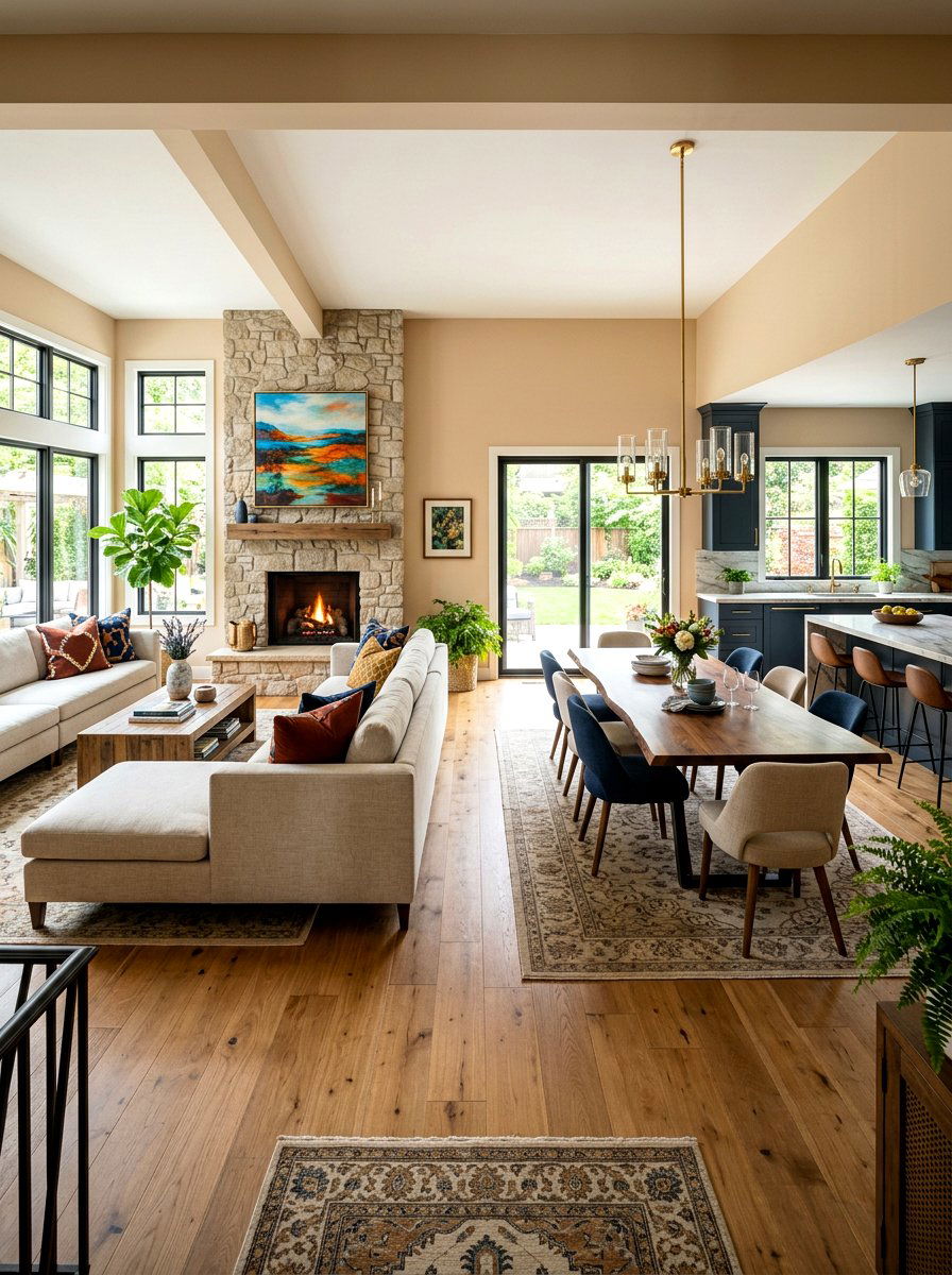
Applying a bisque open concept palette ensures a seamless and warm flow throughout the main living areas of your home. Bisque is a smooth, light tan that bridges the gap between different functional zones without creating harsh visual breaks. In a large open-plan space, this color provides a consistent and calming backdrop that ties together the kitchen, dining, and living rooms. It works well with various flooring types, from light oak to dark walnut, maintaining a balanced aesthetic across the entire floor. By using a single warm neutral like bisque, you create a sense of cohesion and spaciousness that makes your home feel much more unified and designed.
24. Linen Studio
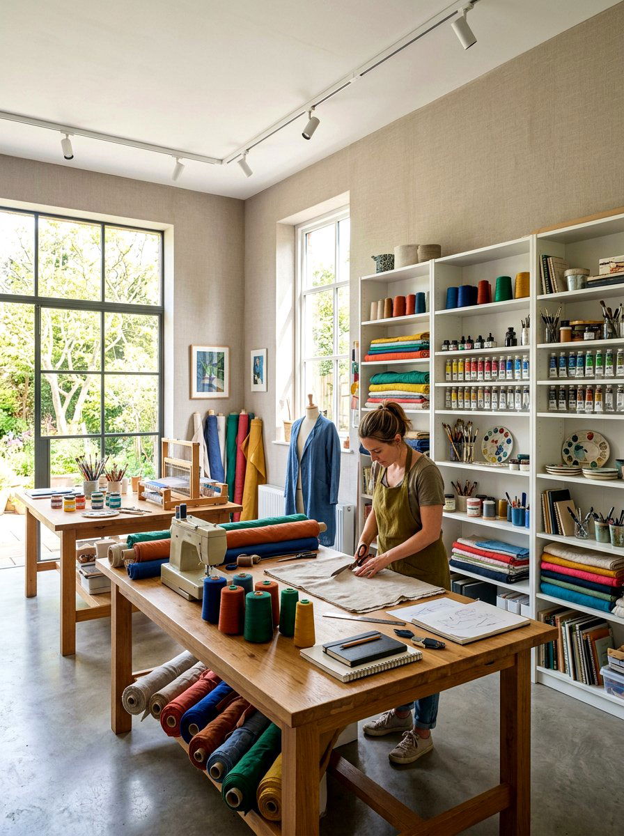
Designing a linen studio provides a clean and creative environment that feels like a fresh start for any project or hobby. Linen is a classic neutral that carries the textured feel of natural fabric, offering a soft and breathable aesthetic for a workspace. It provides a neutral base that doesn't compete with colorful art supplies, fabrics, or designs, making it ideal for artists and crafters. The warmth of the paint ensures the studio feels like a comfortable room rather than a cold garage or basement. Adding open shelving and ample task lighting further enhances the functionality while keeping the space feeling light, airy, and full of creative potential.
25. Warm Sand Sunroom
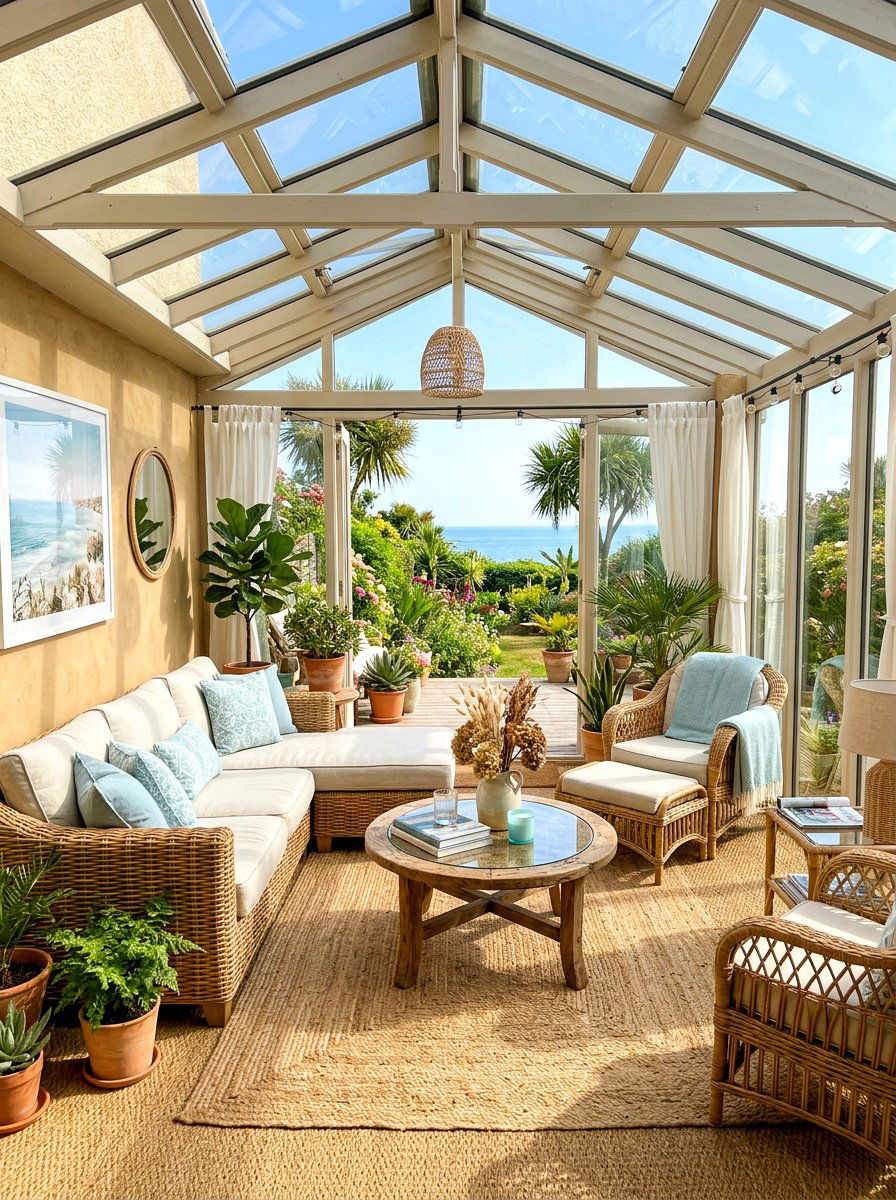
Bringing the beachy vibes indoors with a warm sand sunroom creates a vacation-like atmosphere in your own home all year round. This color perfectly captures the essence of sun-drenched coastal dunes, making any room feel more relaxed and informal. It pairs beautifully with natural textures like seagrass rugs, rattan furniture, and airy linen curtains. The warm sand tone glows under the afternoon sun, emphasizing the connection to the outdoors and making the sunroom feel like an organic extension of the landscape. It is a timeless and cheerful choice that turns a glass-walled room into a bright, inviting sanctuary for reading, napping, or simply enjoying the daylight.
26. Khaki Media Room
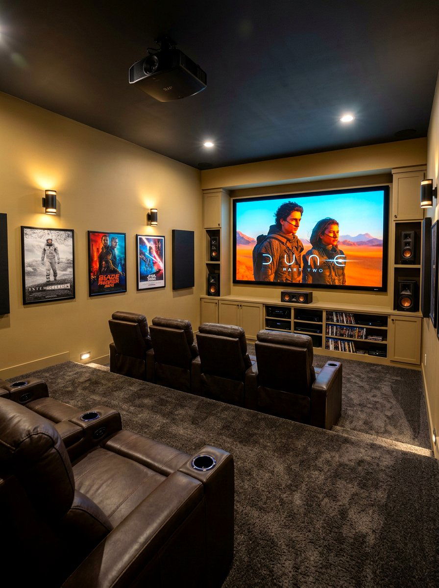
Setting up a khaki media room offers a smart and cozy alternative to the typical dark-painted home theaters. Khaki is a mid-toned warm neutral that provides enough depth to reduce glare on the screen while still keeping the room feeling lived-in and comfortable. It creates a snug, enveloping feeling that is perfect for movie marathons without being as dramatic as black or charcoal. This color looks great with oversized plush seating, textured carpets, and dimmable sconce lighting. The earthy warmth of khaki makes the media room feel like a cozy den, providing a versatile space that works just as well for daytime lounging as it does for evening entertainment.
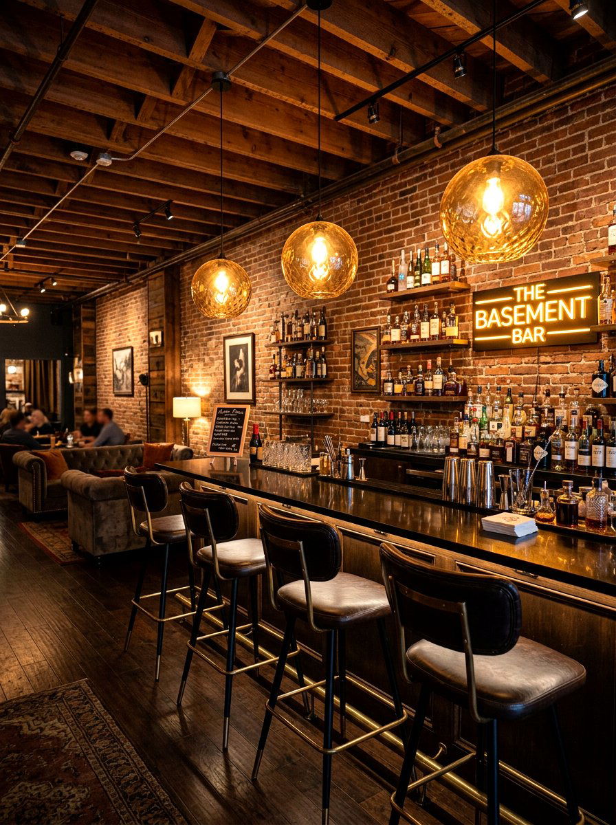
27. Putty Basement

Brightening up a lower-level space with a putty basement transformation makes a subterranean area feel like a high-end part of the home. Putty is a sophisticated neutral that blends gray and beige with a slight greenish or earthy undertone, helping to ground a room that lacks natural light. This color adds character and depth to large, open basement layouts, preventing them from feeling like unfinished storage spaces. When paired with light-colored flooring and plenty of artificial light sources, the putty walls create a warm and finished look. It is a durable and stylish choice that can handle the multipurpose needs of a modern family basement area.
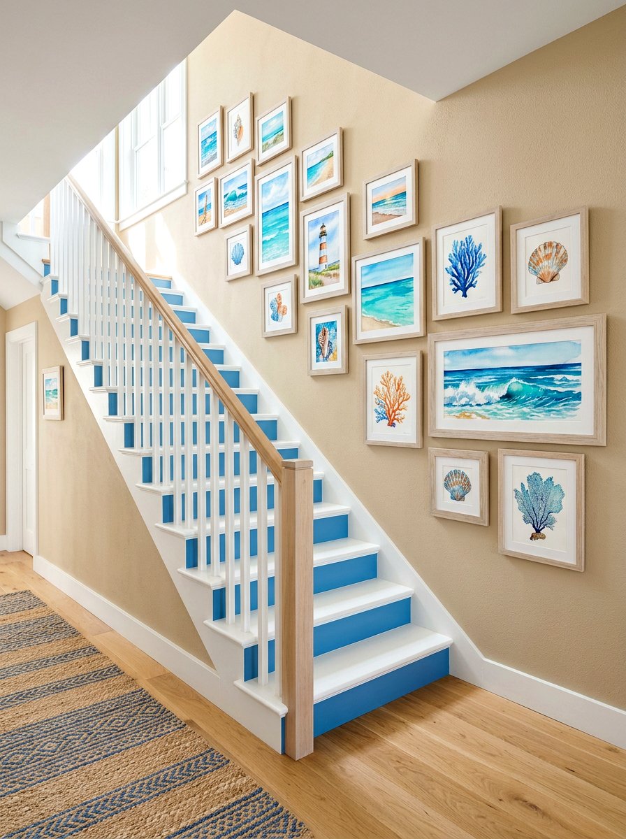
28. Creamy Staircase
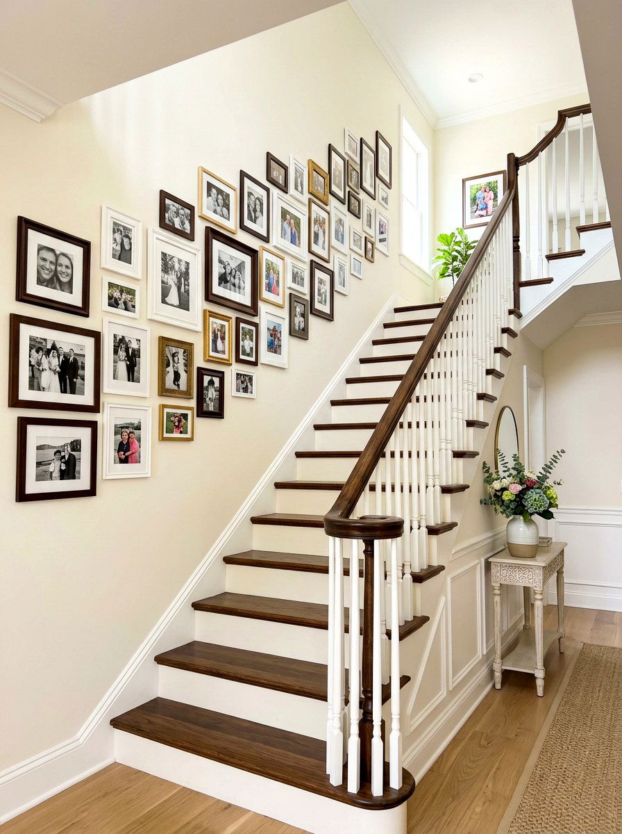
Enhancing the architectural heart of your home with a creamy staircase creates a beautiful and bright transition between floors. Using a warm, creamy neutral on the walls and trim of a stairwell prevents these often-narrow spaces from feeling cramped or dark. It reflects light down the hallway, making the entire vertical space feel more open and grand. You can accentuate the design by pairing the cream paint with dark wood handrails or wrought iron spindles for a classic, high-contrast look. This simple color choice ensures that moving through your home feels like a bright and pleasant experience, highlighting the craftsmanship and layout of your interior architecture perfectly.
29. Soft Fawn Kids Room
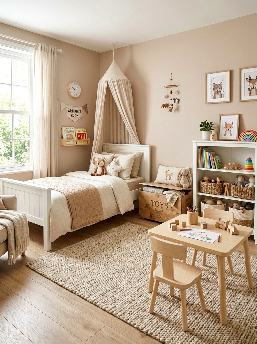
Designing a soft fawn kids room offers a gentle and timeless aesthetic that grows with your child through the years. Fawn is a light, grayish-brown neutral that feels incredibly soft and nurturing, providing a calm environment for sleep and play. It serves as a sophisticated alternative to typical primary colors, allowing you to add personality through colorful bedding, wall decals, and toys. This warm tone works well with light wood furniture and soft white accents, creating a space that feels clean and organized. The versatility of a fawn palette ensures the room remains stylish from the toddler years through the teenage years without needing a complete overhaul.
30. Warm Vanilla Playroom
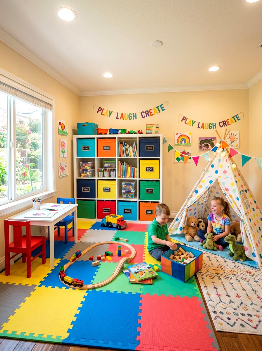
Creating a cheerful and bright warm vanilla playroom provides the perfect backdrop for imagination and active play. Vanilla is a sunny, creamy neutral that makes a space feel happy and energetic without being visually overwhelming for children. It reflects light beautifully, ensuring the room stays bright even when filled with colorful toy bins and play mats. This color choice keeps the playroom feeling like a cohesive part of the rest of the house, rather than a separate zone of chaos. By adding soft rugs and comfortable seating, you create a space where kids feel inspired to play and parents feel comfortable spending time together as a family.
Conclusion:
Choosing the right warm neutral paint can completely transform the atmosphere of your home, turning cold spaces into inviting retreats. These thirty ideas demonstrate how versatile tones like cream, beige, greige, and taupe can be applied to every room to create a cohesive and stylish environment. By understanding the undertones and how they interact with your specific lighting, you can select a palette that feels both modern and timeless. Warm neutrals provide the perfect foundation for any design style, allowing you to express your personality through textures and decor. Embrace the comfort of these classic hues and enjoy a home that feels truly welcoming.
Related posts: