Two-tone walls have become a viral sensation in the world of interior design because they offer an affordable way to add architectural depth to any room. This versatile painting technique allows homeowners to play with light and shadow while defining specific zones within a home. Whether you are working with a small apartment or a sprawling estate, a dual-colored palette can instantly elevate your aesthetic from basic to bespoke. By carefully selecting contrasting or complementary hues, you can manipulate the perceived height of your ceilings and the overall warmth of your environment. This guide explores creative ways to implement this look throughout your entire home.
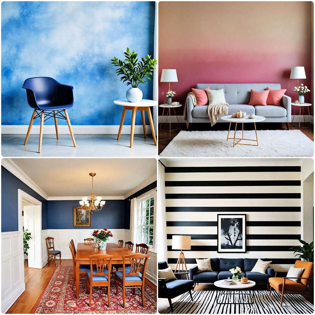
1. Living Room Horizontal Split
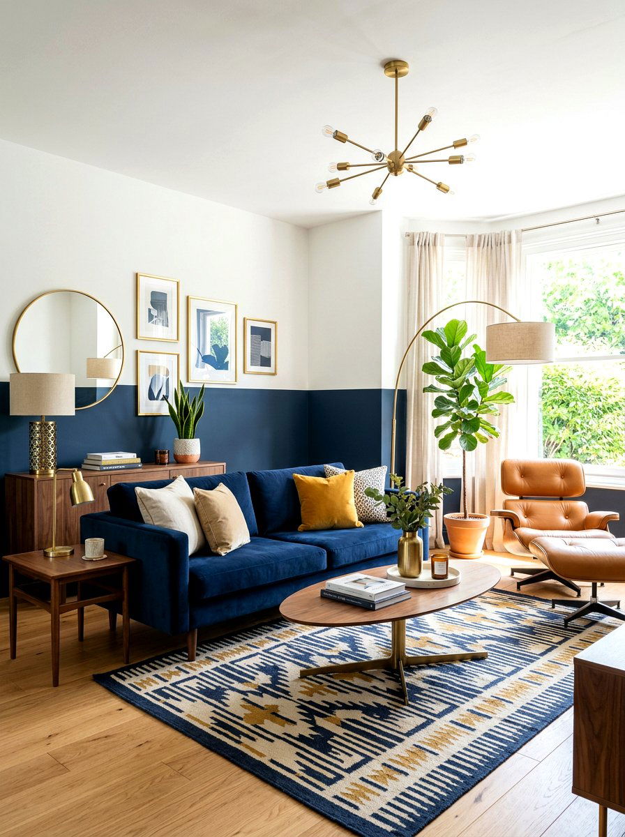
How do you make a standard living room feel instantly more architectural and grounded? Adding a horizontal split is the easiest way to transform your space without buying new furniture. By painting the bottom third of your wall a darker, moodier shade, you create a visual anchor that makes the room feel sophisticated and stable. This technique works incredibly well with high ceilings because it brings the eye level down, making a large area feel much cozier. You can use a crisp white on top to keep things airy or try a soft beige for a more tonal look. It is a timeless choice for modern homes today.
2. Bedroom Chair Rail Paint
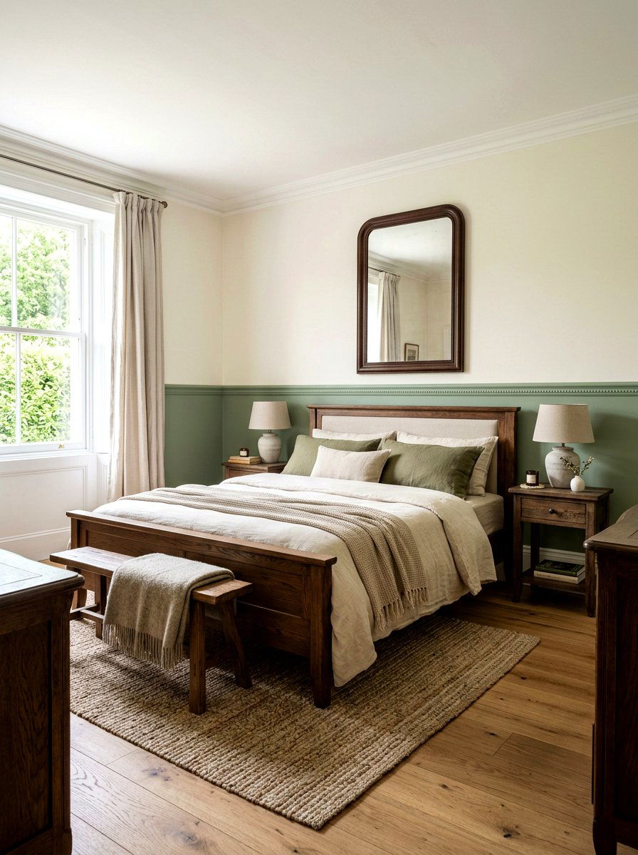
Traditional bedrooms often benefit from a classic touch that feels both high-end and nostalgic. Using a chair rail or a simple painted line to separate two colors can mimic the look of expensive millwork at a fraction of the cost. For a serene environment, try pairing a soft sage green on the bottom with a creamy off-white on the top. This combination promotes relaxation and rest, which are essential for any sleeping space. To make the look even more cohesive, consider matching your bedding textures to one of the wall colors. It creates a professional, designer-led finish that feels curated and intentional for your sanctuary.
3. Nursery Geometric Mountain Wall
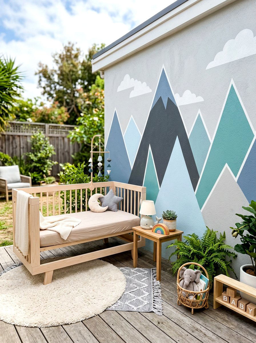
Creating a whimsical and imaginative space for a child does not require expensive wallpaper or complicated murals. A simple two-tone geometric mountain pattern can serve as a stunning focal point that grows with your child over the years. By using painter’s tape to create sharp, angular peaks in shades of dusty blue or muted terracotta, you add a playful energy to the nursery. Keep the top half of the wall a neutral light grey to represent the sky, which helps maintain a sense of calm in the room. This design is high-impact yet surprisingly easy to execute for any DIY enthusiast looking for charm.
4. Dark Painted Ceiling
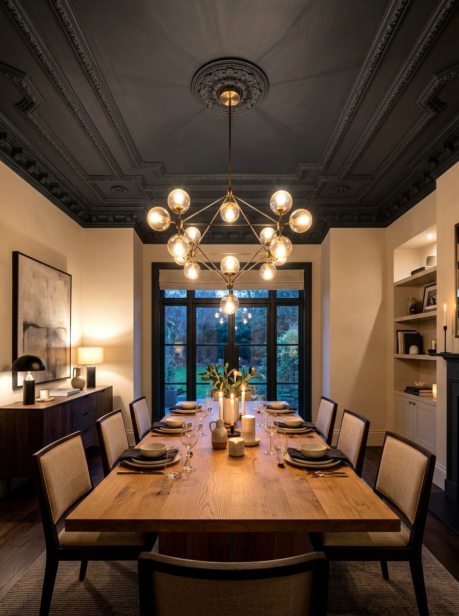
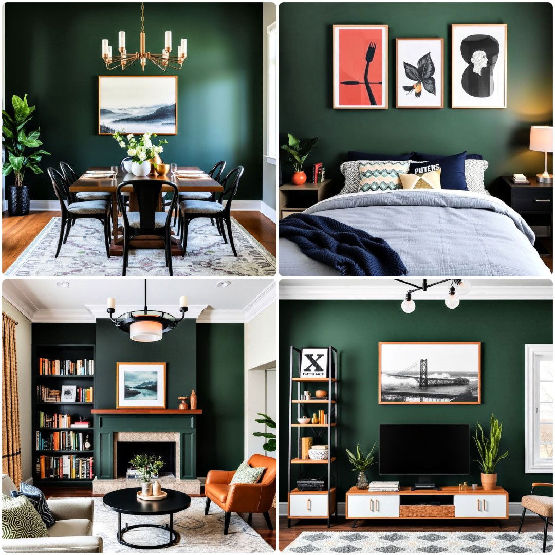
Most people forget that the ceiling is essentially a fifth wall that offers immense creative potential. Painting your ceiling a deep, dark color while keeping the walls a lighter shade is a bold move that adds instant drama. This "reverse" two-tone approach is particularly effective in dining rooms or primary suites where you want to create an intimate, cocoon-like atmosphere. Darker shades like charcoal, navy, or even forest green on the ceiling can make a room feel taller if the wall color is bright and reflects light. It is a sophisticated way to challenge traditional design norms and impress guests with your style.
5. Diagonal Split Accent Wall
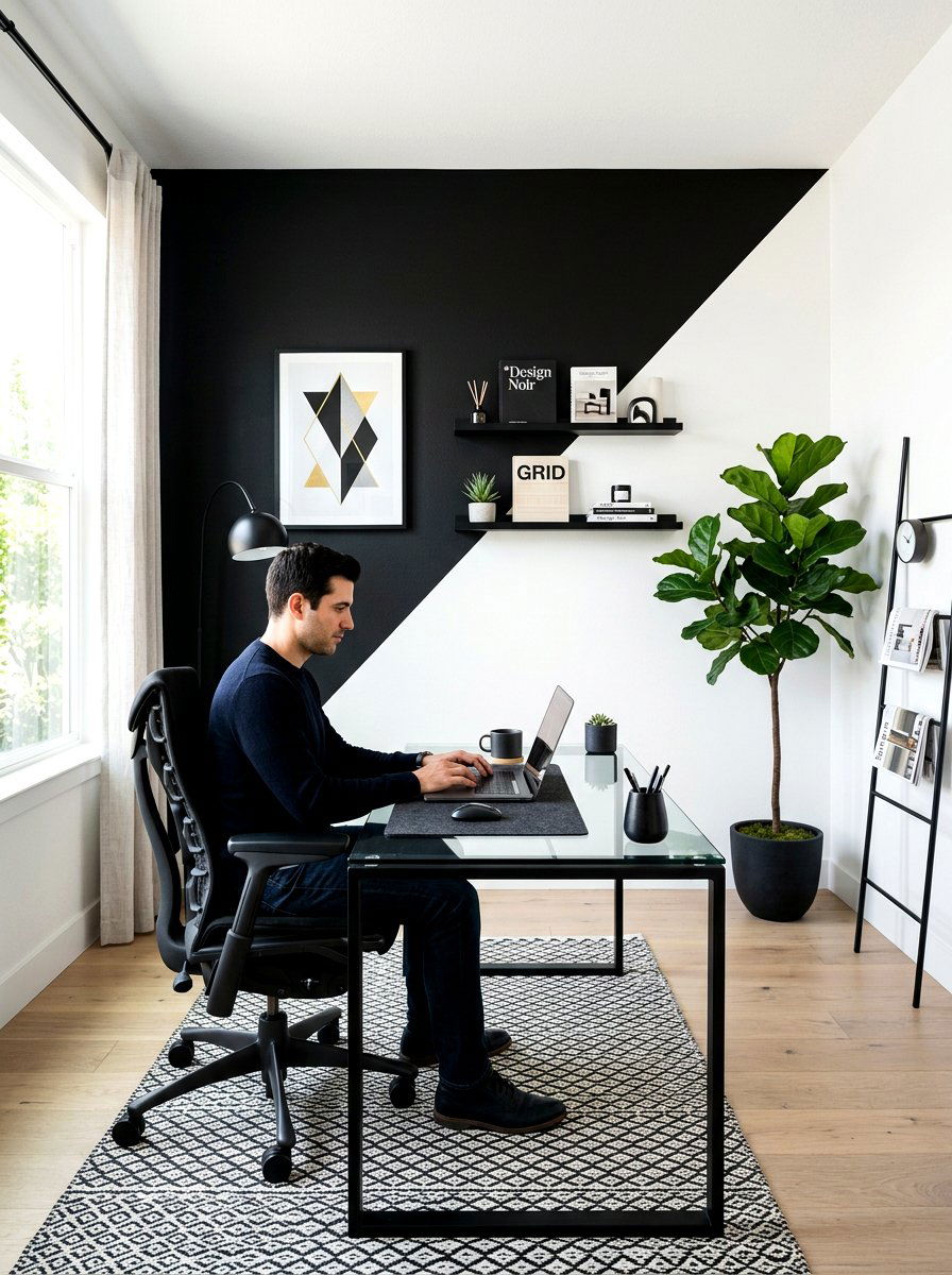
For those who prefer a more modern and edgy look, a diagonal split on an accent wall is a fantastic choice. This technique breaks up the monotony of right angles and adds a sense of movement to a home office or creative studio. You can use high-contrast colors like black and white or more subtle pairings like two shades of the same blue. The diagonal line draws the eye across the room, making the space feel dynamic and larger than it actually is. It serves as a built-in piece of art that requires nothing more than a steady hand and some high-quality masking tape.
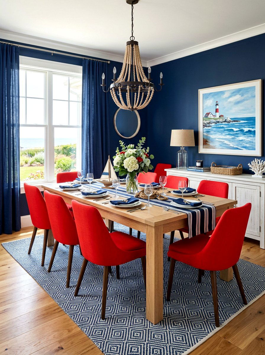
6. Dining Room Wainscoting Color
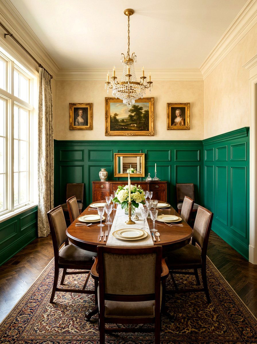
Wainscoting provides a natural boundary for two-tone paint, but you can modernize this classic look by choosing unexpected color combinations. Instead of the standard white paneling, try painting the wainscoting a deep emerald green and the wall above it a soft parchment color. This creates a luxurious backdrop for dinner parties and family gatherings. The darker color on the lower half helps hide scuff marks from chairs while providing a rich foundation for wooden furniture. It is a practical yet elegant solution for high-traffic dining areas that need a touch of formality without feeling stuffy or outdated in a modern home.
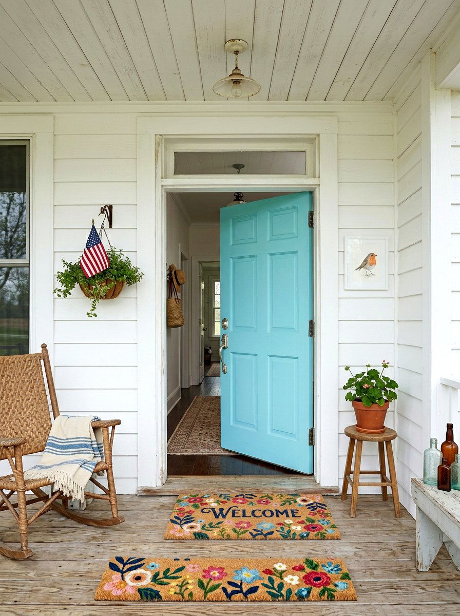
7. Entryway Painted Arch
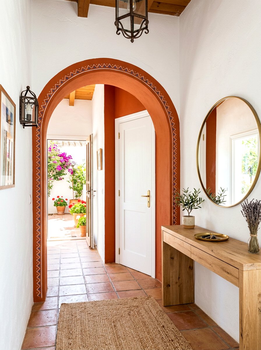
First impressions are everything, and a painted arch in your entryway can make a powerful statement. This two-tone technique involves painting a large semi-circle or arch shape around a doorway or a console table to create a focal point. Using a warm terracotta or a sunny ochre against a white wall adds a welcoming glow to the entrance of your home. It mimics the look of architectural features found in Mediterranean or Southwestern homes without the need for structural changes. This simple paint trick defines the entry zone perfectly and gives your home an artistic, boutique hotel feel the moment you walk inside.
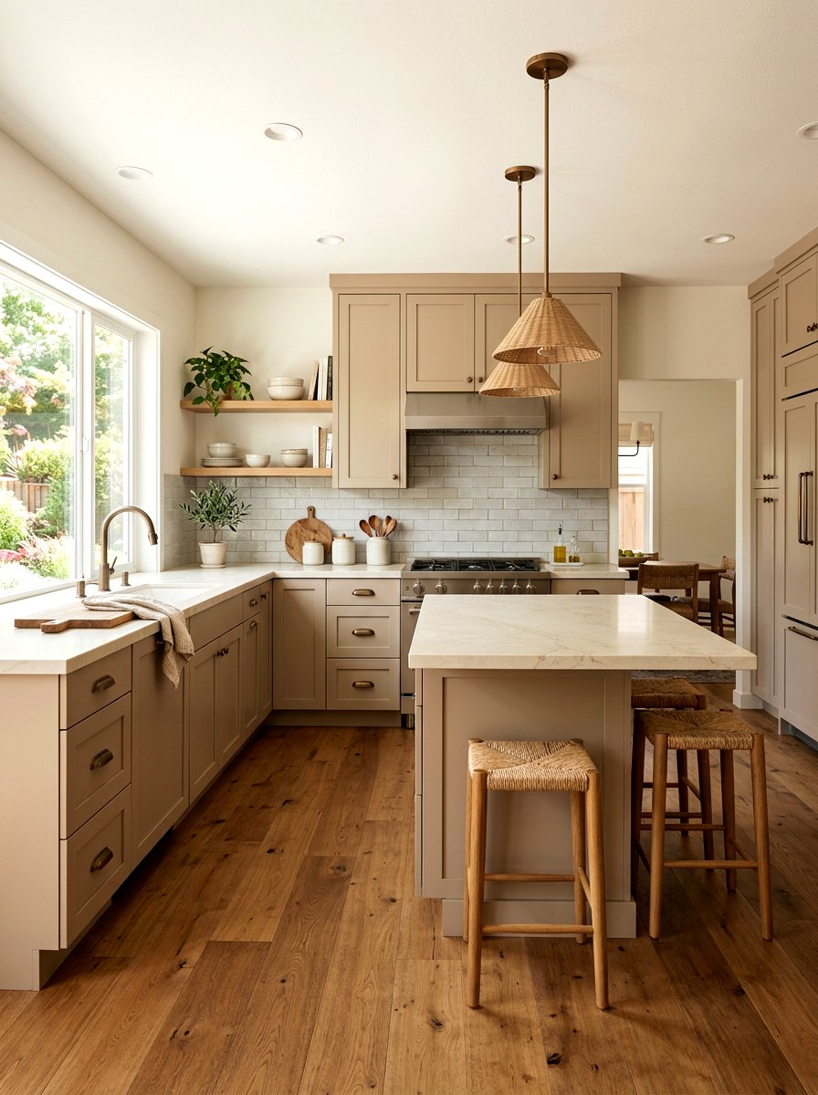
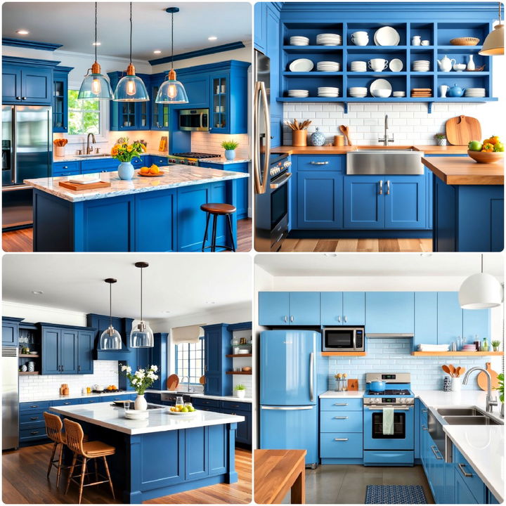
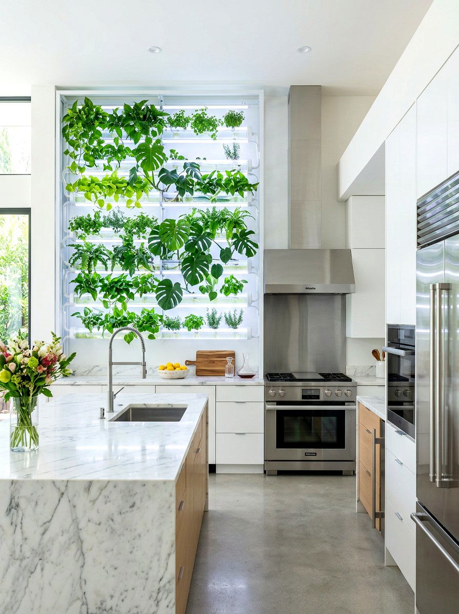
8. Kitchen Two Tone Color Scheme
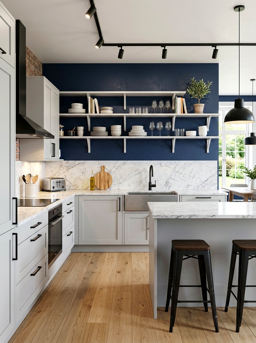
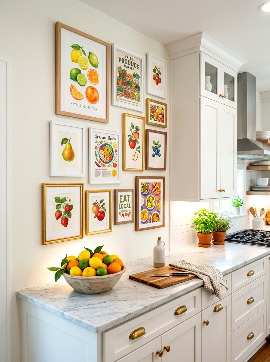
Kitchens are often dominated by cabinetry, but the walls offer a unique opportunity to experiment with dual colors. A popular trend is to paint the wall area behind open shelving a different color than the rest of the kitchen. For example, a deep navy blue background can make white ceramic dishes and wooden cutting boards pop beautifully. By carrying this second color onto a kitchen island or a lower section of the wall, you create a cohesive and layered look. This approach adds personality to a functional space and allows you to highlight your favorite kitchen accessories through smart color placement.
9. Ombre Gradient Wall
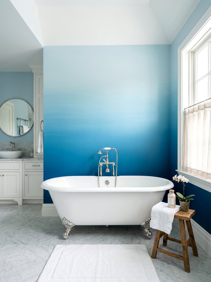
An ombre wall is a soft and ethereal way to introduce two colors into a room without a harsh dividing line. This technique involves blending two shades together where they meet, creating a seamless transition from dark to light. It is perfect for bathrooms or meditation rooms where a sense of flow and tranquility is desired. You can start with a deep ocean blue at the floor level and gradually fade into a pale sky blue near the ceiling. While it requires a bit more skill with a dry brush, the result is a stunning, cloud-like effect that feels incredibly high-end and unique.
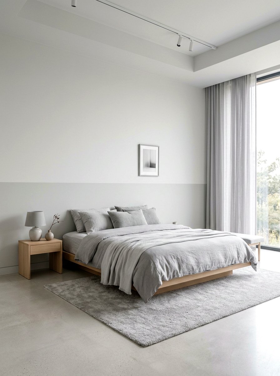
10. Bathroom Half Wall Paint
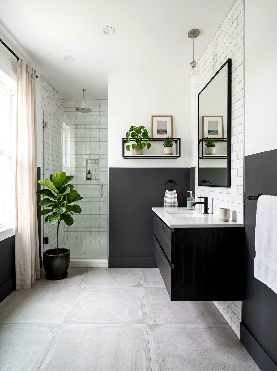
Bathrooms are often small, making them the perfect candidate for a half-wall paint design. By painting the bottom half of the wall in a moisture-resistant dark paint, you create a durable surface that also adds a lot of style. Charcoal grey or a deep plum can look exceptionally modern when paired with bright white subway tile or a light upper wall. This horizontal split also provides a great line to install a small shelf for toiletries or decorative plants. It keeps the space from feeling too cramped while adding the depth and character that single-colored small bathrooms often lack in modern layouts.
11. Vertical Stripe Wall Divider
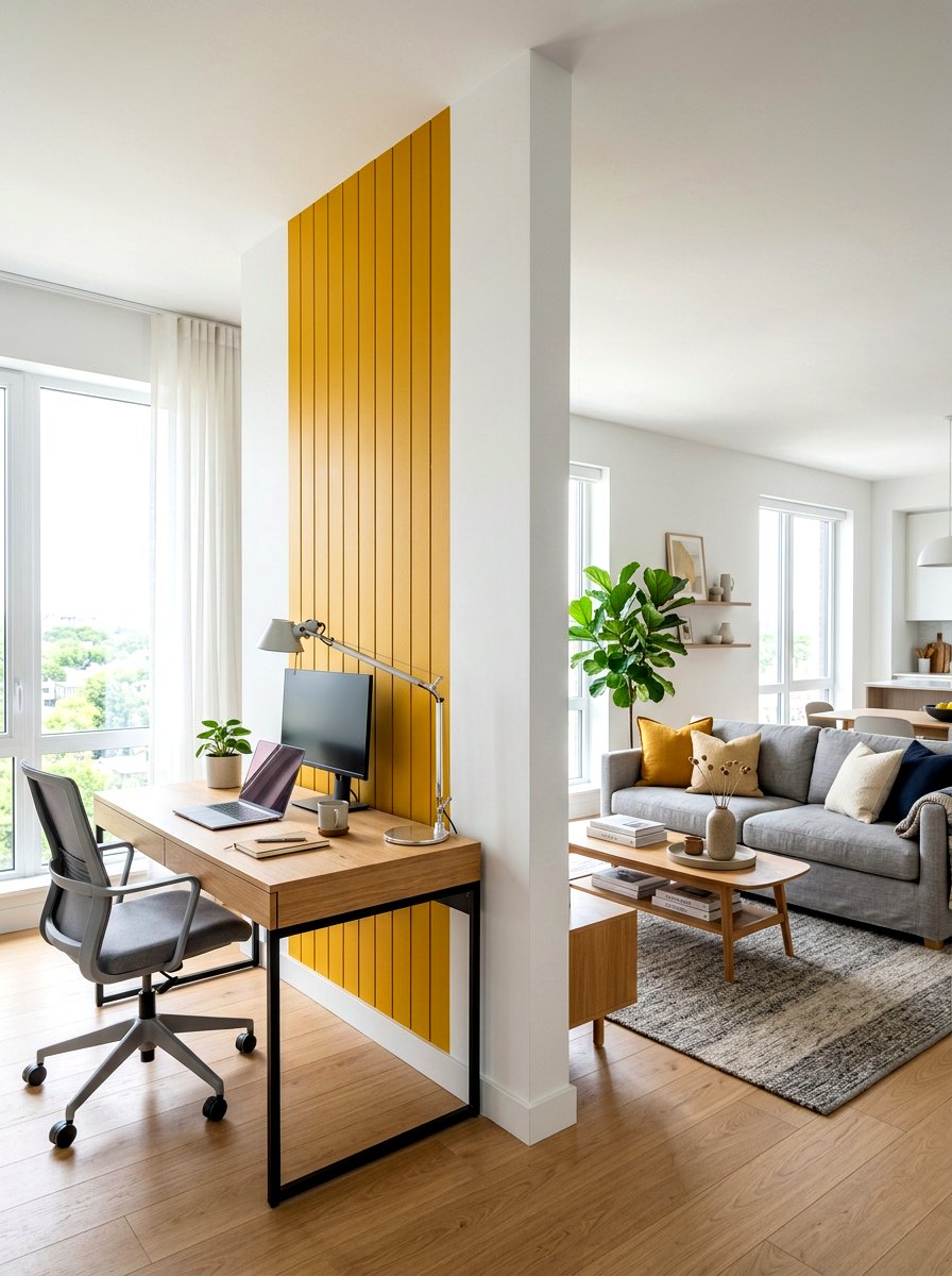
If you have an open-concept living area, using a vertical two-tone split is an excellent way to define different functional zones. You can paint a wide vertical stripe in a contrasting color to mark the transition from the living room to a home office nook. This visual "divider" creates a sense of separation without the need for physical walls or bulky furniture. Using a bold color like mustard yellow or deep burgundy can make the desk area feel like its own distinct room. It is a clever and space-saving solution for modern homes that prioritize multi-functional living and clean architectural lines.
12. Hallway Horizon Line Paint
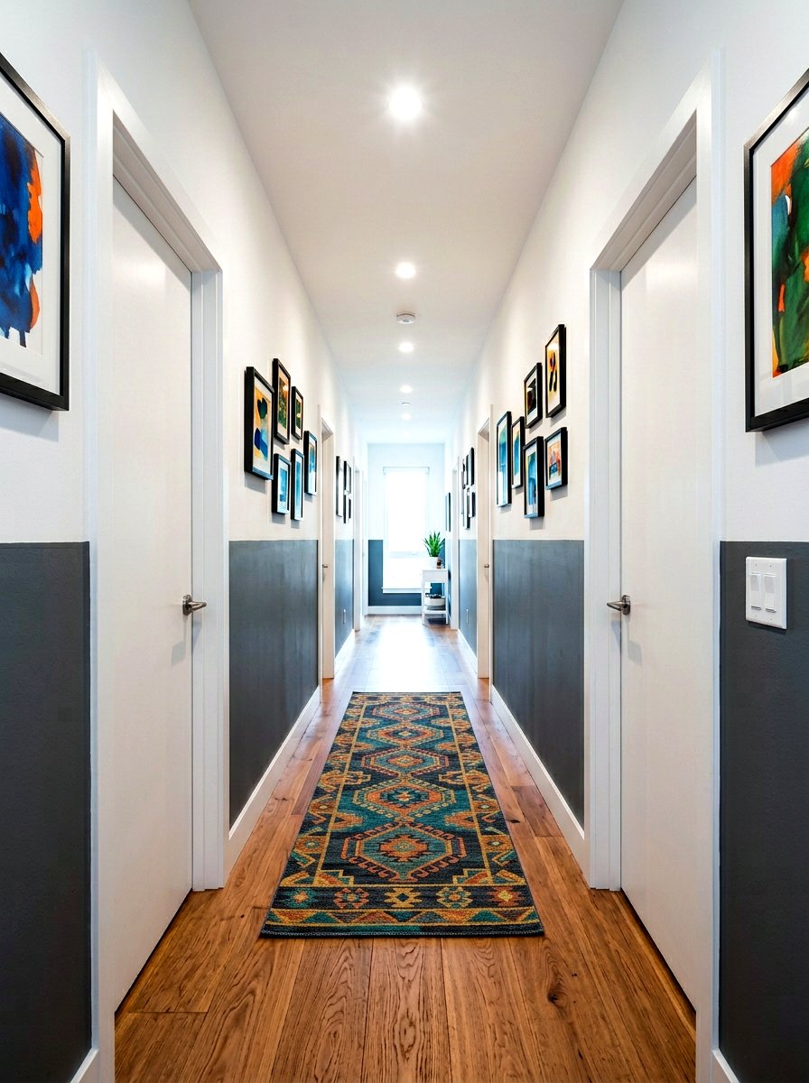
Long hallways can often feel like dark tunnels, but a horizontal two-tone paint job can make them feel expansive and bright. By placing the transition line slightly higher than usual, you draw the eye upward and create a sense of rhythm as you move through the home. Try using a light grey on the bottom and a crisp white on the top to keep the hallway feeling open. You can also align the paint line with the tops of the door frames for a very clean and intentional look. This simple design trick adds architectural interest to one of the most neglected areas of the house.
13. Stairwell Wall Color Block
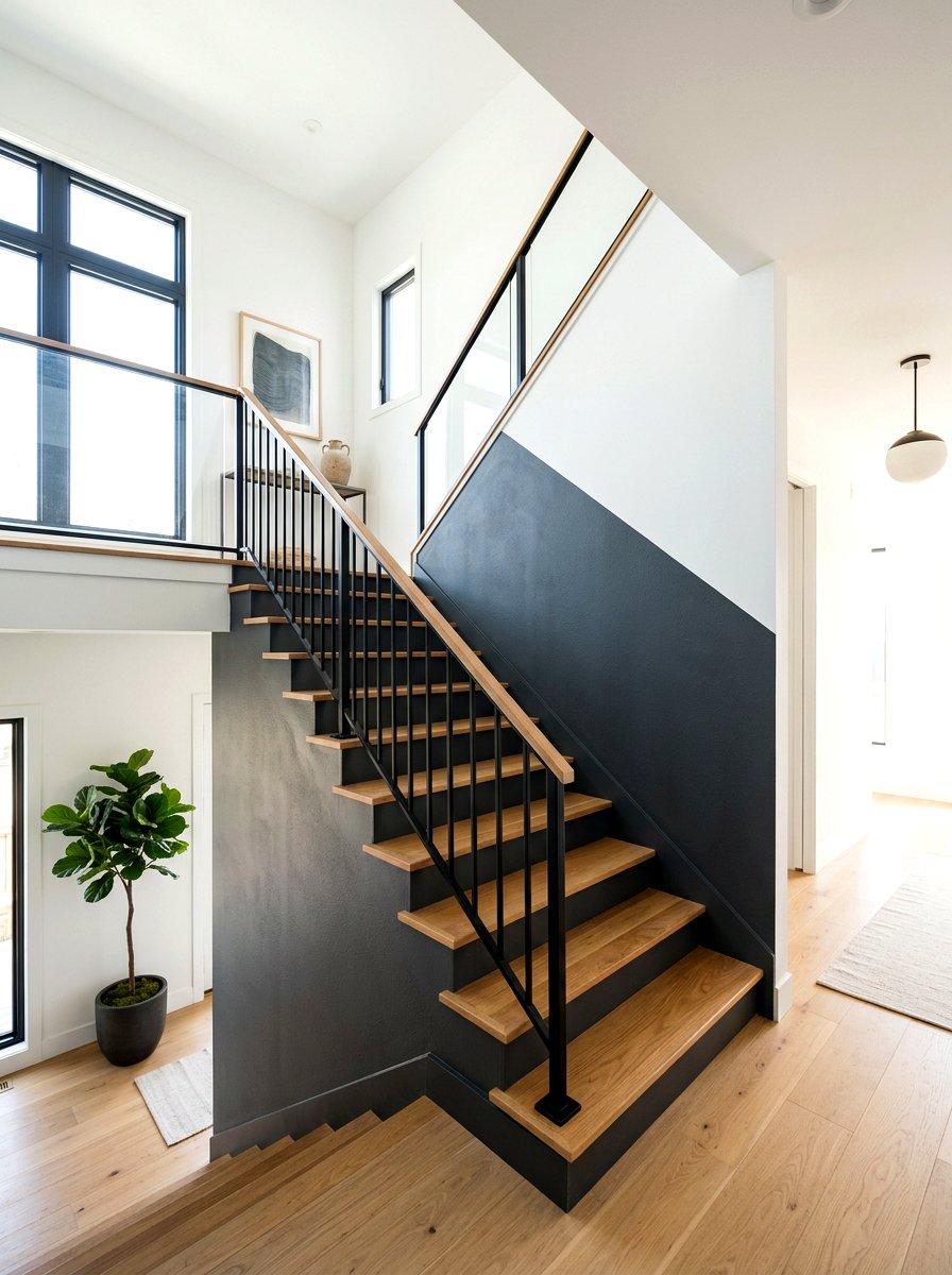
Staircases are often architectural masterpieces that deserve to be highlighted with creative paint. A color-blocking technique that follows the angle of the stairs can emphasize the height and structure of the stairwell. You might choose a bold charcoal for the lower section that follows the steps and a soft white for the upper wall. This creates a striking silhouette that feels modern and energetic. It also helps to hide the inevitable handprints and scuffs that occur in high-traffic staircases. This two-tone approach turns a functional transition space into a major design feature that connects the different levels of your home.
14. Playroom Circle Wall Paint
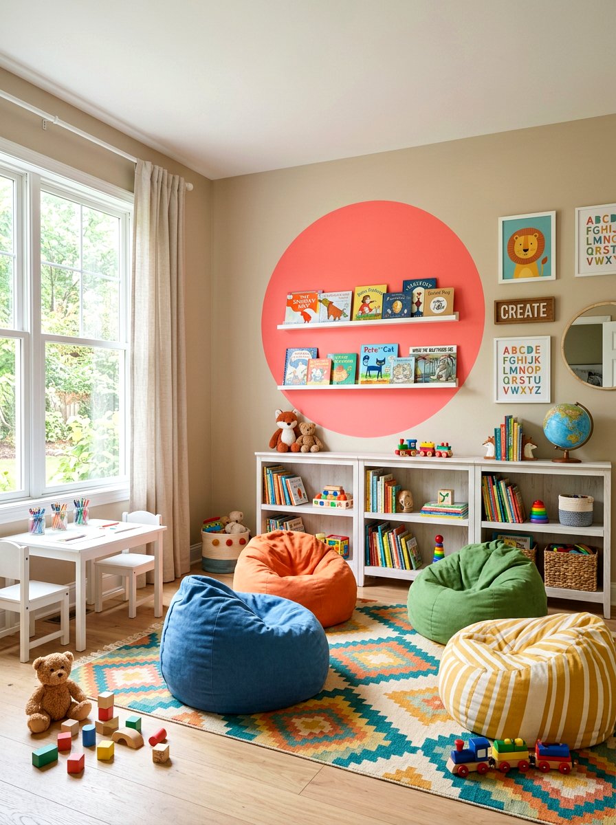
Playrooms should be filled with energy and creativity, and a two-tone circle design is a great way to achieve that. Instead of a straight line, paint a large, vibrant circle on one wall to serve as a backdrop for a reading nook or a toy chest. A bright coral or a cheerful mint green circle against a neutral background adds a sense of playfulness. This geometric shape acts as a giant piece of graphic art that stimulates a child’s imagination. It is a simple weekend project that can completely change the vibe of a room, making it feel more customized and fun for kids.
15. Navy And Cream Bedroom
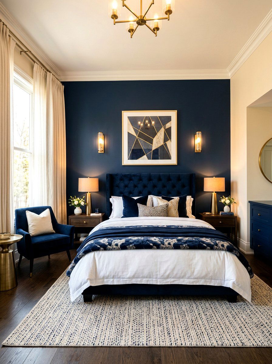
For a sophisticated and timeless look, you cannot go wrong with a navy and cream two-tone bedroom. This combination offers the perfect balance between dark drama and light comfort. By painting the wall behind the headboard a deep navy and the other three walls a warm cream, you create a stunning focal point. This setup makes the bed feel like the center of the room and provides a rich backdrop for wooden or metallic furniture. It is a classic choice for primary suites because it feels expensive and serene. This palette works beautifully with both traditional and contemporary decor styles throughout the seasons.
16. Modern Grey White Split
The combination of grey and white is a staple in modern design, but a two-tone application keeps it from looking too sterile. A horizontal split with a cool slate grey on the bottom and a pure white on top creates a sleek, industrial-inspired look. This works exceptionally well in lofts or minimalist apartments where clean lines are a priority. To add warmth, you can bring in natural wood elements and soft textiles like wool or linen. The grey adds enough weight to the room to make it feel grounded, while the white ensures that the space remains bright and open for daily activities.
17. Terracotta Beige Living Room
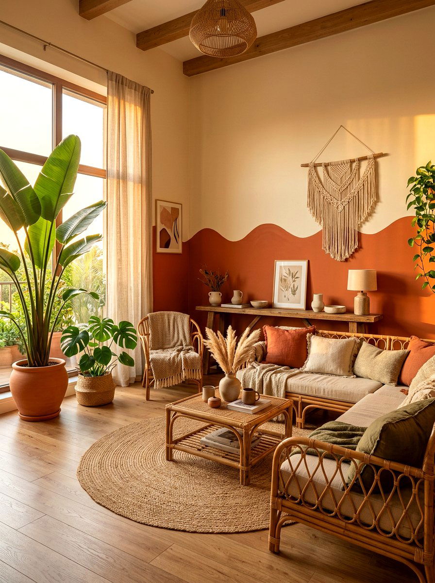
Earthy tones are making a massive comeback, and a terracotta and beige two-tone wall is the perfect way to embrace this trend. The warmth of terracotta provides a sun-drenched feel, while the beige softens the intensity of the orange hues. This pairing is ideal for living rooms where you want to foster a sense of comfort and organic beauty. You can use a scalloped or wavy line between the two colors for a more bohemian look. Pairing this with plenty of indoor plants and woven textures like rattan will create a cohesive, nature-inspired environment that feels incredibly inviting for guests and family.
18. Emerald Green Wood Paneling
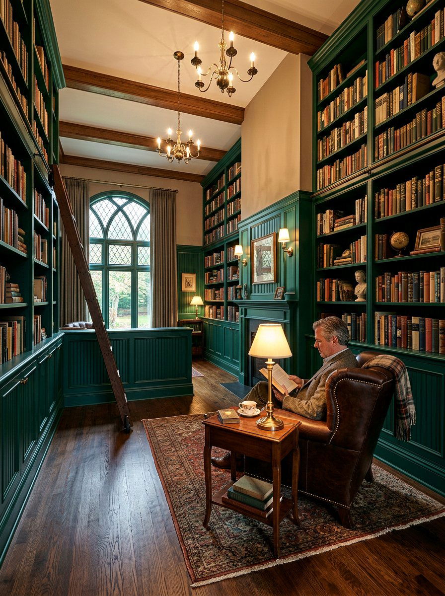
If you have existing wood paneling or beadboard, painting it a deep emerald green while keeping the wall above it neutral is a masterclass in style. This two-tone approach celebrates the texture of the wood while giving it a modern, moody update. Emerald green is a regal color that pairs perfectly with gold accents and dark leather furniture. It creates a library-like atmosphere that is perfect for a home office or a cozy den. The contrast between the saturated green and a light taupe or cream upper wall provides a sophisticated balance that feels both historical and fresh in today's interior design world.
19. Dusty Rose Charcoal Wall
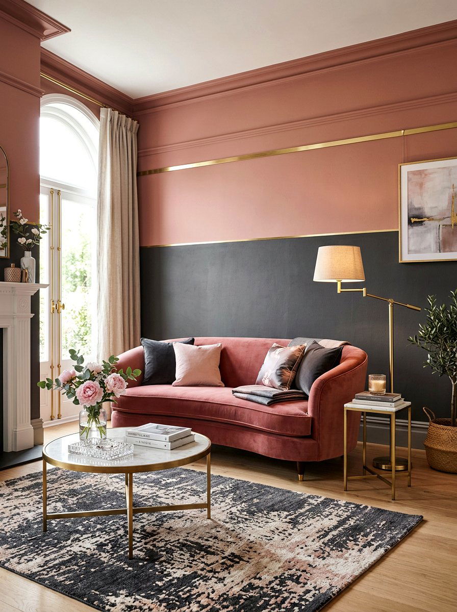
For a look that is both moody and romantic, try a combination of dusty rose and charcoal grey. This two-tone pairing is unexpected and incredibly stylish, especially in a bedroom or a formal sitting room. The charcoal provides a dark, masculine edge, while the dusty rose adds a soft, feminine touch. By splitting the wall horizontally, you can play with the proportions of the room to make it feel more intimate. This color duo works best with velvet furniture and brass lighting fixtures, creating a glamorous space that feels like a high-end boutique lounge. It is a bold choice for confident decorators.
20. Scalloped Edge Wall Paint
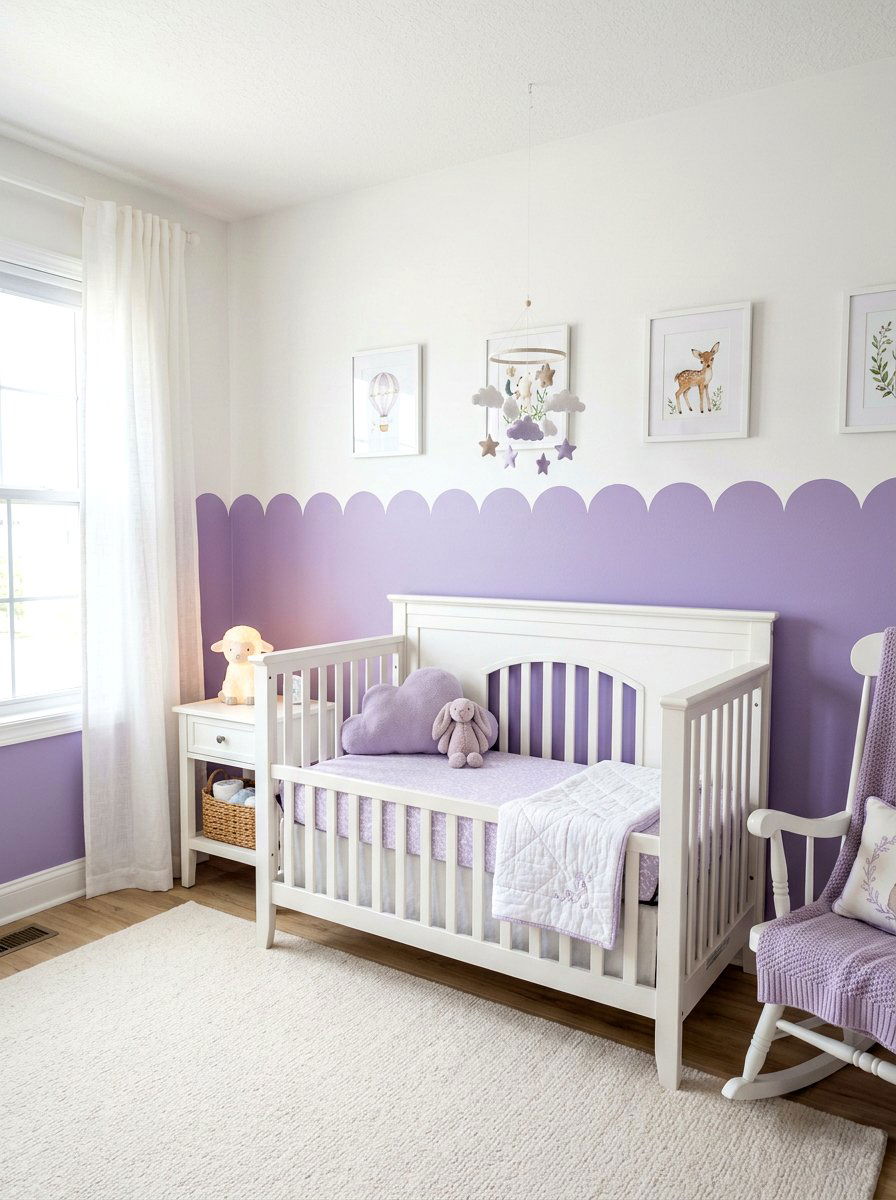
A scalloped edge is a charming and whimsical way to transition between two colors on a wall. Instead of a straight tape line, you use a stencil to create soft, rounded curves that look like waves or flower petals. This technique is particularly popular in nurseries or guest rooms where you want to add a touch of personality. Using a soft lavender and a crisp white creates a gentle and dreamy atmosphere. The scalloped line adds a hand-crafted feel to the room, making it feel more personal and artistic. It is a simple way to add a lot of character without needing any expensive materials.
21. Picture Frame Molding Contrast
If your home has traditional picture frame molding, you can use two-tone paint to highlight these architectural details. Painting the inside of the frames a slightly darker or lighter shade than the rest of the wall creates a beautiful layered effect. For a subtle look, use two shades of beige that are only one or two steps apart on the color wheel. This adds depth and dimension to the wall without being overwhelming. It makes the molding pop and gives the entire room a more expensive, custom-built appearance. It is a sophisticated way to modernize a traditional home while respecting its original features.
22. Built In Bookshelf Backdrop
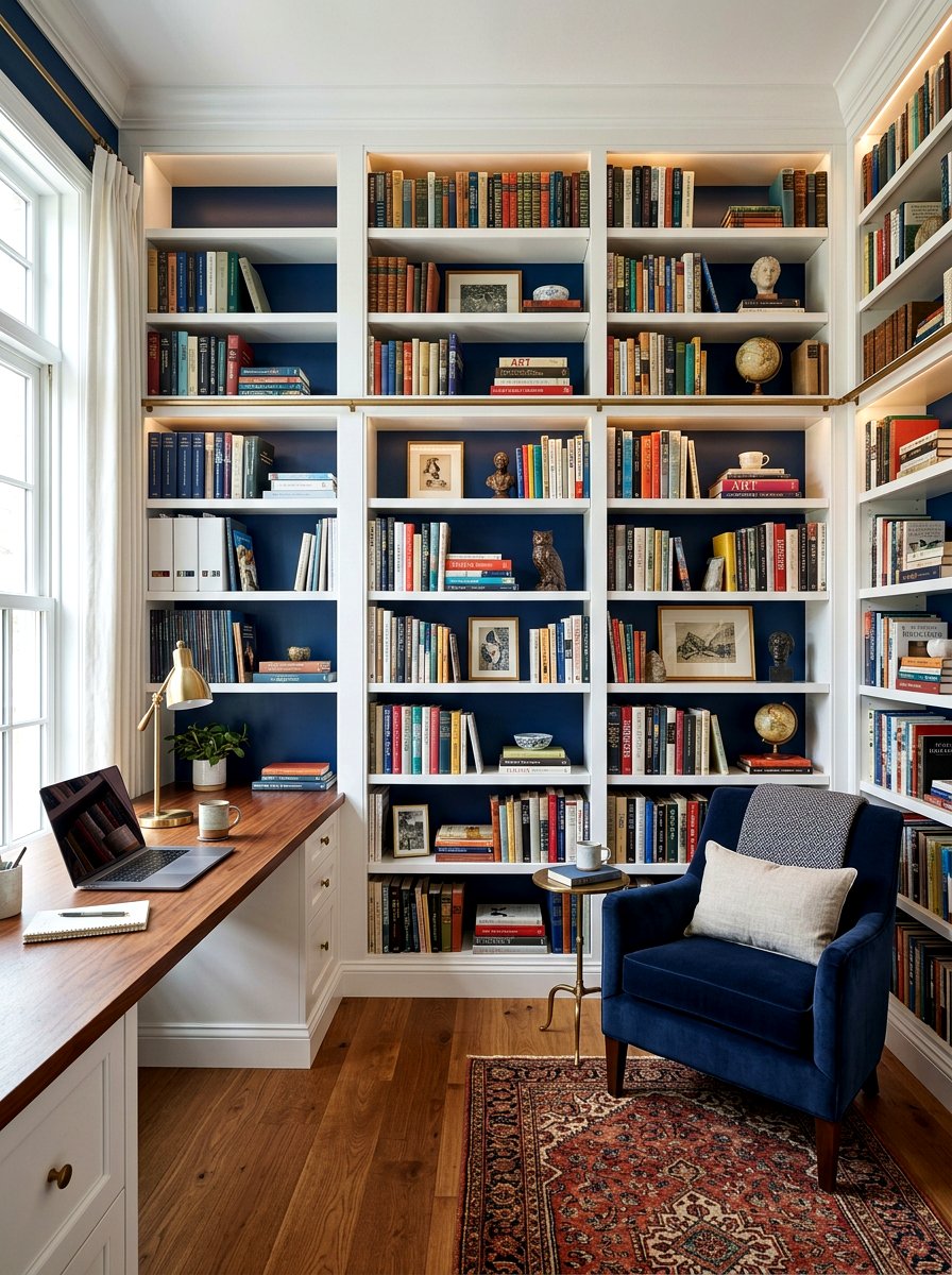
Built-in bookshelves are a fantastic feature, but they can sometimes look cluttered or flat. Painting the back of the shelves a different color than the surrounding walls is a clever two-tone trick that adds instant depth. If your room is painted a light grey, try a deep forest green or a navy blue behind the books and decor. This makes your collection of books and art pieces stand out as a curated display. It also makes the shelves feel like a built-in piece of furniture rather than just a part of the wall. This small change can completely transform the look of your office.
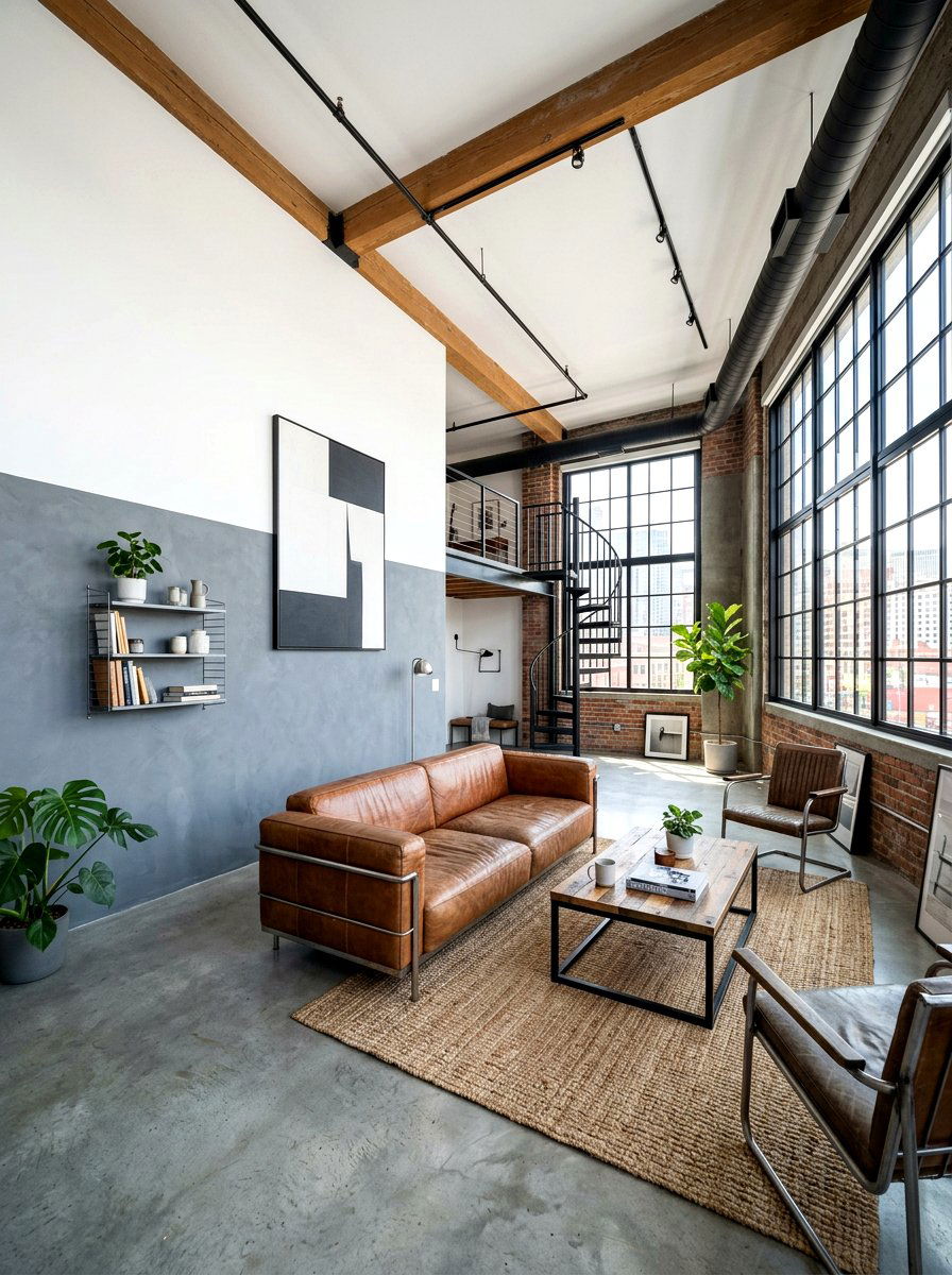
23. Industrial Loft Concrete Black
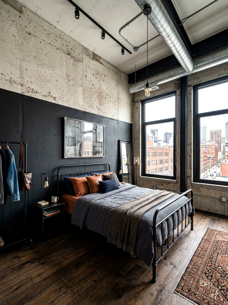
For those who love the industrial aesthetic, a two-tone wall featuring a concrete texture and matte black paint is a winning combination. This look is perfect for large open spaces with exposed pipes or high ceilings. You can paint the bottom half of the wall in a matte black to create a bold, grounded base, while the top half features a light grey concrete-effect finish. This pairing feels raw, edgy, and very modern. It provides a great backdrop for metallic furniture and large-scale art pieces. It is a high-impact design choice that brings a sense of urban sophistication to any living area.
24. Yellow White Sunroom
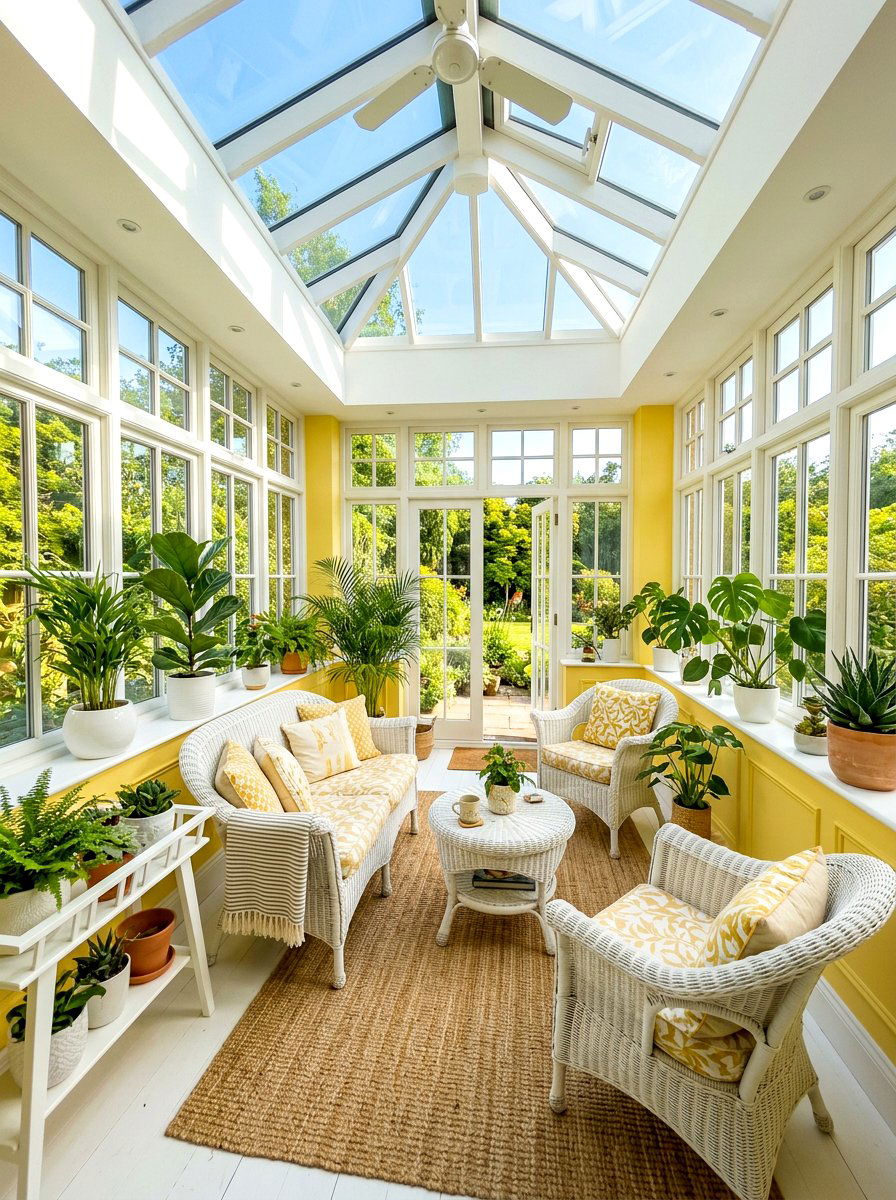
Sunrooms should always feel bright and energetic, and a two-tone yellow and white color scheme is the perfect way to enhance the natural light. By painting the lower half of the walls a soft butter yellow and the upper half a bright white, you mimic the feeling of sunshine even on cloudy days. This combination is cheerful and inviting, making it the perfect spot for morning coffee or afternoon reading. The white helps bounce the light around the room, while the yellow adds a touch of warmth. Pairing this with white wicker furniture and green plants creates a classic, refreshing outdoor-in vibe.
25. Mudroom Functional Dark Lower Wall
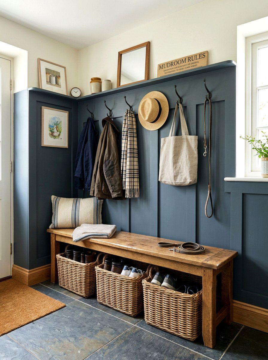
Mudrooms are hardworking spaces that deal with a lot of dirt, which makes a two-tone paint job both stylish and practical. By painting the lower half of the wall in a durable, dark color like navy or slate grey, you can easily hide scuff marks from boots and bags. The upper half can remain a light neutral to keep the space from feeling too small or dark. This horizontal split also provides a natural place to install hooks for coats and shelves for shoes. It is a smart design choice that balances the need for functionality with the desire for a beautiful, welcoming entryway.
26. Monochrome Light Grey Shifting
A monochrome two-tone wall uses two different shades of the same color to create a subtle and sophisticated look. For example, using a light grey and a medium grey creates a sense of depth without introducing a new color to the palette. This is ideal for minimalist homes where a clean and cohesive look is desired. The slight shift in tone adds enough visual interest to keep the walls from looking flat, but it remains calm and understated. This technique is perfect for bedrooms or living rooms where you want to create a serene environment that feels thoughtfully designed and very high-end.
27. Black White Geometric Wall
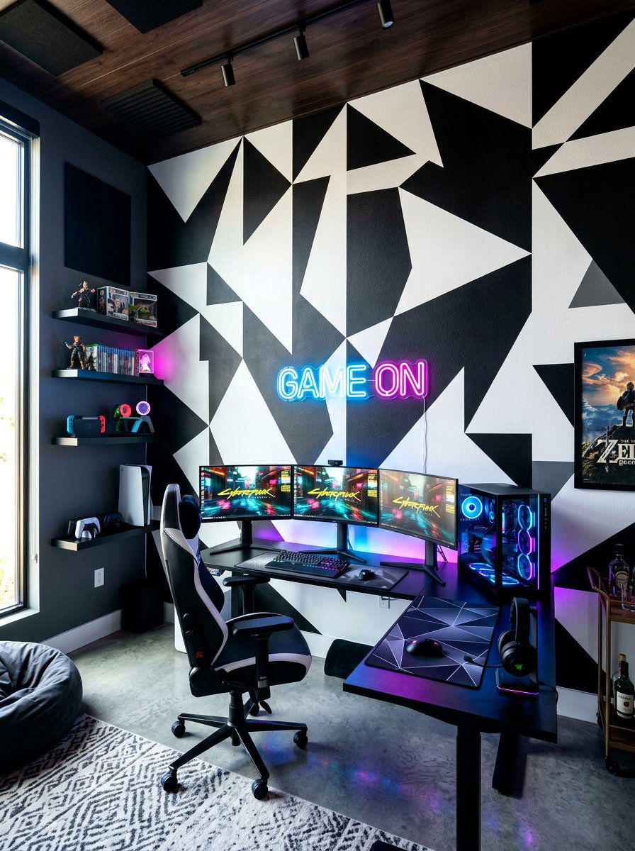
If you want to make a bold statement, a black and white geometric two-tone wall is the way to go. Using sharp lines and triangles to create a large-scale pattern can turn a plain wall into a piece of modern art. This high-contrast pairing is energetic and eye-catching, making it perfect for a game room or a modern home office. You can use a "color block" style where large sections of the wall are painted in each color. This design works best in rooms with simple furniture so that the wall remains the main focus of the space. It is a daring and unforgettable look.
28. Lavender Sage Green Bedroom
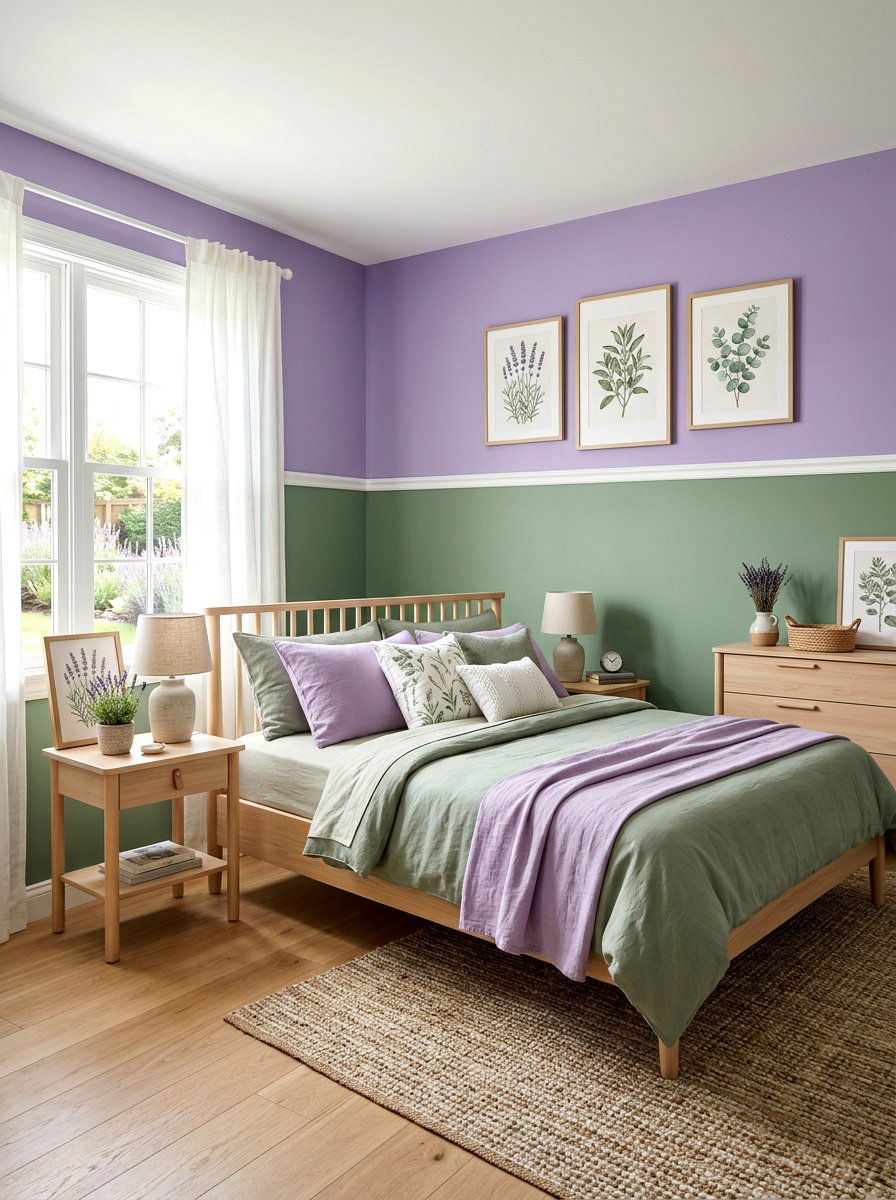
For a unique and calming bedroom, try pairing lavender with sage green. These two muted colors are often found together in nature and create a very peaceful, organic atmosphere. Painting the bottom half of the wall in sage green and the top half in a soft lavender provides a gentle contrast that feels very modern. This combination is a great alternative to traditional blue and white palettes. It feels fresh and creative, especially when paired with natural wood accents and botanical prints. It is a perfect choice for anyone looking to create a restorative sanctuary that feels soft, elegant, and very stylish.
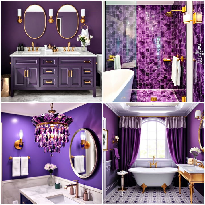
29. Midnight Blue Gold Trim
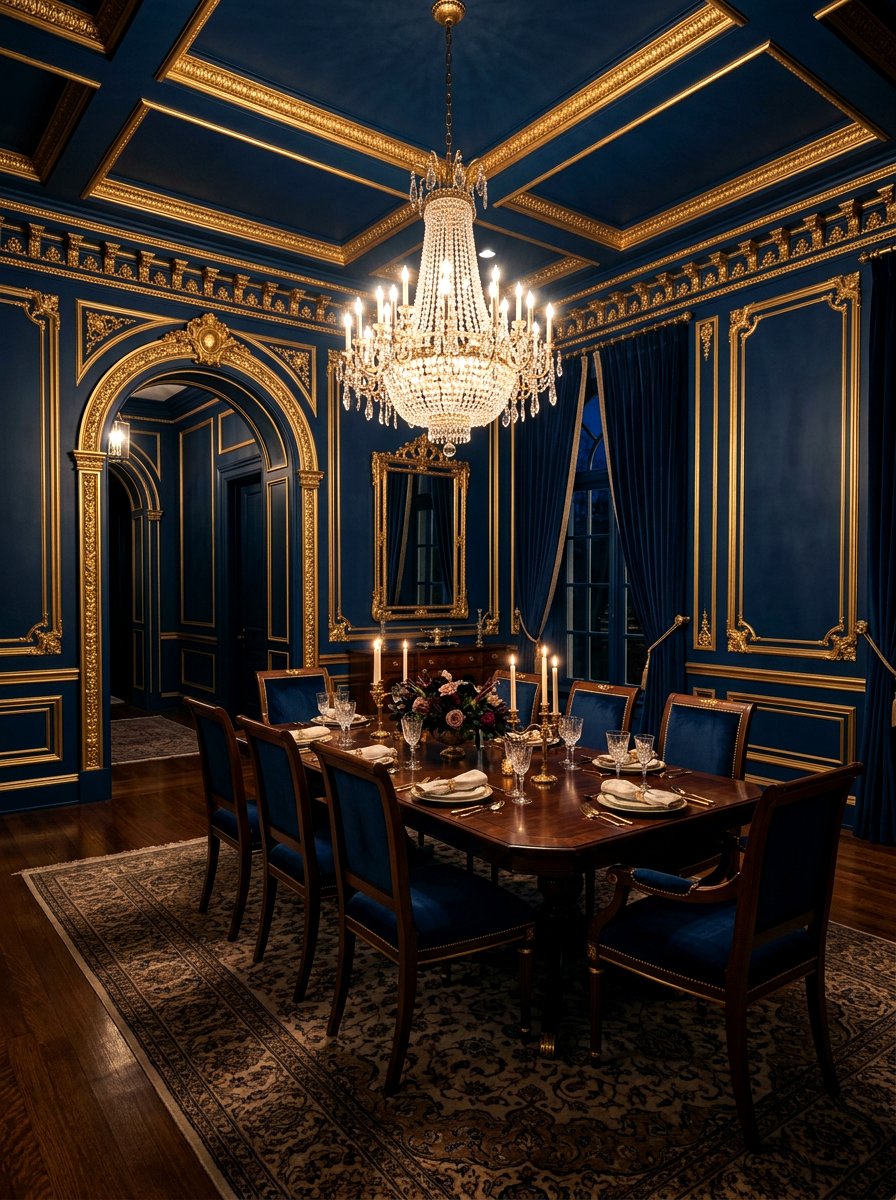
For a truly luxurious and dramatic look, try a two-tone design featuring midnight blue walls with gold-painted trim or accents. While not a traditional split, using the trim as the second "tone" creates a very high-end aesthetic. The deep, dark blue provides a moody and intimate backdrop, while the gold accents add a touch of glamour and light. This combination is perfect for a formal dining room or a home library. It feels regal and sophisticated, especially when paired with velvet curtains and crystal lighting. This is a great way to use two colors to create a space that feels like a private club.
30. White Olive Farmhouse Wall
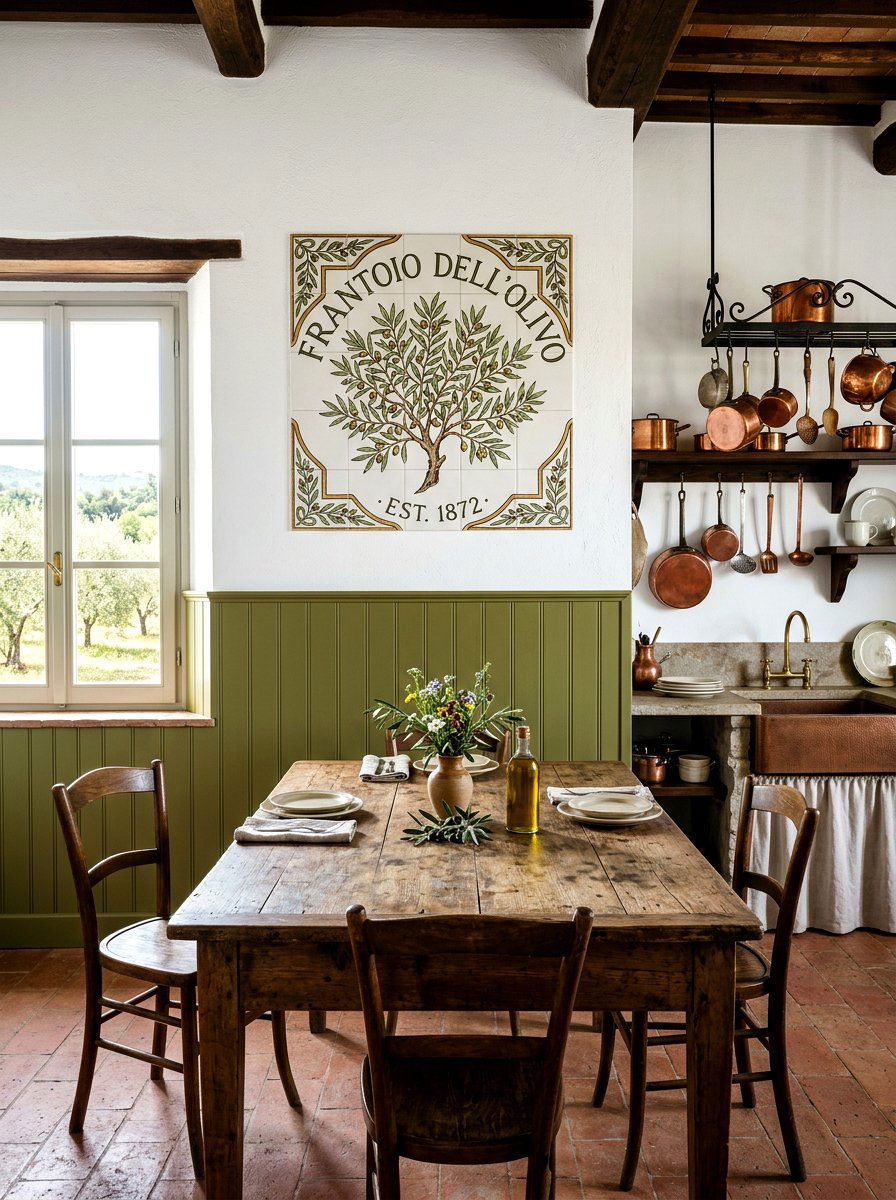
The modern farmhouse style often relies on neutral colors, but adding a touch of olive green can give it a fresh update. A horizontal split with olive green on the bottom and white on top is a beautiful way to add color while staying true to the rustic aesthetic. Olive green is an earthy, versatile shade that pairs perfectly with reclaimed wood and vintage decor. It adds a sense of history and warmth to a kitchen or living area. This two-tone look is grounded and cozy, making your home feel lived-in and comfortable while still looking polished and professionally designed for Pinterest.
Conclusion:
Selecting the perfect two-tone wall paint design is a transformative way to breathe new life into your home. This technique allows you to experiment with colors that you might be hesitant to use on an entire wall. By combining different shades, you can create a unique environment that reflects your personal style and enhances your home's architecture. Whether you choose a bold geometric pattern or a subtle horizontal split, the key is to have fun with the process. A simple can of paint and some tape can truly turn any room into a viral-worthy space that feels both modern and timeless for years.
Related posts: